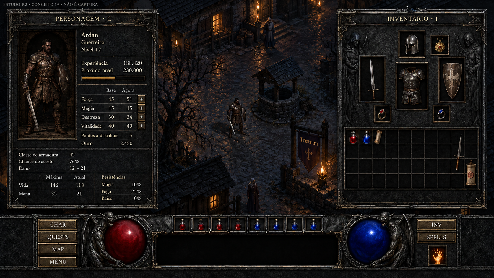
Abrir o inventário, conversar com um morador ou ajustar o áudio também faz parte da atmosfera de Diablo. O estudo R2 amplia a direção visual do projeto para essas situações, com propostas organizadas por tela, referências disponíveis e três exemplos editáveis no Godot. As imagens apresentadas aqui são conceitos candidatos; os novos painéis ainda não foram integrados ao jogo.
Uma direção para o jogo inteiro
O objetivo continua sendo reconstruir Diablo 1 inteiro em 3D. Tristram é a primeira etapa de validação, enquanto o estudo de interfaces considera as telas e os estados que acompanham a experiência mais ampla: entrada, personagens, equipamentos, magias, missões, diálogos, comércio e configurações.
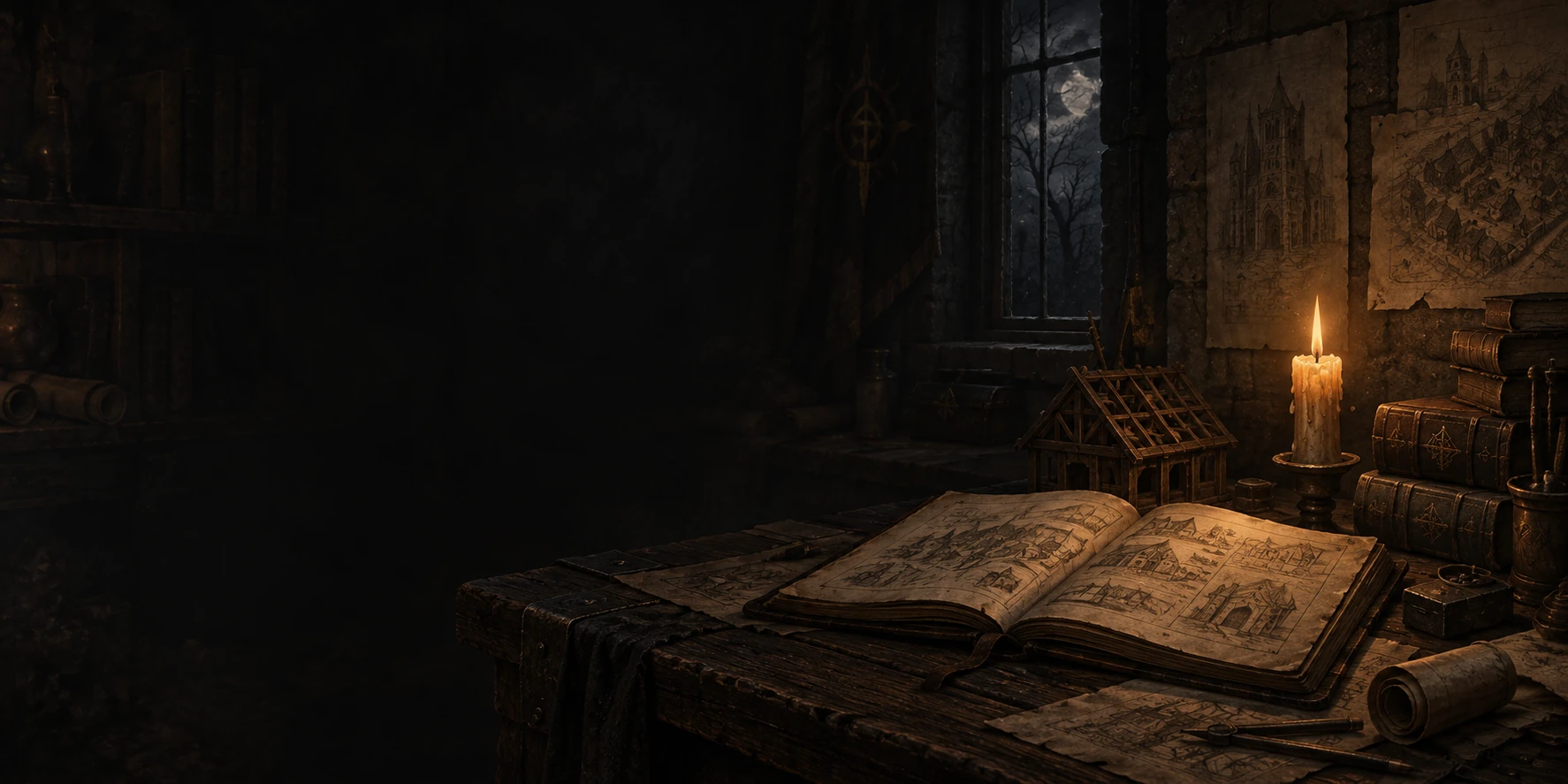
A direção procura manter pedra escura, ferro envelhecido, texto em marfim e destaques em âmbar. Molduras e ornamentos precisam dividir espaço com nomes, valores e descrições legíveis. O fundo deve sustentar essa atmosfera de maneira consistente, sem disputar atenção com a informação que o jogador está procurando.
O menu principal reutiliza a direção anterior. O HUD principal já instalado e os créditos permanecem preservados; este lote trata das demais interfaces. A documentação do estudo explica a organização e os próximos passos.
65 arquétipos, 223 estados
O catálogo reúne 65 arquétipos e 223 estados rastreados. Um arquétipo é uma estrutura compartilhada: uma lista de opções pode ter diferentes conteúdos e condições sem precisar de um desenho independente para cada combinação. Esses números não representam 223 menus distintos.
As propostas cobrem os 63 arquétipos que precisam de arte. Foram produzidas 60 composições novas: 18 de entrada e navegação, 12 de configurações, 21 de painéis e nove de comércio. Algumas pranchas apresentam várias variantes. Com três peças sem texto e o menu reutilizado, o catálogo reúne 64 recursos visuais.
Entre os grupos estão seleção de heróis e sessões, ajustes de áudio e gráficos, teclas e controles, personagem e inventário, baú e ouro, livro de magias, mapas, missões, conversas, lojas e avisos. Cada proposta está relacionada às ações e condições registradas no catálogo.
O levantamento inclui estados condicionais de Hellfire, rede, shareware, controle, toque e ferramentas de desenvolvimento. Sua presença no catálogo não significa que todos estejam disponíveis na build atual.
Conceito e referência têm papéis diferentes
Uma ilustração ajuda a avaliar composição, materiais e hierarquia. A referência nativa permite conferir o que a interface realmente precisa mostrar e fazer. A galeria identifica os dois papéis para que uma proposta gerada não seja confundida com o original.
Há 14 referências nativas em imagem: uma captura histórica de janela e 13 composições técnicas produzidas fora da janela da partida. Algumas já mostram fundos modificados pelo projeto; não são todas reproduções intactas do Diablo original. Uma referência também pode cobrir apenas parte das variantes de um arquétipo.
Os outros 51 arquétipos ainda precisam de captura nativa. Nesses casos, a comparação informa a lacuna e aponta para as funções existentes no código. A comparação visual integral permanece pendente.
Para publicação, 60 conceitos e 14 referências foram convertidos para WebP sem perdas. O recibo das 74 conversões registra igualdade dos pixels RGBA e das dimensões. Não houve recorte, redimensionamento ou retoque; os masters originais permaneceram intactos.
Do desenho a controles editáveis
Três exemplos passaram da composição ilustrada para cenas separadas no Godot: configurações, inventário e comércio. As molduras usam os três kits sem texto; nomes, valores, botões e células são elementos editáveis. Assim, a arte pode orientar a apresentação enquanto o conteúdo permanece separado.
O inventário conserva sete receptáculos de equipamento e mochila de 10×4 células. O exemplo de comércio usa loja de 10×9 células, além da mochila. Configurações apresenta 18 linhas e um rodapé horizontal. Os itens geométricos e os atributos exibidos são exemplos locais.
O recibo dos protótipos registra 819 verificações aprovadas de estrutura, geometria e acionamentos locais. Esses testes não produziram renders ou capturas do Godot, nem validaram input físico ou aparência final. Comprar apenas abre uma confirmação demonstrativa; confirmar ou cancelar fecha a prévia, sem transação.
Salvar essas cenas não altera a partida, as configurações ou os saves. A integração futura ainda precisa ligar cada controle aos comportamentos nativos.
O que ainda precisa de correção
Duas pranchas deixam claro por que uma imagem não pode determinar sozinha as regras da interface. P08 desenha aproximadamente um baú de 10×9 e uma mochila de 10×3; os contratos corretos são 10×10 e 10×4. A prancha c-05 apresenta uma loja de 11×8, enquanto o protótipo Godot já usa os 10×9 corretos. Essas grades ilustradas estão bloqueadas para promoção direta.
Letras, números, itens e exemplos de chat também precisam virar conteúdo real. Os ornamentos centrais das molduras exigem revisão ao mudar de proporção, e a leitura deve ser conferida em diferentes tamanhos e idiomas. A validação estrutural não substitui essa avaliação visual.
O próximo passo é revisar cada família, completar as referências faltantes e ajustar os componentes antes de integrar uma família por vez. A cobertura de conceitos está organizada; a aprovação artística e a comparação completa continuam em aberto.
Em outra frente do projeto, Griswold e Ogden aparecem nos dois vídeos públicos abaixo, em uma volta rápida de 360°. São modelos em desenvolvimento: a apresentação não é gameplay e não comprova integração ao jogo ou aprovação artística.
MODELOS EM DESENVOLVIMENTO · WIP
Griswold e Ogden em 360°
Uma prévia de 28 segundos dos dois modelos em desenvolvimento, com um vídeo principal horizontal e um Short dos mesmos personagens.
São estudos visuais em revisão. Os vídeos não mostram gameplay nem comprovam integração no jogo ou aprovação artística.
Clique no play ou em “Assistir aqui” para reproduzir neste card. O player só carrega após esse clique. Acompanhar o devlog.

Vídeo principal horizontal · 28 s · WIP
Griswold & Ogden | Fast 360° Character Showcase | Diablo3D
Griswold e Ogden em giro de 360° para revisão visual.

Short vertical · 28 s · WIP
Griswold + Ogden in 28 Seconds | Diablo3D #Shorts
Os mesmos dois modelos, em formato vertical.
Galeria completa do estudo R2
A galeria reúne os 64 recursos visuais e as 14 referências disponíveis, com suas identificações e limites. Observe a disposição dos controles, a leitura dos textos e a continuidade dos materiais. Nas propostas de baú e loja, considere também as divergências de grade descritas acima: elas fazem parte da revisão pendente.
Entrada, heróis e carregamento
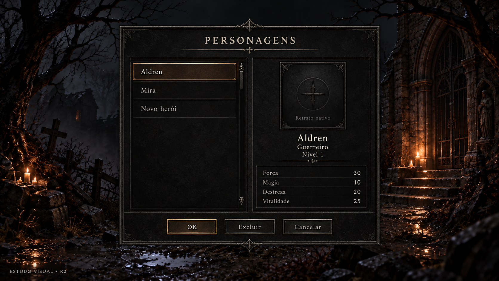
Personagens de um jogador
Conceito gerado · R2 · candidato em revisão; não é captura do jogo.
Ver prompt original
Use case: ui-mockup.
Asset type: Diablo 3D frontend r2 visual study, a proposed polished UI mockup, never a screenshot.
Output: one 1920x1080 landscape image, 16:9.
Input image 1 is the APPROVED menu background. Use exactly its composition, environment, perspective, scenery, candle locations, branches, fog and image framing, as a retained background plate. Do not redesign, replace or stylize the background. Overlay only a UI foreground. Input image 2 is a style reference ONLY for sober charcoal stone, iron, pewter, ivory lettering and restrained warm amber accents. Do not copy its gameplay or HUD.
Visual style: high definition, elegant dark gothic Diablo I atmosphere, quiet pewter borders and restrained engraved details, readable large ivory text with subtle shadow; selected row has a thin warm amber rule and a dim amber fill. No ornate heavy gold slabs, no bright fantasy glow, no oversized panels. UI should feel consistent across the set.
Composition: preserve substantial empty background; center the useful UI within the safe rectangle x=320..1600, y=150..950; avoid text touching edges; use balanced title, content and footer with large breathing room. A translucent charcoal panel ensures legibility without hiding the whole approved setting. A small understated study label at bottom-left reads "ESTUDO VISUAL • R2". No newly invented game logo, no copyright logo replacement, no original/comparison column.
PT-BR text is illustrative, rendered verbatim below; future UI will render live text. Do not add functions, explanatory mechanics, navigation tabs or buttons beyond those listed. Names are fictitious.

Screen F04 — saved single player heroes.
Title: "PERSONAGENS".
A wide quiet central panel, left column is a scrollable hero list with only three visible real entries: "Aldren" (selected), "Mira", "Novo herói". Do not show numbered save slots, empty slots or multiple checkpoint cards.
Right column: a restrained empty portrait inset with small neutral label "Retrato nativo"; this is a reserved location for the inherited approved portrait, do NOT draw a new character, silhouette or illustration. Below it selected details: "Aldren", "Guerreiro", "Nível 1".
A two-column detail table reads exactly: "Força 30", "Magia 10", "Destreza 20", "Vitalidade 25".
Footer has exactly three modest buttons "OK", "Excluir", "Cancelar". Highlight "OK" softly, keep Excluir secondary.
Only the specified functions and data. No account, armor preview, character customization, delete icon repeated per row, level progress bar, quest or equipment.
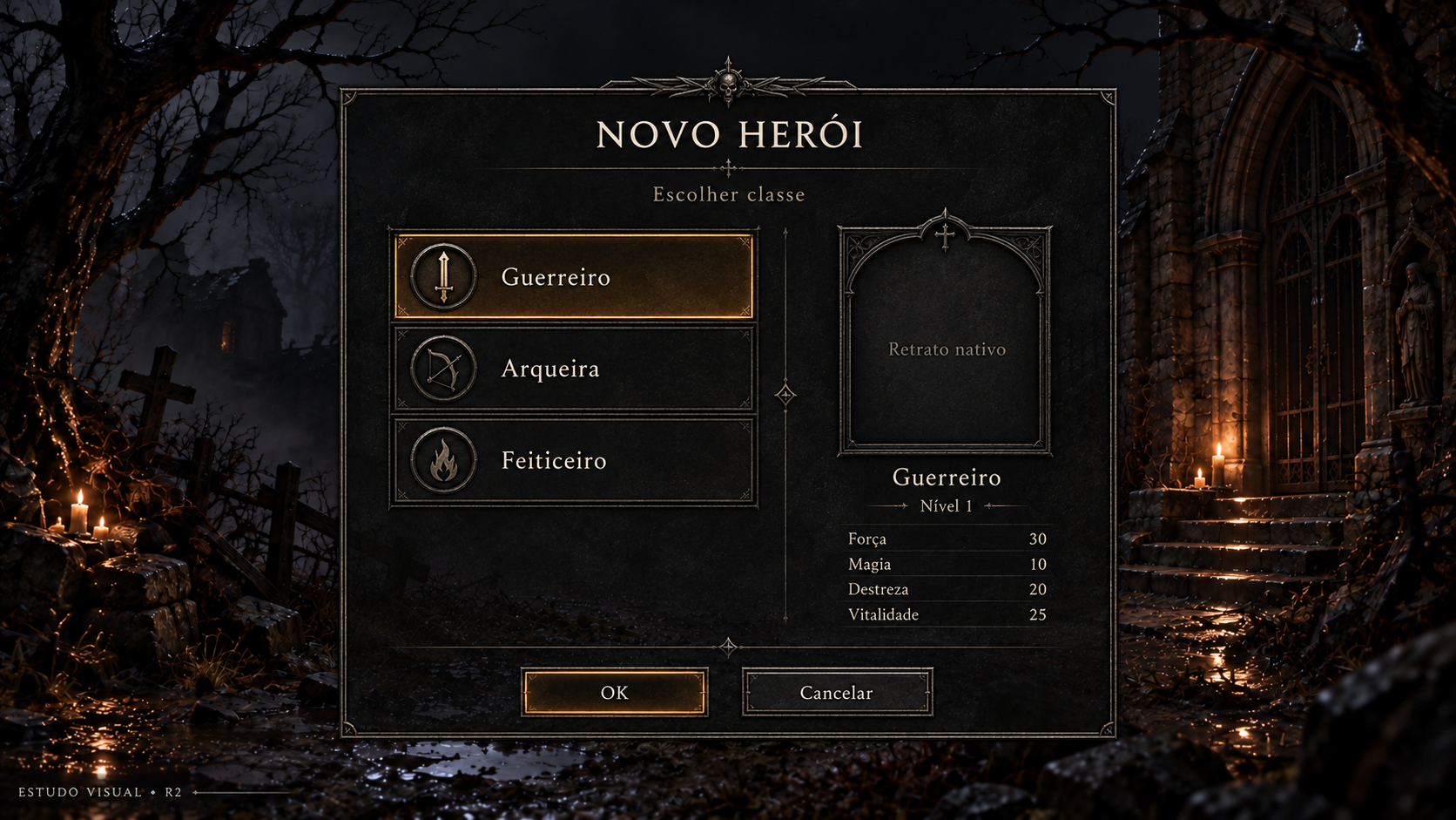
Novo herói — escolher classe
Conceito gerado · R2 · candidato em revisão; não é captura do jogo.
Ver prompt original
Use case: ui-mockup.
Asset type: Diablo 3D frontend r2 visual study, a proposed polished UI mockup, never a screenshot.
Output: one 1920x1080 landscape image, 16:9.
Input image 1 is the APPROVED menu background. Use exactly its composition, environment, perspective, scenery, candle locations, branches, fog and image framing, as a retained background plate. Do not redesign, replace or stylize the background. Overlay only a UI foreground. Input image 2 is a style reference ONLY for sober charcoal stone, iron, pewter, ivory lettering and restrained warm amber accents. Do not copy its gameplay or HUD.
Visual style: high definition, elegant dark gothic Diablo I atmosphere, quiet pewter borders and restrained engraved details, readable large ivory text with subtle shadow; selected row has a thin warm amber rule and a dim amber fill. No ornate heavy gold slabs, no bright fantasy glow, no oversized panels. UI should feel consistent across the set.
Composition: preserve substantial empty background; center the useful UI within the safe rectangle x=320..1600, y=150..950; avoid text touching edges; use balanced title, content and footer with large breathing room. A translucent charcoal panel ensures legibility without hiding the whole approved setting. A small understated study label at bottom-left reads "ESTUDO VISUAL • R2". No newly invented game logo, no copyright logo replacement, no original/comparison column.
PT-BR text is illustrative, rendered verbatim below; future UI will render live text. Do not add functions, explanatory mechanics, navigation tabs or buttons beyond those listed. Names are fictitious.

Screen F05 — new hero, choose class. Title "NOVO HERÓI"; small subtitle "Escolher classe".
Central two-column panel, same visual language as F04.
Left side list contains EXACTLY: "Guerreiro" selected, "Arqueira", "Feiticeiro". This is the full Diablo base game example, do not add Hellfire-only classes or custom classes.
Right: quiet empty reserved portrait frame labelled "Retrato nativo", no invented person, character, silhouette or artwork. Below: "Guerreiro" and "Nível 1"; compact attribute rows "Força 30", "Magia 10", "Destreza 20", "Vitalidade 25".
Footer only two buttons "OK" and "Cancelar". No appearance editor, no class lore, abilities, inventory, gender or traits.
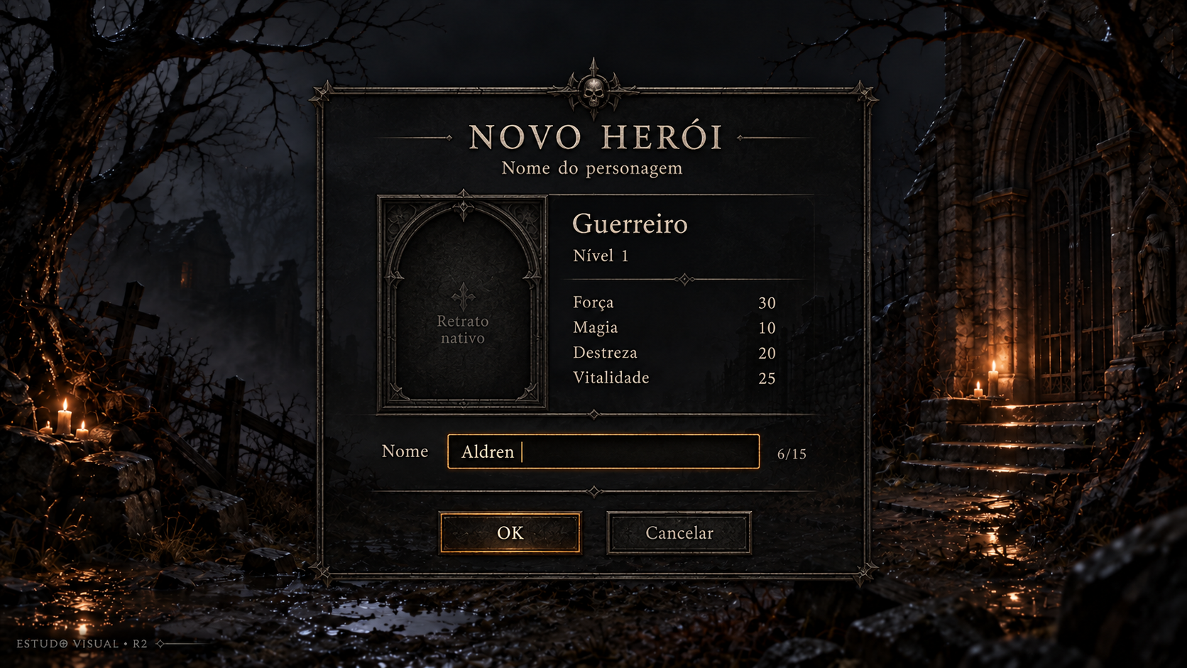
Novo herói — nome
Conceito gerado · R2 · candidato em revisão; não é captura do jogo.
Ver prompt original
Use case: ui-mockup.
Asset type: Diablo 3D frontend r2 visual study, a proposed polished UI mockup, never a screenshot.
Output: one 1920x1080 landscape image, 16:9.
Input image 1 is the APPROVED menu background. Use exactly its composition, environment, perspective, scenery, candle locations, branches, fog and image framing, as a retained background plate. Do not redesign, replace or stylize the background. Overlay only a UI foreground. Input image 2 is a style reference ONLY for sober charcoal stone, iron, pewter, ivory lettering and restrained warm amber accents. Do not copy its gameplay or HUD.
Visual style: high definition, elegant dark gothic Diablo I atmosphere, quiet pewter borders and restrained engraved details, readable large ivory text with subtle shadow; selected row has a thin warm amber rule and a dim amber fill. No ornate heavy gold slabs, no bright fantasy glow, no oversized panels. UI should feel consistent across the set.
Composition: preserve substantial empty background; center the useful UI within the safe rectangle x=320..1600, y=150..950; avoid text touching edges; use balanced title, content and footer with large breathing room. A translucent charcoal panel ensures legibility without hiding the whole approved setting. A small understated study label at bottom-left reads "ESTUDO VISUAL • R2". No newly invented game logo, no copyright logo replacement, no original/comparison column.
PT-BR text is illustrative, rendered verbatim below; future UI will render live text. Do not add functions, explanatory mechanics, navigation tabs or buttons beyond those listed. Names are fictitious.

Screen F06 — new hero naming.
Title "NOVO HERÓI"; subtitle "Nome do personagem".
A compact central panel, left part retains a quiet empty reserved portrait inset labelled "Retrato nativo"; do not create any character portrait.
Beside it selected information "Guerreiro", "Nível 1"; rows "Força 30", "Magia 10", "Destreza 20", "Vitalidade 25".
Below those details a single editable text field, label "Nome", current example "Aldren" with a thin visible caret after the final n. Small count "6/15" near the field, for study only; no validation error in this state.
Footer has ONLY "OK" and "Cancelar".
No account, password, duplicate confirmation field, appearance settings or additional editable stats. Keep original simple naming function.
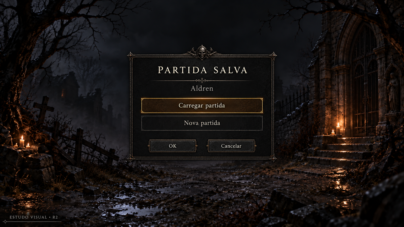
Partida salva existente
Conceito gerado · R2 · candidato em revisão; não é captura do jogo.
Ver prompt original
Use case: ui-mockup.
Asset type: Diablo 3D frontend r2 visual study, a proposed polished UI mockup, never a screenshot.
Output: one 1920x1080 landscape image, 16:9.
Input image 1 is the APPROVED menu background. Use exactly its composition, environment, perspective, scenery, candle locations, branches, fog and image framing, as a retained background plate. Do not redesign, replace or stylize the background. Overlay only a UI foreground. Input image 2 is a style reference ONLY for sober charcoal stone, iron, pewter, ivory lettering and restrained warm amber accents. Do not copy its gameplay or HUD.
Visual style: high definition, elegant dark gothic Diablo I atmosphere, quiet pewter borders and restrained engraved details, readable large ivory text with subtle shadow; selected row has a thin warm amber rule and a dim amber fill. No ornate heavy gold slabs, no bright fantasy glow, no oversized panels. UI should feel consistent across the set.
Composition: preserve substantial empty background; center the useful UI within the safe rectangle x=320..1600, y=150..950; avoid text touching edges; use balanced title, content and footer with large breathing room. A translucent charcoal panel ensures legibility without hiding the whole approved setting. A small understated study label at bottom-left reads "ESTUDO VISUAL • R2". No newly invented game logo, no copyright logo replacement, no original/comparison column.
PT-BR text is illustrative, rendered verbatim below; future UI will render live text. Do not add functions, explanatory mechanics, navigation tabs or buttons beyond those listed. Names are fictitious.

Screen F07 — existing saved game, a single choice prompt.
Title "PARTIDA SALVA"; subtitle "Aldren".
A compact centered charcoal panel with two generous rows: "Carregar partida" selected, "Nova partida". A thin amber marker shows selected first option.
Exactly two footer buttons "OK" and "Cancelar".
This represents one hero's existing game state. Do not show separate save slots, checkpoints, save timestamps, thumbnails, location names, difficulty stats or multiple saves. No invented descriptive line. Keep much approved background visible; this screen should be simpler and smaller than hero/class selection.
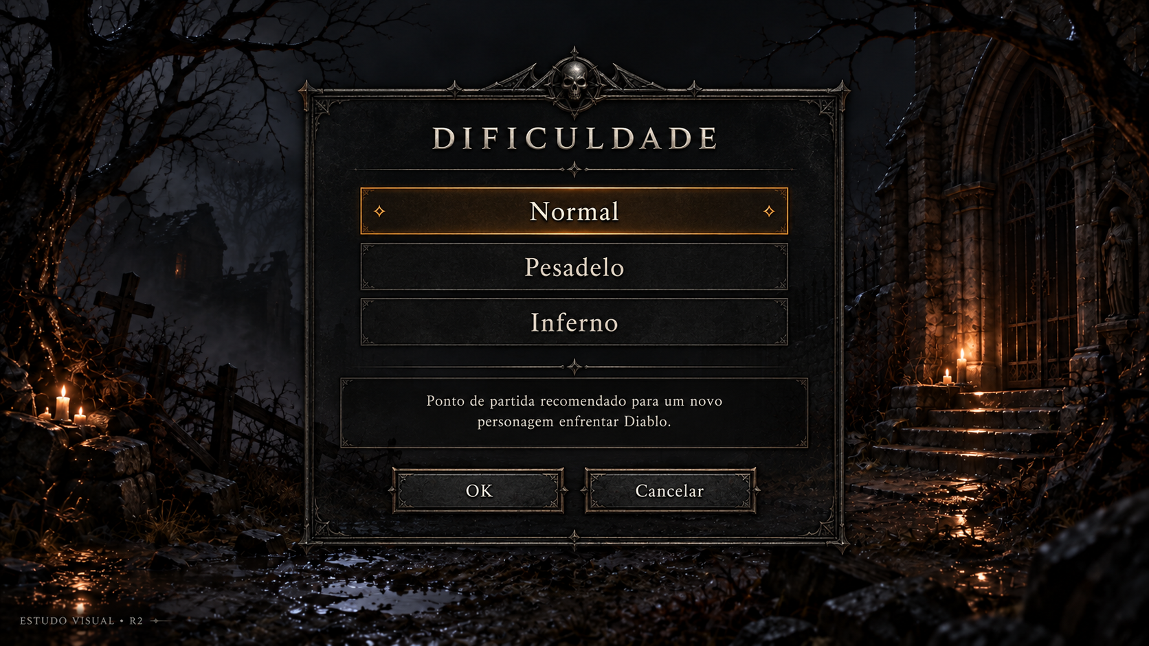
Criar partida — dificuldade
Conceito gerado · R2 · candidato em revisão; não é captura do jogo.
Ver prompt original
Use case: ui-mockup.
Asset type: Diablo 3D frontend r2 visual study, a proposed polished UI mockup, never a screenshot.
Output: one 1920x1080 landscape image, 16:9.
Input image 1 is the APPROVED menu background. Use exactly its composition, environment, perspective, scenery, candle locations, branches, fog and image framing, as a retained background plate. Do not redesign, replace or stylize the background. Overlay only a UI foreground. Input image 2 is a style reference ONLY for sober charcoal stone, iron, pewter, ivory lettering and restrained warm amber accents. Do not copy its gameplay or HUD.
Visual style: high definition, elegant dark gothic Diablo I atmosphere, quiet pewter borders and restrained engraved details, readable large ivory text with subtle shadow; selected row has a thin warm amber rule and a dim amber fill. No ornate heavy gold slabs, no bright fantasy glow, no oversized panels. UI should feel consistent across the set.
Composition: preserve substantial empty background; center the useful UI within the safe rectangle x=320..1600, y=150..950; avoid text touching edges; use balanced title, content and footer with large breathing room. A translucent charcoal panel ensures legibility without hiding the whole approved setting. A small understated study label at bottom-left reads "ESTUDO VISUAL • R2". No newly invented game logo, no copyright logo replacement, no original/comparison column.
PT-BR text is illustrative, rendered verbatim below; future UI will render live text. Do not add functions, explanatory mechanics, navigation tabs or buttons beyond those listed. Names are fictitious.

Screen F08 — new game difficulty.
Title "DIFICULDADE".
A quiet medium central panel contains three large text-only rows: "Normal" selected, "Pesadelo", "Inferno". The selection marker is amber but restrained. No class art or character portrait.
Beneath the choices a separated readable description block says exactly:
"Ponto de partida recomendado para um novo personagem enfrentar Diablo."
Footer only two buttons "OK" and "Cancelar".
This is a single player example. Do not invent Hardcore, seasonal, custom, story-only or extra challenge modes. Do not add a speed selector on this screen, extra rewards, recommended level badges or gameplay modifiers.
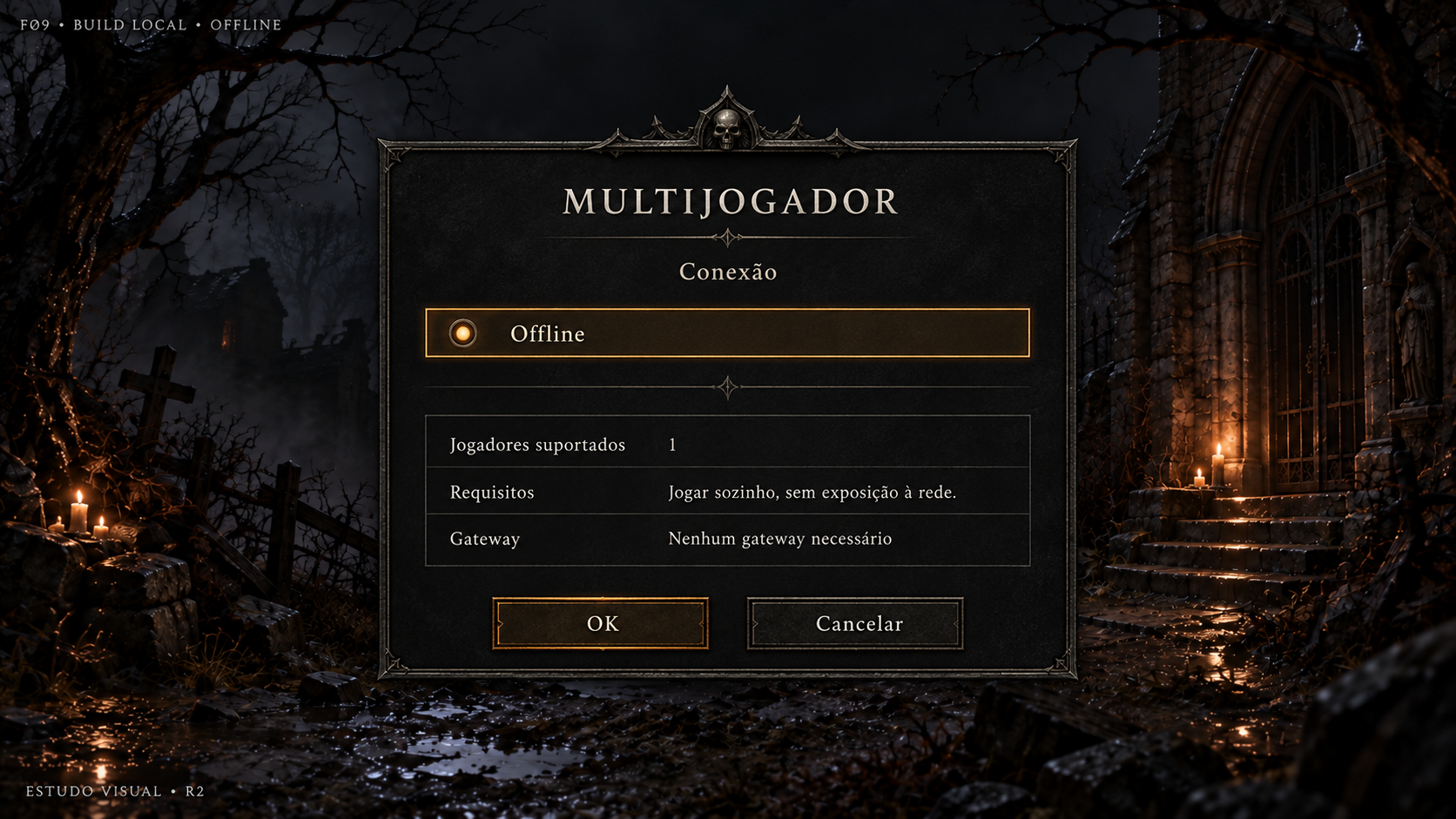
Multijogador — conexão Offline
Conceito gerado · R2 · candidato em revisão; não é captura do jogo.
Ver prompt original
Use case: ui-mockup.
Asset type: Diablo 3D frontend r2 visual study, a proposed polished UI mockup, never a screenshot.
Output: one 1920x1080 landscape image, 16:9.
Input image 1 is the APPROVED menu background. Use exactly its composition, environment, perspective, scenery, candle locations, branches, fog and image framing, as a retained background plate. Do not redesign, replace or stylize the background. Overlay only a UI foreground. Input image 2 is a style reference ONLY for sober charcoal stone, iron, pewter, ivory lettering and restrained warm amber accents. Do not copy its gameplay or HUD.
Visual style: high definition, elegant dark gothic Diablo I atmosphere, quiet pewter borders and restrained engraved details, readable large ivory text with subtle shadow; selected row has a thin warm amber rule and a dim amber fill. No ornate heavy gold slabs, no bright fantasy glow, no oversized panels. UI should feel consistent across the set.
Composition: preserve substantial empty background; center the useful UI within the safe rectangle x=320..1600, y=150..950; avoid text touching edges; use balanced title, content and footer with large breathing room. A translucent charcoal panel ensures legibility without hiding the whole approved setting. A small understated study label at bottom-left reads "ESTUDO VISUAL • R2". No newly invented game logo, no copyright logo replacement, no original/comparison column.
PT-BR text is illustrative, rendered verbatim below; future UI will render live text. Do not add functions, explanatory mechanics, navigation tabs or buttons beyond those listed. Names are fictitious.

Screen F09 — local multiplayer provider selector.
Title "MULTIJOGADOR"; subtitle "Conexão".
This local build actually has only one selectable provider: a single row "Offline", selected with quiet amber accent. Do not show disabled fake TCP or ZeroTier options.
Below, three clearly readable info rows:
"Jogadores suportados" — "1"
"Requisitos" — "Jogar sozinho, sem exposição à rede."
"Gateway" — "Nenhum gateway necessário"
Compact central panel, about 50% viewport width, much approved background visible.
Footer only two buttons "OK" and "Cancelar".
Small study badge outside the panel at top-left says "F09 • BUILD LOCAL • OFFLINE".
Do not create a gateway change button, network login, server browser, online indicator, voice, chat, refresh or custom server list.
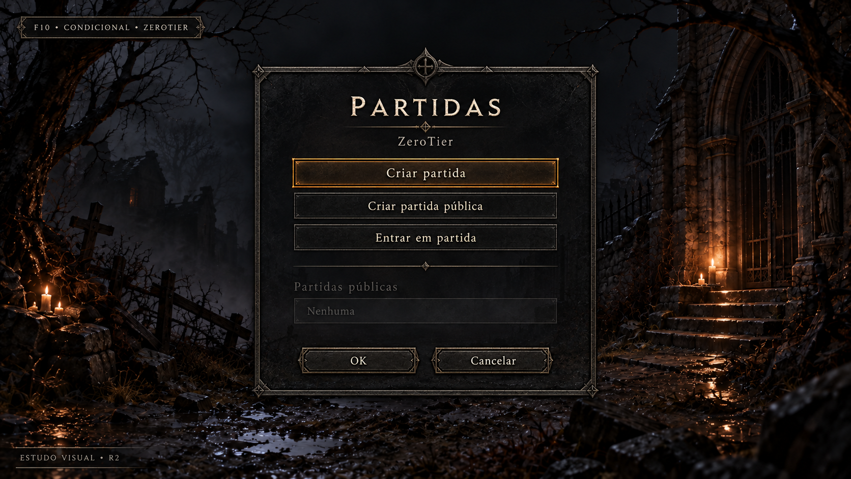
ZeroTier — ações e partidas públicas
Conceito gerado · R2 · candidato em revisão; não é captura do jogo.
Ver prompt original
Use case: ui-mockup.
Asset type: Diablo 3D frontend r2 visual study, a proposed polished UI mockup, never a screenshot.
Output: one 1920x1080 landscape image, 16:9.
Input image 1 is the APPROVED menu background. Use exactly its composition, environment, perspective, scenery, candle locations, branches, fog and image framing, as a retained background plate. Do not redesign, replace or stylize the background. Overlay only a UI foreground. Input image 2 is a style reference ONLY for sober charcoal stone, iron, pewter, ivory lettering and restrained warm amber accents. Do not copy its gameplay or HUD.
Visual style: high definition, elegant dark gothic Diablo I atmosphere, quiet pewter borders and restrained engraved details, readable large ivory text with subtle shadow; selected row has a thin warm amber rule and a dim amber fill. No ornate heavy gold slabs, no bright fantasy glow, no oversized panels. UI should feel consistent across the set.
Composition: preserve substantial empty background; center the useful UI within the safe rectangle x=320..1600, y=150..950; avoid text touching edges; use balanced title, content and footer with large breathing room. A translucent charcoal panel ensures legibility without hiding the whole approved setting. A small understated study label at bottom-left reads "ESTUDO VISUAL • R2". No newly invented game logo, no copyright logo replacement, no original/comparison column.
PT-BR text is illustrative, rendered verbatim below; future UI will render live text. Do not add functions, explanatory mechanics, navigation tabs or buttons beyond those listed. Names are fictitious.

Screen F10 — conditional ZeroTier actions and public game list.
Title "PARTIDAS"; subtitle "ZeroTier".
A centered medium panel. At its top three selectable menu rows:
"Criar partida" selected
"Criar partida pública"
"Entrar em partida"
A thin pewter separator, then a disabled non-clickable section heading "Partidas públicas". Under it a subdued disabled row "Nenhuma", illustrating empty discovery. Do not invent an active server, game lobby, connected players, room name, latency or session.
Exactly two footer buttons "OK" and "Cancelar".
Small study badge above/outside panel "F10 • CONDICIONAL • ZEROTIER".
This conditional screen is inherited and not offered by local NONET build. Private create is shown as conditional on compiled encryption. No chat, matchmaking, Refresh button, login, friends, invite, extra server modes or room configuration.
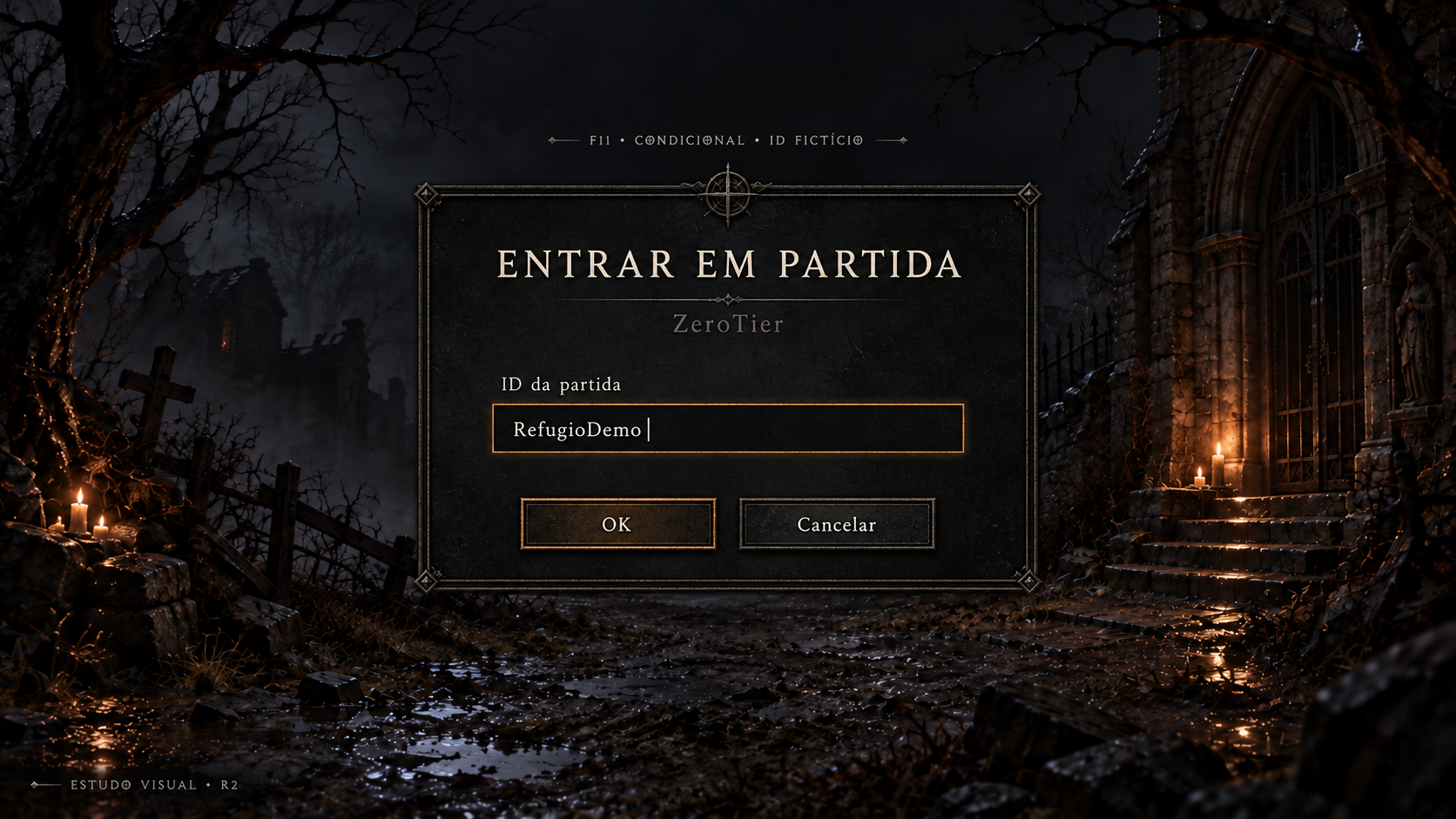
Entrar em partida — ID ZeroTier
Conceito gerado · R2 · candidato em revisão; não é captura do jogo.
Ver prompt original
Use case: ui-mockup.
Asset type: Diablo 3D frontend r2 visual study, a proposed polished UI mockup, never a screenshot.
Output: one 1920x1080 landscape image, 16:9.
Input image 1 is the APPROVED menu background. Use exactly its composition, environment, perspective, scenery, candle locations, branches, fog and image framing, as a retained background plate. Do not redesign, replace or stylize the background. Overlay only a UI foreground. Input image 2 is a style reference ONLY for sober charcoal stone, iron, pewter, ivory lettering and restrained warm amber accents. Do not copy its gameplay or HUD.
Visual style: high definition, elegant dark gothic Diablo I atmosphere, quiet pewter borders and restrained engraved details, readable large ivory text with subtle shadow; selected row has a thin warm amber rule and a dim amber fill. No ornate heavy gold slabs, no bright fantasy glow, no oversized panels. UI should feel consistent across the set.
Composition: preserve substantial empty background; center the useful UI within the safe rectangle x=320..1600, y=150..950; avoid text touching edges; use balanced title, content and footer with large breathing room. A translucent charcoal panel ensures legibility without hiding the whole approved setting. A small understated study label at bottom-left reads "ESTUDO VISUAL • R2". No newly invented game logo, no copyright logo replacement, no original/comparison column.
PT-BR text is illustrative, rendered verbatim below; future UI will render live text. Do not add functions, explanatory mechanics, navigation tabs or buttons beyond those listed. Names are fictitious.

Screen F11 — manual join by ZeroTier ID.
Title "ENTRAR EM PARTIDA"; subtitle "ZeroTier".
A quiet compact centered charcoal panel. Exactly one input field:
Label "ID da partida", fictitious example value "RefugioDemo", with a thin caret.
Below only two small buttons "OK" and "Cancelar".
Small study badge above/outside the panel "F11 • CONDICIONAL • ID FICTÍCIO".
No separate IP/hostname field in this variant, no port, login, account, region, password, confirmation, name-room or Refresh. Do not invent a reachable destination. Future text field has a 128-character limit but DO NOT draw a new counter or explanatory widget. Let the single field and footer have generous spacing; approved background remains clear around the panel.
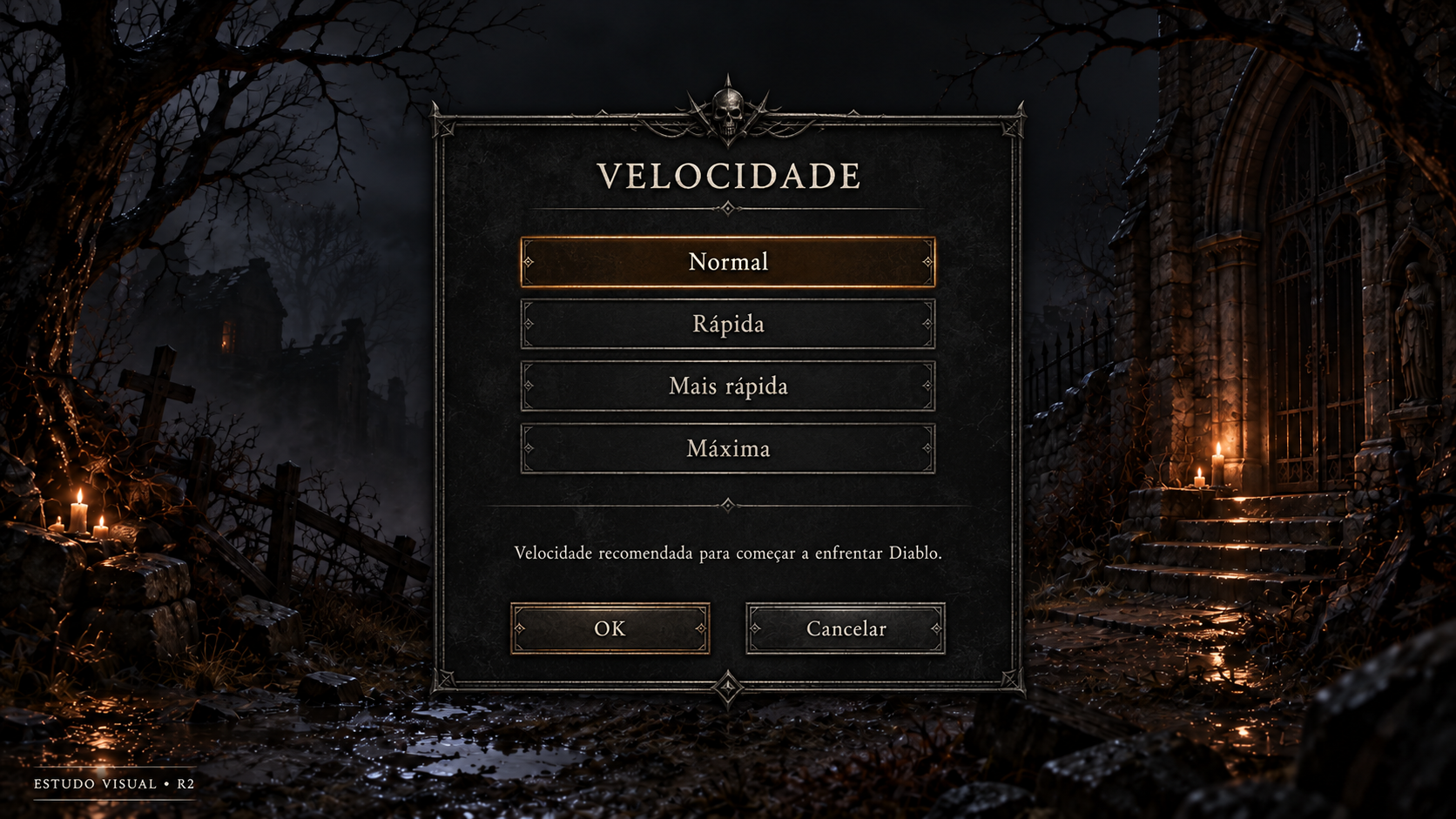
Criar partida — velocidade
Conceito gerado · R2 · candidato em revisão; não é captura do jogo.
Ver prompt original
Use case: ui-mockup.
Asset type: Diablo 3D frontend r2 visual study, a proposed polished UI mockup, never a screenshot.
Output: one 1920x1080 landscape image, 16:9.
Input image 1 is the APPROVED menu background. Use exactly its composition, environment, perspective, scenery, candle locations, branches, fog and image framing, as a retained background plate. Do not redesign, replace or stylize the background. Overlay only a UI foreground. Input image 2 is a style reference ONLY for sober charcoal stone, iron, pewter, ivory lettering and restrained warm amber accents. Do not copy its gameplay or HUD.
Visual style: high definition, elegant dark gothic Diablo I atmosphere, quiet pewter borders and restrained engraved details, readable large ivory text with subtle shadow; selected row has a thin warm amber rule and a dim amber fill. No ornate heavy gold slabs, no bright fantasy glow, no oversized panels. UI should feel consistent across the set.
Composition: preserve substantial empty background; center the useful UI within the safe rectangle x=320..1600, y=150..950; avoid text touching edges; use balanced title, content and footer with large breathing room. A translucent charcoal panel ensures legibility without hiding the whole approved setting. A small understated study label at bottom-left reads "ESTUDO VISUAL • R2". No newly invented game logo, no copyright logo replacement, no original/comparison column.
PT-BR text is illustrative, rendered verbatim below; future UI will render live text. Do not add functions, explanatory mechanics, navigation tabs or buttons beyond those listed. Names are fictitious.

Screen F12 — creation game speed.
Title "VELOCIDADE".
Medium centered panel, four selectable rows ONLY:
"Normal" selected
"Rápida"
"Mais rápida"
"Máxima"
Below them a clear description section with exactly:
"Velocidade recomendada para começar a enfrentar Diablo."
Footer ONLY "OK" and "Cancelar".
No slider, framerate/FPS value, hardware settings, extra presets, game mode or difficulty controls. This is the existing game simulation speed step for Offline or network creation, not a solo new-game step. Do not print ticks per second.
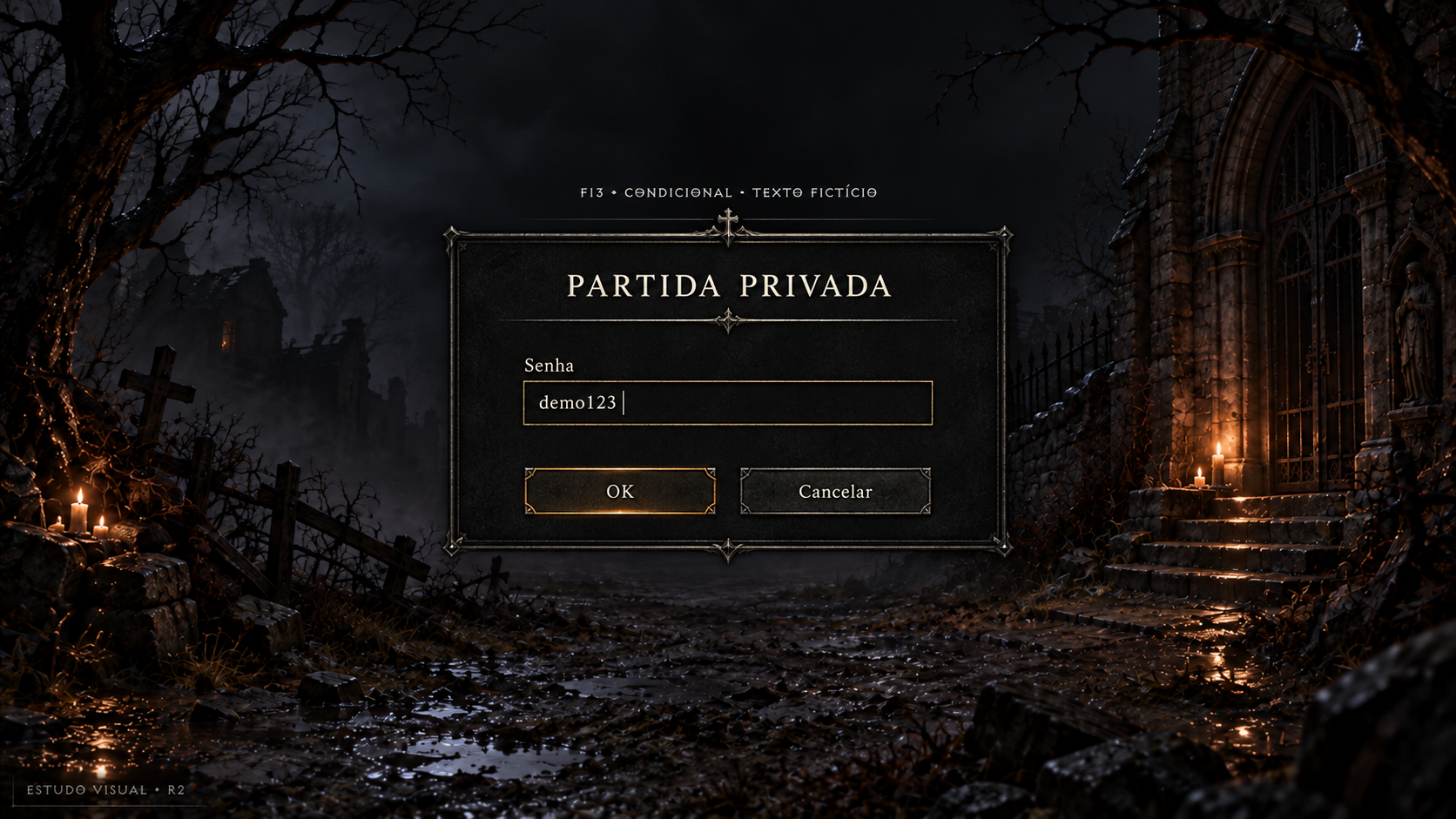
Criar partida privada — senha
Conceito gerado · R2 · candidato em revisão; não é captura do jogo.
Ver prompt original
Use case: ui-mockup.
Asset type: Diablo 3D frontend r2 visual study, a proposed polished UI mockup, never a screenshot.
Output: one 1920x1080 landscape image, 16:9.
Input image 1 is the APPROVED menu background. Use exactly its composition, environment, perspective, scenery, candle locations, branches, fog and image framing, as a retained background plate. Do not redesign, replace or stylize the background. Overlay only a UI foreground. Input image 2 is a style reference ONLY for sober charcoal stone, iron, pewter, ivory lettering and restrained warm amber accents. Do not copy its gameplay or HUD.
Visual style: high definition, elegant dark gothic Diablo I atmosphere, quiet pewter borders and restrained engraved details, readable large ivory text with subtle shadow; selected row has a thin warm amber rule and a dim amber fill. No ornate heavy gold slabs, no bright fantasy glow, no oversized panels. UI should feel consistent across the set.
Composition: preserve substantial empty background; center the useful UI within the safe rectangle x=320..1600, y=150..950; avoid text touching edges; use balanced title, content and footer with large breathing room. A translucent charcoal panel ensures legibility without hiding the whole approved setting. A small understated study label at bottom-left reads "ESTUDO VISUAL • R2". No newly invented game logo, no copyright logo replacement, no original/comparison column.
PT-BR text is illustrative, rendered verbatim below; future UI will render live text. Do not add functions, explanatory mechanics, navigation tabs or buttons beyond those listed. Names are fictitious.

Screen F13 — private game password.
Title "PARTIDA PRIVADA".
A compact centered panel with ONE text field labelled "Senha". Show the fictitious value "demo123" in clear text with a thin caret, exactly as inherited UiEdit behaves. Do not mask with dots/asterisks; do not add an eye icon.
Footer only two buttons "OK" and "Cancelar".
Small study label above/outside panel "F13 • CONDICIONAL • TEXTO FICTÍCIO".
Creation requires nonempty content; no validation error in this selected state. No password confirmation, recovery link, account, username, save password checkbox, room name, privacy slider or encryption toggle.
Much background visible; this simple function should feel calm and compact.
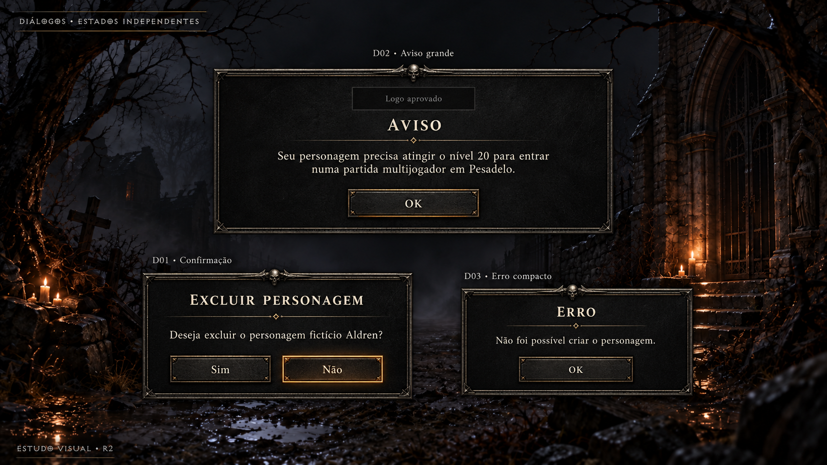
Diálogos — exclusão de herói, dificuldade e erro de criação
Conceito gerado · R2 · candidato em revisão; não é captura do jogo.
Ver prompt original
Use case: ui-mockup.
Asset type: Diablo 3D frontend r2 visual study, a proposed polished UI mockup, never a screenshot.
Output: one 1920x1080 landscape image, 16:9.
Input image 1 is the APPROVED menu background. Use exactly its composition, environment, perspective, scenery, candle locations, branches, fog and image framing, as a retained background plate. Do not redesign, replace or stylize the background. Overlay only a UI foreground. Input image 2 is a style reference ONLY for sober charcoal stone, iron, pewter, ivory lettering and restrained warm amber accents. Do not copy its gameplay or HUD.
Visual style: high definition, elegant dark gothic Diablo I atmosphere, quiet pewter borders and restrained engraved details, readable large ivory text with subtle shadow; selected row has a thin warm amber rule and a dim amber fill. No ornate heavy gold slabs, no bright fantasy glow, no oversized panels. UI should feel consistent across the set.
Composition: preserve substantial empty background; center the useful UI within the safe rectangle x=320..1600, y=150..950; avoid text touching edges; use balanced title, content and footer with large breathing room. A translucent charcoal panel ensures legibility without hiding the whole approved setting. A small understated study label at bottom-left reads "ESTUDO VISUAL • R2". No newly invented game logo, no copyright logo replacement, no original/comparison column.
PT-BR text is illustrative, rendered verbatim below; future UI will render live text. Do not add functions, explanatory mechanics, navigation tabs or buttons beyond those listed. Names are fictitious.

This is a STUDY BOARD of THREE INDEPENDENT DIALOG STATES, not a real simultaneous UI screen. Small top label "DIÁLOGOS • ESTADOS INDEPENDENTES".
Place each modal entirely inside the following normalized regions; label each with ID outside the panel:
D02 region x=0.18..0.82, y=0.12..0.49 (wide upper central panel).
Above it "D02 • Aviso grande". Inside it a small empty logo reservation with neutral text "Logo aprovado" (do NOT redraw an approved logo); title "AVISO". Body:
"Seu personagem precisa atingir o nível 20 para entrar numa partida multijogador em Pesadelo."
Only one button "OK".
D01 region x=0.10..0.48, y=0.60..0.90 (lower left panel).
Above it "D01 • Confirmação". Title "EXCLUIR PERSONAGEM". Body:
"Deseja excluir o personagem fictício Aldren?"
Only two buttons "Sim" and "Não", with Não softly selected.
D03 region x=0.55..0.90, y=0.64..0.87 (lower right smaller popup).
Above it "D03 • Erro compacto". Title "ERRO". Body:
"Não foi possível criar o personagem."
Only one button "OK".
Keep differences clear: D02 is larger and more spacious; D01 medium yes/no; D03 a modest compact popup. No success toast, extra actions, support link, error code, retry button, icons requiring new mechanics. Never draw an original-comparison column. The approved image1 background plate is retained behind all independent examples.
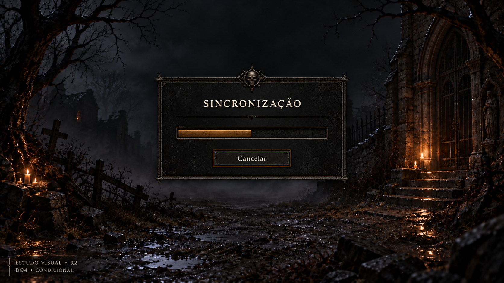
Sincronização — progresso cancelável
Conceito gerado · R2 · candidato em revisão; não é captura do jogo.
Ver prompt original
Use case: ui-mockup.
Asset type: Diablo 3D frontend r2 visual study, a proposed polished UI mockup, never a screenshot.
Output: one 1920x1080 landscape image, 16:9.
Input image 1 is the APPROVED menu background. Use exactly its composition, environment, perspective, scenery, candle locations, branches, fog and image framing, as a retained background plate. Do not redesign, replace or stylize the background. Overlay only a UI foreground. Input image 2 is a style reference ONLY for sober charcoal stone, iron, pewter, ivory lettering and restrained warm amber accents. Do not copy its gameplay or HUD.
Visual style: high definition, elegant dark gothic Diablo I atmosphere, quiet pewter borders and restrained engraved details, readable large ivory text with subtle shadow; selected row has a thin warm amber rule and a dim amber fill. No ornate heavy gold slabs, no bright fantasy glow, no oversized panels. UI should feel consistent across the set.
Composition: preserve substantial empty background; center the useful UI within the safe rectangle x=320..1600, y=150..950; avoid text touching edges; use balanced title, content and footer with large breathing room. A translucent charcoal panel ensures legibility without hiding the whole approved setting. A small understated study label at bottom-left reads "ESTUDO VISUAL • R2". No newly invented game logo, no copyright logo replacement, no original/comparison column.
PT-BR text is illustrative, rendered verbatim below; future UI will render live text. Do not add functions, explanatory mechanics, navigation tabs or buttons beyond those listed. Names are fictitious.

Screen D04 — conditional waiting for multiplayer synchronization.
A compact centered popup. Title "SINCRONIZAÇÃO".
It contains exactly one sober horizontal progress bar with a partially filled muted amber segment; this is an illustrative state only. No numeric percentage, no ETA, no time elapsed, no fake network metrics.
Below it ONLY one button "Cancelar".
Small study badge outside the popup "D04 • CONDICIONAL".
Do not add an OK/Continue/Retry button, loading tips, level scenery, character art, connection icons or imaginary synchronization steps. This is a cancelable progress modal, distinct from L01 level loading. Keep much approved menu background visible.
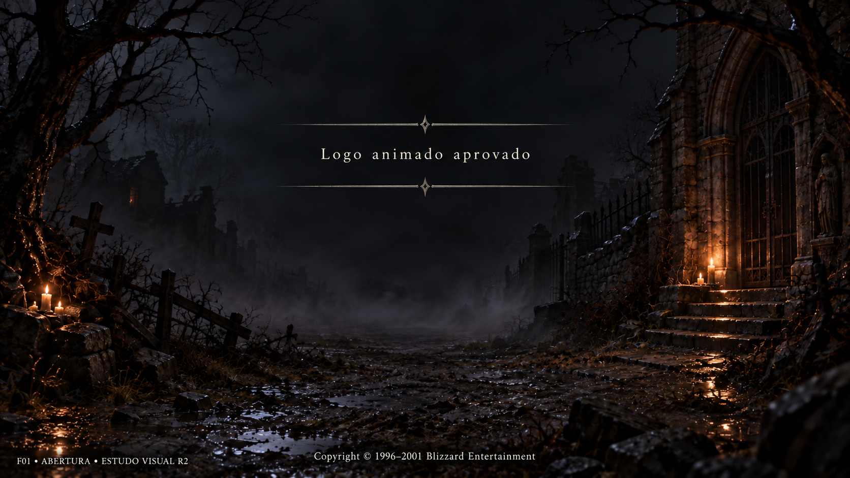
Abertura — título
Conceito gerado · R2 · candidato em revisão; não é captura do jogo.
Ver prompt original
Use case: ui-mockup.
Asset type: Diablo 3D frontend r2 visual study, a proposed polished UI mockup, never a screenshot.
Output: one 1920x1080 landscape image, 16:9.
Input image 1 is the APPROVED menu background. Use exactly its composition, environment, perspective, scenery, candle locations, branches, fog and image framing, as a retained background plate. Do not redesign, replace or stylize the background. Overlay only a UI foreground. Input image 2 is a style reference ONLY for sober charcoal stone, iron, pewter, ivory lettering and restrained warm amber accents. Do not copy its gameplay or HUD.
Visual style: high definition, elegant dark gothic Diablo I atmosphere, quiet pewter borders and restrained engraved details, readable large ivory text with subtle shadow; selected row has a thin warm amber rule and a dim amber fill. No ornate heavy gold slabs, no bright fantasy glow, no oversized panels. UI should feel consistent across the set.
Composition: preserve substantial empty background; center the useful UI within the safe rectangle x=320..1600, y=150..950; avoid text touching edges; use balanced title, content and footer with large breathing room. A translucent charcoal panel ensures legibility without hiding the whole approved setting. A small understated study label at bottom-left reads "ESTUDO VISUAL • R2". No newly invented game logo, no copyright logo replacement, no original/comparison column.
PT-BR text is illustrative, rendered verbatim below; future UI will render live text. Do not add functions, explanatory mechanics, navigation tabs or buttons beyond those listed. Names are fictitious.

Screen F01 — title opening.
Very restrained opening screen, keep the approved background dominant and entirely recognizable. No menu, no selectable options, no button, no Continue button, no input field.
The approved animated Diablo 3D logo must be preserved by future implementation. Because its artwork is NOT being redesigned, reserve an unadorned broad centered logo location at x=0.28..0.72,y=0.18..0.39 with only a small neutral ivory study annotation "Logo animado aprovado" (not a new logo). Do not draw lettered DIABLO lettering, stylized logo, emblem or brand redesign.
At lower central safe area draw the inherited credit verbatim:
"Copyright © 1996–2001 Blizzard Entertainment".
At bottom-left the small study notation is "F01 • ABERTURA • ESTUDO VISUAL R2".
Make this opening quiet and cinematic; no big UI slab. Only the reserved logo location and legal credit. There is no new functional instruction or affordance.
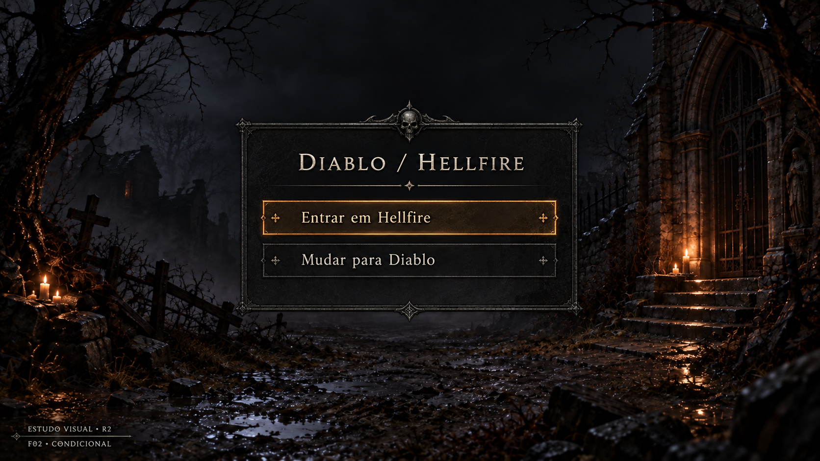
Escolher Diablo ou Hellfire
Conceito gerado · R2 · candidato em revisão; não é captura do jogo.
Ver prompt original
Use case: ui-mockup.
Asset type: Diablo 3D frontend r2 visual study, a proposed polished UI mockup, never a screenshot.
Output: one 1920x1080 landscape image, 16:9.
Input image 1 is the APPROVED menu background. Use exactly its composition, environment, perspective, scenery, candle locations, branches, fog and image framing, as a retained background plate. Do not redesign, replace or stylize the background. Overlay only a UI foreground. Input image 2 is a style reference ONLY for sober charcoal stone, iron, pewter, ivory lettering and restrained warm amber accents. Do not copy its gameplay or HUD.
Visual style: high definition, elegant dark gothic Diablo I atmosphere, quiet pewter borders and restrained engraved details, readable large ivory text with subtle shadow; selected row has a thin warm amber rule and a dim amber fill. No ornate heavy gold slabs, no bright fantasy glow, no oversized panels. UI should feel consistent across the set.
Composition: preserve substantial empty background; center the useful UI within the safe rectangle x=320..1600, y=150..950; avoid text touching edges; use balanced title, content and footer with large breathing room. A translucent charcoal panel ensures legibility without hiding the whole approved setting. A small understated study label at bottom-left reads "ESTUDO VISUAL • R2". No newly invented game logo, no copyright logo replacement, no original/comparison column.
PT-BR text is illustrative, rendered verbatim below; future UI will render live text. Do not add functions, explanatory mechanics, navigation tabs or buttons beyond those listed. Names are fictitious.

Screen F02 — conditional launch mode selector.
A compact central translucent charcoal selector; title "DIABLO / HELLFIRE".
ONLY two selectable choice rows:
"Entrar em Hellfire" selected
"Mudar para Diablo"
No extra footer buttons at all. No OK, Cancelar, Continuar or Voltar button. The choices themselves are the native actions.
Small understated outside-panel study badge "F02 • CONDICIONAL".
The selector only appears when Hellfire is discovered and launch preference asks; do not depict this as a universal campaign selector, extra expansion store or new game modes. Do not add portraits, cover art, logos, mode descriptions or ownership/login indicators. Preserve approved background and quiet spacing.
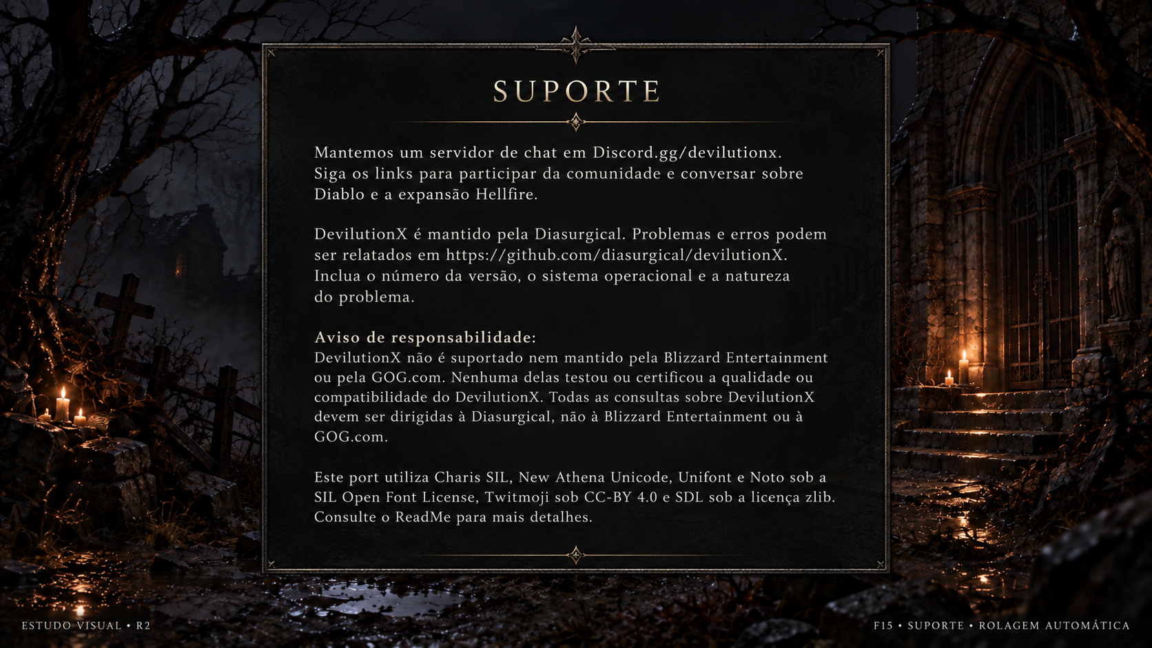
Suporte
Conceito gerado · R2 · candidato em revisão; não é captura do jogo.
Ver prompt original
Use case: ui-mockup.
Asset type: Diablo 3D frontend r2 visual study, a proposed polished UI mockup, never a screenshot.
Output: one 1920x1080 landscape image, 16:9.
Input image 1 is the APPROVED menu background. Use exactly its composition, environment, perspective, scenery, candle locations, branches, fog and image framing, as a retained background plate. Do not redesign, replace or stylize the background. Overlay only a UI foreground. Input image 2 is a style reference ONLY for sober charcoal stone, iron, pewter, ivory lettering and restrained warm amber accents. Do not copy its gameplay or HUD.
Visual style: high definition, elegant dark gothic Diablo I atmosphere, quiet pewter borders and restrained engraved details, readable large ivory text with subtle shadow; selected row has a thin warm amber rule and a dim amber fill. No ornate heavy gold slabs, no bright fantasy glow, no oversized panels. UI should feel consistent across the set.
Composition: preserve substantial empty background; center the useful UI within the safe rectangle x=320..1600, y=150..950; avoid text touching edges; use balanced title, content and footer with large breathing room. A translucent charcoal panel ensures legibility without hiding the whole approved setting. A small understated study label at bottom-left reads "ESTUDO VISUAL • R2". No newly invented game logo, no copyright logo replacement, no original/comparison column.
PT-BR text is illustrative, rendered verbatim below; future UI will render live text. Do not add functions, explanatory mechanics, navigation tabs or buttons beyond those listed. Names are fictitious.

Screen F15 — Support, inherited automatic-scrolling text screen.
Title "SUPORTE".
Large centered quiet translucent charcoal text panel; width around 64% viewport, height around 78%. Ivory body text in an exceptionally legible readable serif, tidy paragraph spacing, restrained headings. No heavy ornament; no scrollbar/slider suggesting a new manual feature.
Show the following full inherited source-grounded content in PT-BR verbatim. Do not drop ANY organization, software name, license, link, or disclaimer. All text links are plain text, NOT buttons. This is a frozen visual sample of automatic rolling content; future implementation must use the complete inherited live source content.
TEXT:
Mantemos um servidor de chat em Discord.gg/devilutionx. Siga os links para participar da comunidade e conversar sobre Diablo e a expansão Hellfire.

DevilutionX é mantido pela Diasurgical. Problemas e erros podem ser relatados em https://github.com/diasurgical/devilutionX. Inclua o número da versão, o sistema operacional e a natureza do problema.

Aviso de responsabilidade:
DevilutionX não é suportado nem mantido pela Blizzard Entertainment ou pela GOG.com. Nenhuma delas testou ou certificou a qualidade ou compatibilidade do DevilutionX. Todas as consultas sobre DevilutionX devem ser dirigidas à Diasurgical, não à Blizzard Entertainment ou à GOG.com.

Este port utiliza Charis SIL, New Athena Unicode, Unifont e Noto sob a SIL Open Font License, Twitmoji sob CC-BY 4.0 e SDL sob a licença zlib. Consulte o ReadMe para mais detalhes.
END TEXT.
There are NO buttons. No Open Discord, Report bug, Contact, link icons, QR codes or new clickable links. Small study note outside bottom of panel "F15 • SUPORTE • ROLAGEM AUTOMÁTICA". Keep the approved background visible at edges. Preserve inherited authors and source attribution; do not replace credits with new creators.
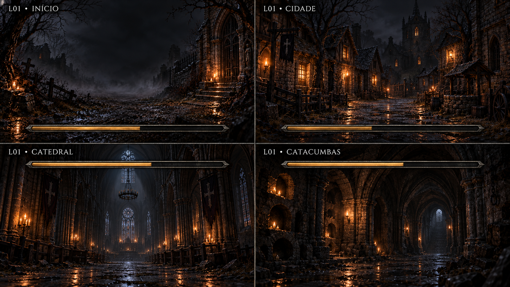
Carregamentos — início, cidade, Catedral e Catacumbas
Conceito gerado · R2 · candidato em revisão; não é captura do jogo.
Ver prompt original
Use case: ui-mockup.
Asset type: Diablo 3D r2 transition/loading concept STUDY BOARD, never a gameplay screenshot, never a claim of implemented 3D environments.
References: image 1 is the approved gloomy wet medieval village menu background, whose muted charcoal palette, restrained candle amber, wet stone detail and sober Diablo I atmosphere must guide the entire board. Retain its exact composition for the Start cell. Other labeled environment cells are explicitly candidate transition artwork, not replacements installed in the game. Image 2 guides the understated iron/pewter interface framing only, not gameplay HUD.
Composition: FOUR 16:9 cells in a precise 2×2 grid, no extra cell or perspective skew; each cell is an independent full loading-screen composition. Ask output 3840x2160, giving each cell a 1920x1080 target. Put the environment ID and label clearly in each cell's top-left safe area. Thin quiet pewter grid separators. Do not draw a title overlay across multiple cells or make fake original/comparison columns. Shared style consistent.
Every cell has ONE thin long progress bar with pewter/iron edge, muted amber fill that is partially filled as an illustrative state. Use 70% of each cell's width, within safe margin. No progress percentage number, no ETA, time elapsed, buttons, tips, menu, gameplay controls, heroes, monsters, logos or HUD. No debug counters or FPS. Cell labels are study identifiers, not new gameplay UI.
Keep scenery dark but visible, empty and cinematic, with clean readable ivory labels and generous space for the single progress bar. Palette charcoal gray, pewter, ivory labels, very slight candle amber; blue/red only where a portal requires it. Avoid ornate gilded UI, cartoon, neon glow, overbright orange fantasy illustration.

BOARD A — four distinct transition backgrounds:
TOP LEFT quadrant: label "L01 • INÍCIO". Retain image1's EXACT dark village road background with branches left, barred gothic church right and candle locations unchanged, rendered in full cell framing. Place the progress bar low at y=0.87 of this cell.
TOP RIGHT quadrant: label "L01 • CIDADE". A quiet candlelit medieval Tristram street, wet cobbled lane, timber/stone cottages, no people, matching the approved background atmosphere and sober scale. Progress bar low at y=0.87.
BOTTOM LEFT quadrant: label "L01 • CATEDRAL". An empty dark gothic cathedral interior of tall worn stone arches and sparse candlelight, charcoal stone. Progress bar HIGH at y=0.14, beneath its label, matching the inherited top placement.
BOTTOM RIGHT quadrant: label "L01 • CATACUMBAS". An empty ancient vaulted stone catacomb passage with alcoves and sober candlelight, no bones/skulls foreground clutter. Progress bar HIGH at y=0.14, beneath label.
Do not add gameplay scenes, faces, monstrous statues or claims of new levels being ready. These are candidate backgrounds for existing loading transition variants only.
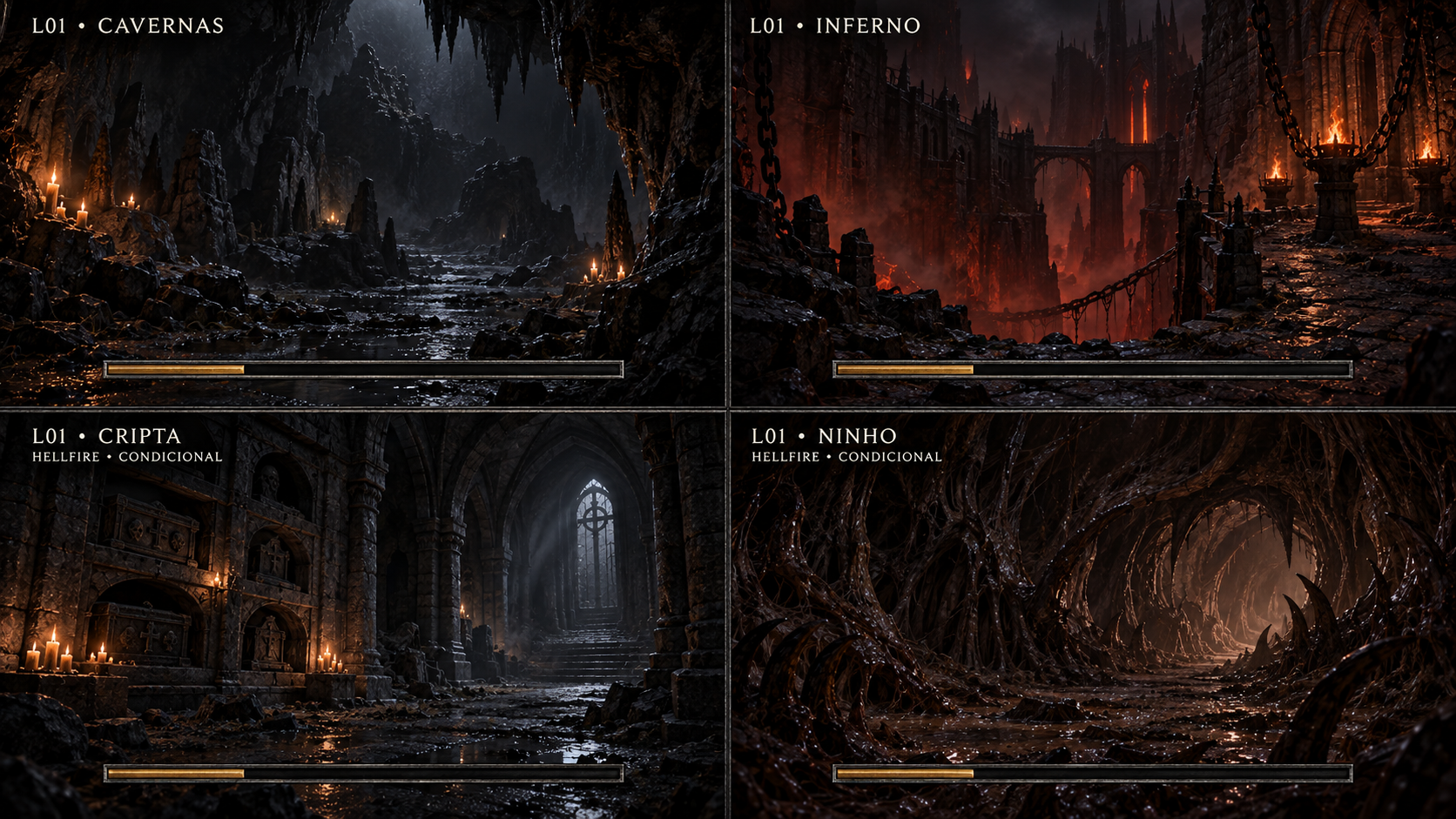
Carregamentos — Cavernas, Inferno, Cripta e Ninho
Conceito gerado · R2 · candidato em revisão; não é captura do jogo.
Ver prompt original
Use case: ui-mockup.
Asset type: Diablo 3D r2 transition/loading concept STUDY BOARD, never a gameplay screenshot, never a claim of implemented 3D environments.
References: image 1 is the approved gloomy wet medieval village menu background, whose muted charcoal palette, restrained candle amber, wet stone detail and sober Diablo I atmosphere must guide the entire board. Retain its exact composition for the Start cell. Other labeled environment cells are explicitly candidate transition artwork, not replacements installed in the game. Image 2 guides the understated iron/pewter interface framing only, not gameplay HUD.
Composition: FOUR 16:9 cells in a precise 2×2 grid, no extra cell or perspective skew; each cell is an independent full loading-screen composition. Ask output 3840x2160, giving each cell a 1920x1080 target. Put the environment ID and label clearly in each cell's top-left safe area. Thin quiet pewter grid separators. Do not draw a title overlay across multiple cells or make fake original/comparison columns. Shared style consistent.
Every cell has ONE thin long progress bar with pewter/iron edge, muted amber fill that is partially filled as an illustrative state. Use 70% of each cell's width, within safe margin. No progress percentage number, no ETA, time elapsed, buttons, tips, menu, gameplay controls, heroes, monsters, logos or HUD. No debug counters or FPS. Cell labels are study identifiers, not new gameplay UI.
Keep scenery dark but visible, empty and cinematic, with clean readable ivory labels and generous space for the single progress bar. Palette charcoal gray, pewter, ivory labels, very slight candle amber; blue/red only where a portal requires it. Avoid ornate gilded UI, cartoon, neon glow, overbright orange fantasy illustration.

BOARD B — four more distinct transition variants; every cell's progress bar is LOW at y=0.87:
TOP LEFT: label "L01 • CAVERNAS". Empty deep natural cave with rough basalt, irregular stone floor and sparse amber torch/candle light; cavernous dark void with readable rocky silhouettes.
TOP RIGHT: label "L01 • INFERNO". Empty infernal stone passage with charred rock, distant dim red ember light and heavy shadows, sober dark medieval horror. No monsters, gore or giant flaming spectacles.
BOTTOM LEFT: label "L01 • CRIPTA"; small label beneath "HELLFIRE • CONDICIONAL". Ancient austere stone crypt, sealed burial niches, worn masonry, faint cold ambient light and tiny warm candles; no characters or bodies.
BOTTOM RIGHT: label "L01 • NINHO"; small label beneath "HELLFIRE • CONDICIONAL". Empty dark organic hive cavern, weathered chitinous/brown-black ribbed walls and faint damp glints, restrained atmospheric horror; avoid graphic gore, creatures, eggs foreground props or bright alien sci-fi machinery.
These are loading-background concept variants, NOT new game levels announced as implemented. Preserve shared iron/pewter single progress bar. No percent or ETA.
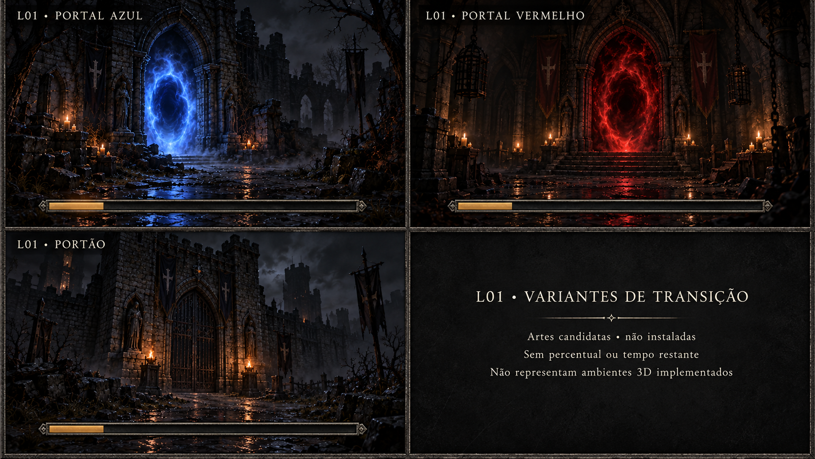
Carregamentos — portais e portão
Conceito gerado · R2 · candidato em revisão; não é captura do jogo.
Ver prompt original
Use case: ui-mockup.
Asset type: Diablo 3D r2 transition/loading concept STUDY BOARD, never a gameplay screenshot, never a claim of implemented 3D environments.
References: image 1 is the approved gloomy wet medieval village menu background, whose muted charcoal palette, restrained candle amber, wet stone detail and sober Diablo I atmosphere must guide the entire board. Retain its exact composition for the Start cell. Other labeled environment cells are explicitly candidate transition artwork, not replacements installed in the game. Image 2 guides the understated iron/pewter interface framing only, not gameplay HUD.
Composition: FOUR 16:9 cells in a precise 2×2 grid, no extra cell or perspective skew; each cell is an independent full loading-screen composition. Ask output 3840x2160, giving each cell a 1920x1080 target. Put the environment ID and label clearly in each cell's top-left safe area. Thin quiet pewter grid separators. Do not draw a title overlay across multiple cells or make fake original/comparison columns. Shared style consistent.
Every cell has ONE thin long progress bar with pewter/iron edge, muted amber fill that is partially filled as an illustrative state. Use 70% of each cell's width, within safe margin. No progress percentage number, no ETA, time elapsed, buttons, tips, menu, gameplay controls, heroes, monsters, logos or HUD. No debug counters or FPS. Cell labels are study identifiers, not new gameplay UI.
Keep scenery dark but visible, empty and cinematic, with clean readable ivory labels and generous space for the single progress bar. Palette charcoal gray, pewter, ivory labels, very slight candle amber; blue/red only where a portal requires it. Avoid ornate gilded UI, cartoon, neon glow, overbright orange fantasy illustration.

BOARD C — THREE loading variants plus ONE non-screen study legend:
TOP LEFT: label "L01 • PORTAL AZUL". Empty ruined medieval stone courtyard with a restrained luminous blue portal opening in a stone arch. Dark charcoal surroundings, small candle amber. Keep the portal blue subdued. One progress bar LOW at y=0.87.
TOP RIGHT: label "L01 • PORTAL VERMELHO". Empty dark stone vault with a restrained red magical portal opening, dim ember red, medieval horror. One progress bar LOW at y=0.87. No demons, no battle.
BOTTOM LEFT: label "L01 • PORTÃO". Monumental closed dark iron gate within worn basalt fortification, dim firelight, empty approach, sober final descent mood. One progress bar LOW at y=0.87.
BOTTOM RIGHT is NOT another loading screen or environment. Render a plain matte charcoal study legend with these exact centered readable lines:
"L01 • VARIANTES DE TRANSIÇÃO"
"Artes candidatas • não instaladas"
"Sem percentual ou tempo restante"
"Não representam ambientes 3D implementados"
NO progress bar in this legend quadrant. It is explicitly outside the variant set, do not invent a twelfth environment.
Keep a precise 2×2 grid and shared pewter bar styling. Candidate concept board only.
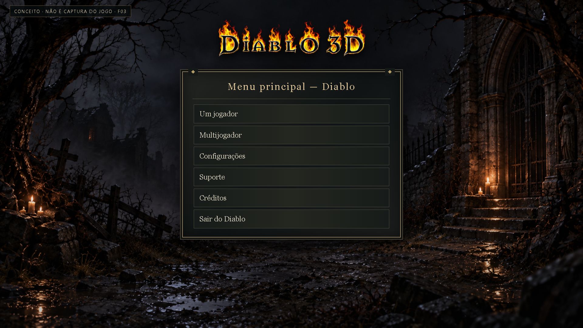
Menu principal — estudo r1 reutilizado
Direção anterior R1 reutilizada; estudo visual, não captura de partida.
Configurações e atalhos
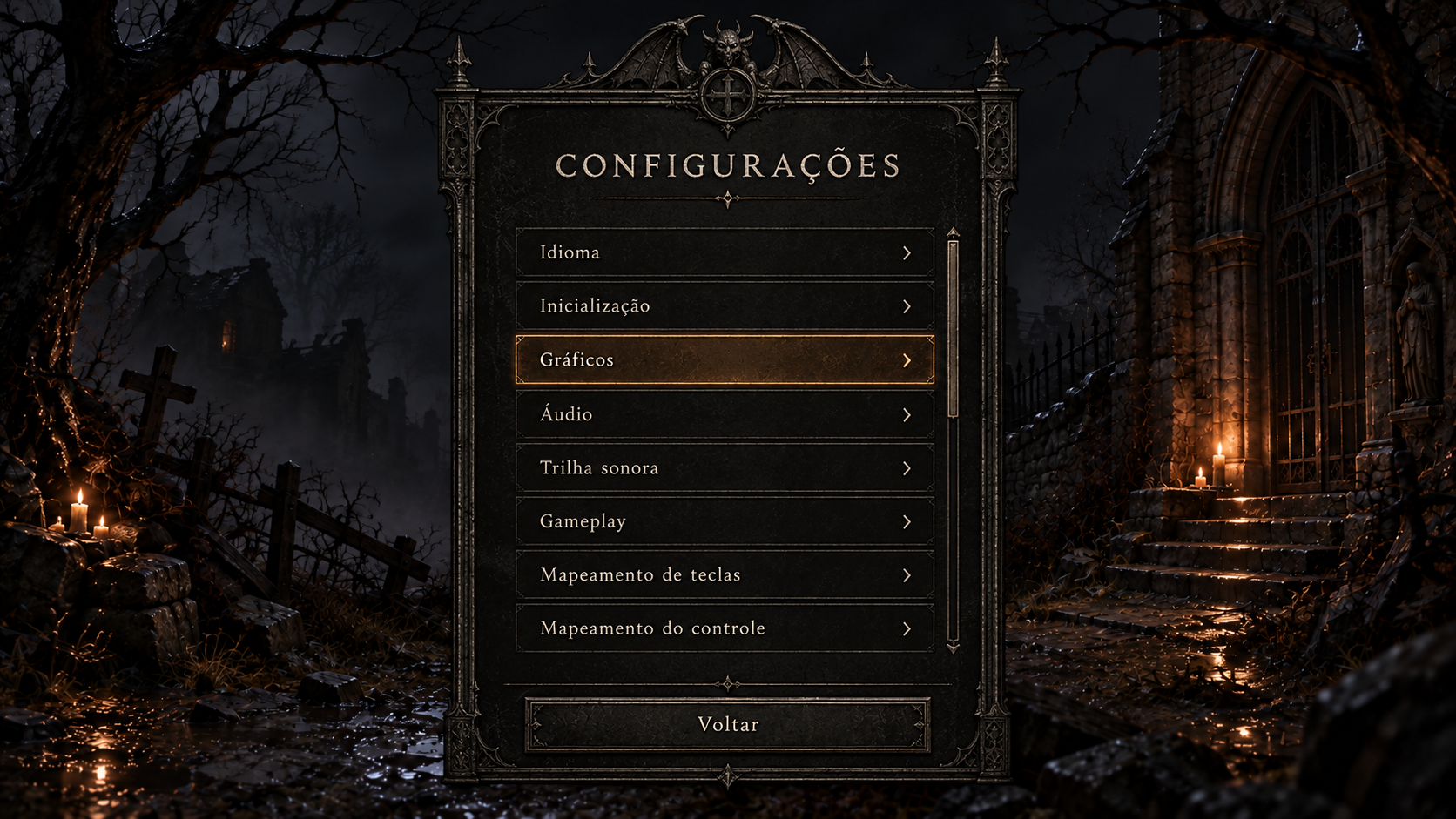
Configurações pré-partida — categorias
Conceito gerado · R2 · candidato em revisão; não é captura do jogo.
Ver prompt original
Use case: ui-mockup. Project-bound Diablo 3D interface concept, not a screenshot. Use reference image 1 as the approved EXACT visual direction and scene background: dark ruined chapel, restrained candlelight, same charcoal/earth/amber palette; reference image 2 only for worn pewter/iron framing language. Create a polished readable 1920x1080 landscape UI screen, original Diablo 1 gothic restraint, ivory live-text examples, warm muted selected-row accent, no MMO gradients, no electric neon, no new gameplay. Keep central panel bounded in safe screen area, ample line spacing, bottom horizontal Back footer, crisp professional typography, subtle thin ornament. Do not add logo text unless requested. All text Portuguese (Brazil). No misleading before/after or original column. Do not embed technical implementation labels; screen is a candidate for the player. Screen: pre-game Settings categories. Verbatim title 'CONFIGURAÇÕES'. Single centered panel about 46% width and 84% height with rows 'Idioma', 'Inicialização', 'Gráficos', 'Áudio', 'Trilha sonora', 'Gameplay', 'Mapeamento de teclas', 'Mapeamento do controle'; selected 'Gráficos'. Footer 'Voltar'. No search, Apply, reset, or Save button invented. Thin vertical scrollbar permits conditional Mods/Modo de jogo in real runtime; do not show fictional mod names.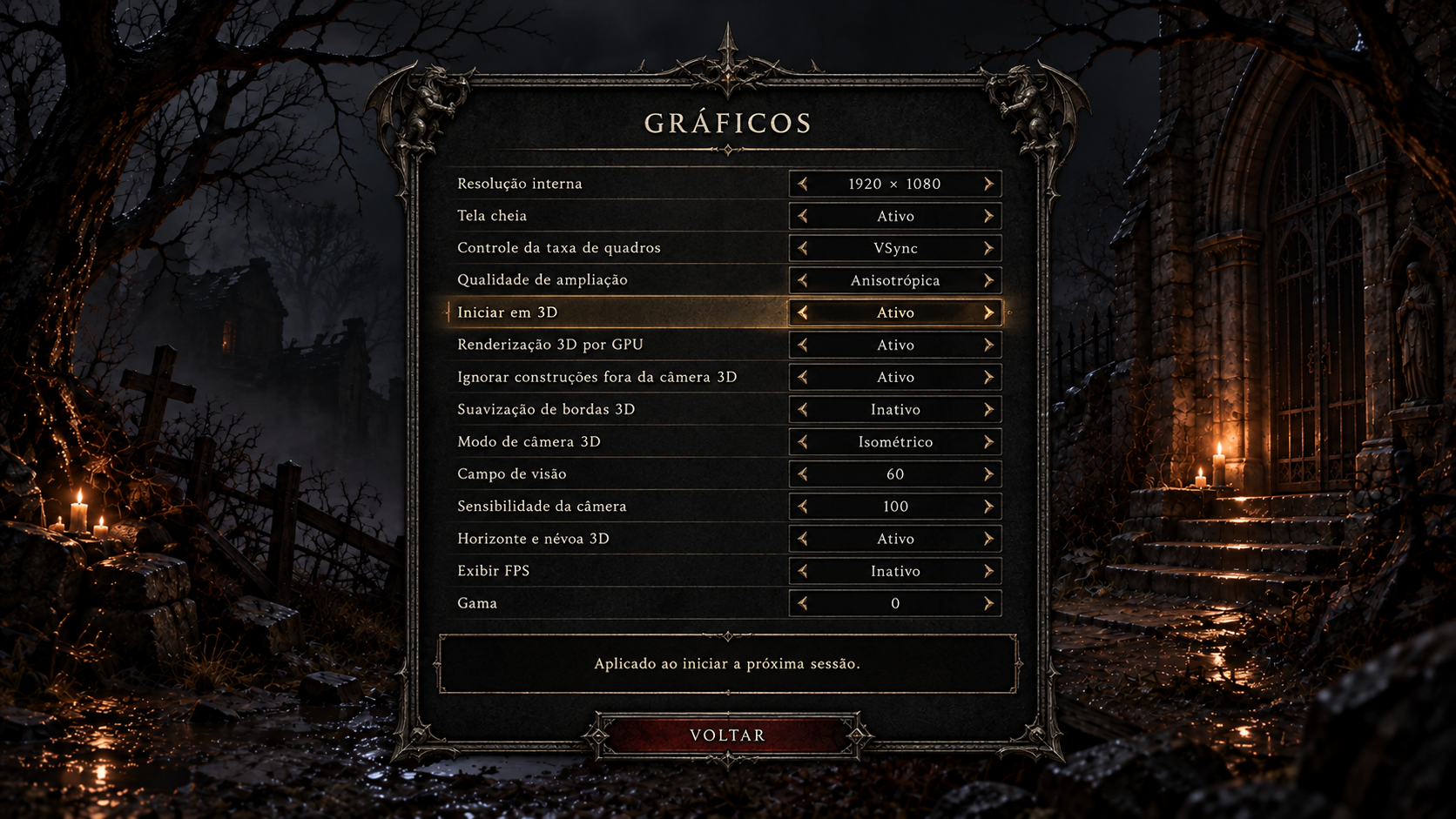
Configurações pré-partida — gráficos
Conceito gerado · R2 · candidato em revisão; não é captura do jogo.
Ver prompt original
Use case: ui-mockup. Project-bound Diablo 3D interface concept, not a screenshot. Use reference image 1 as the approved EXACT visual direction and scene background: dark ruined chapel, restrained candlelight, same charcoal/earth/amber palette; reference image 2 only for worn pewter/iron framing language. Create a polished readable 1920x1080 landscape UI screen, original Diablo 1 gothic restraint, ivory live-text examples, warm muted selected-row accent, no MMO gradients, no electric neon, no new gameplay. Keep central panel bounded in safe screen area, ample line spacing, bottom horizontal Back footer, crisp professional typography, subtle thin ornament. Do not add logo text unless requested. All text Portuguese (Brazil). No misleading before/after or original column. Do not embed technical implementation labels; screen is a candidate for the player. Screen: pre-game graphics options, polished wide panel with 14 two-column rows; title 'GRÁFICOS'. Rows left/right: 'Resolução interna'/'1920 × 1080'; 'Tela cheia'/'Ativo'; 'Controle da taxa de quadros'/'VSync'; 'Qualidade de ampliação'/'Anisotrópica'; 'Iniciar em 3D'/'Ativo'; 'Renderização 3D por GPU'/'Ativo'; 'Ignorar construções fora da câmera 3D'/'Ativo'; 'Suavização de bordas 3D'/'Inativo'; 'Modo de câmera 3D'/'Isométrico'; 'Campo de visão'/'60'; 'Sensibilidade da câmera'/'100'; 'Horizonte e névoa 3D'/'Ativo'; 'Exibir FPS'/'Inativo'; 'Gama'/'0'. Current row 'Iniciar em 3D' highlighted softly. Bottom contextual description 'Aplicado ao iniciar a próxima sessão.' and 'Voltar'. No fictional quality presets, ray tracing, DLSS, day/night or tessellation.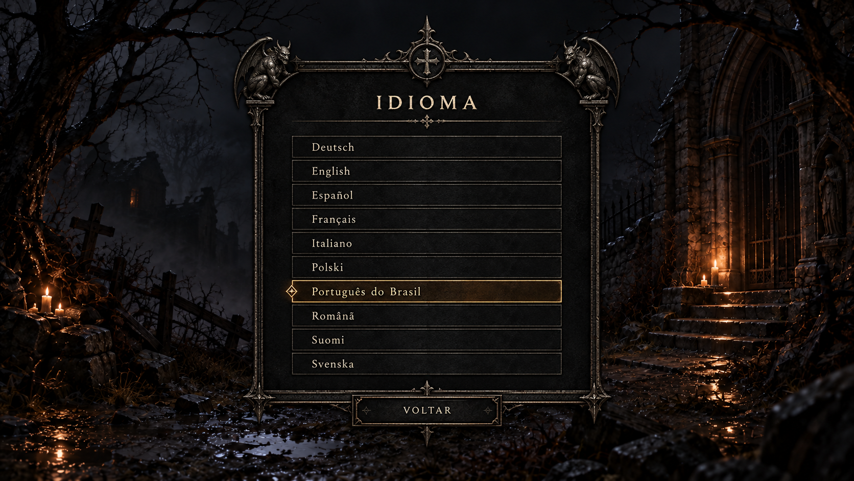
Configurações pré-partida — escolha de idioma
Conceito gerado · R2 · candidato em revisão; não é captura do jogo.
Ver prompt original
Use case: ui-mockup. Project-bound Diablo 3D interface concept, not a screenshot. Use reference image 1 as the approved EXACT visual direction and scene background: dark ruined chapel, restrained candlelight, same charcoal/earth/amber palette; reference image 2 only for worn pewter/iron framing language. Create a polished readable 1920x1080 landscape UI screen, original Diablo 1 gothic restraint, ivory live-text examples, warm muted selected-row accent, no MMO gradients, no electric neon, no new gameplay. Keep central panel bounded in safe screen area, ample line spacing, bottom horizontal Back footer, crisp professional typography, subtle thin ornament. Do not add logo text unless requested. All text Portuguese (Brazil). No misleading before/after or original column. Do not embed technical implementation labels; screen is a candidate for the player. Screen: native language value picker pre-game. Title 'IDIOMA'. Scrollable elegant list 10 visible rows: 'Deutsch', 'English', 'Español', 'Français', 'Italiano', 'Polski', 'Português do Brasil', 'Română', 'Suomi', 'Svenska'. Português do Brasil is selected with understated ivory/gold cursor and thin warm row focus. Selection marker distinct from keyboard focus. Title+list optically centered. Footer 'Voltar'. No flag icons or translation service UI, search, or save button.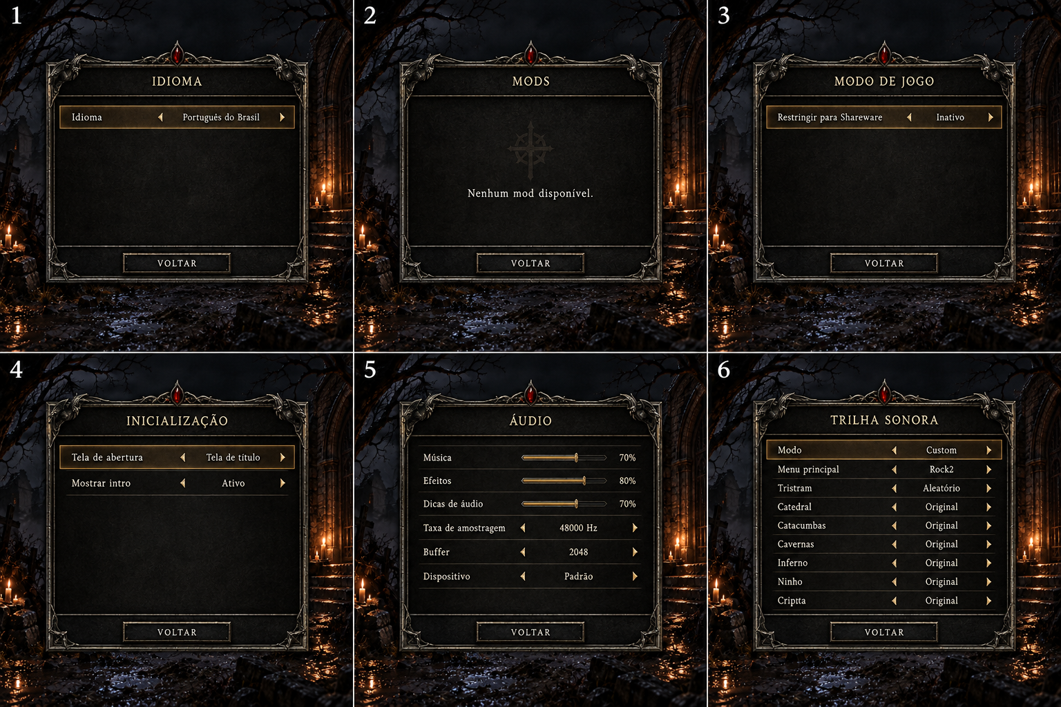
Configurações pré-partida — idioma, mods, modo, inicialização, áudio e trilha
Conceito gerado · R2 · candidato em revisão; não é captura do jogo.
Ver prompt original
Use case: ui-mockup. Project-bound Diablo 3D interface concept, not a screenshot. Use reference image 1 as the approved EXACT visual direction and scene background: dark ruined chapel, restrained candlelight, same charcoal/earth/amber palette; reference image 2 only for worn pewter/iron framing language. Create a polished readable 1920x1080 landscape UI screen, original Diablo 1 gothic restraint, ivory live-text examples, warm muted selected-row accent, no MMO gradients, no electric neon, no new gameplay. Keep central panel bounded in safe screen area, ample line spacing, bottom horizontal Back footer, crisp professional typography, subtle thin ornament. Do not add logo text unless requested. All text Portuguese (Brazil). No misleading before/after or original column. Do not embed technical implementation labels; screen is a candidate for the player. Create a design review CONTACT SHEET with six equally sized complete miniature menu screens arranged 3 columns ×2 rows, requested canvas 3072x2048. Thin gutters; each screen numbered outside UI only. Six category variants of the SAME frame. 1 'IDIOMA': Idioma/Português do Brasil. 2 'MODS': empty registered mods panel, 'Nenhum mod disponível' (conditional state, no fictional mod); 3 'MODO DE JOGO': Restringir para Shareware/Inativo. 4 'INICIALIZAÇÃO': Tela de abertura/Tela de título; Mostrar intro/Ativo. 5 'ÁUDIO': Música/70%, Efeitos/80%, Dicas de áudio/70%, Taxa de amostragem/48000 Hz, Buffer/2048, Dispositivo/Padrão. 6 'TRILHA SONORA': Modo/Custom, Menu principal/Rock2, Tristram/Aleatório, Catedral/Original, Catacumbas/Original, Cavernas/Original, Inferno/Original, Ninho/Original, Cripta/Original. Every panel has only Voltar footer. No music play/pause or downloads UI, no fake installation status. All examples are candidate layouts, actual values supplied by runtime.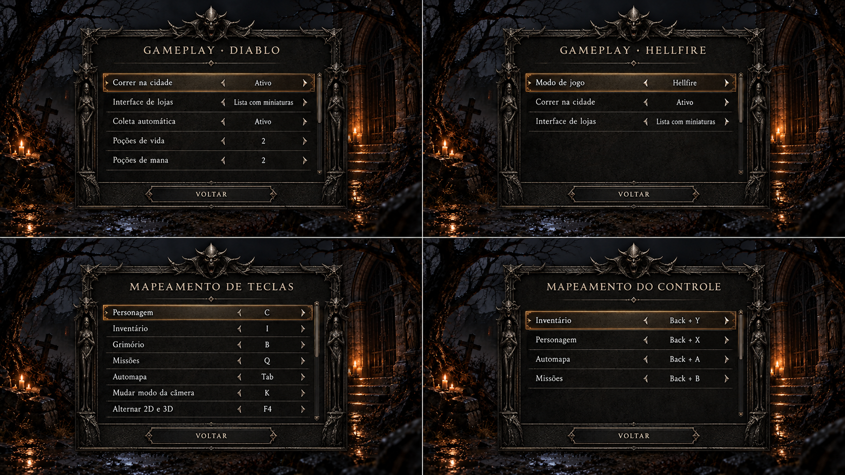
Configurações pré-partida — gameplay e mapeamentos
Conceito gerado · R2 · candidato em revisão; não é captura do jogo.
Ver prompt original
Use case: ui-mockup. Project-bound Diablo 3D interface concept, not a screenshot. Use reference image 1 as the approved EXACT visual direction and scene background: dark ruined chapel, restrained candlelight, same charcoal/earth/amber palette; reference image 2 only for worn pewter/iron framing language. Create a polished readable 1920x1080 landscape UI screen, original Diablo 1 gothic restraint, ivory live-text examples, warm muted selected-row accent, no MMO gradients, no electric neon, no new gameplay. Keep central panel bounded in safe screen area, ample line spacing, bottom horizontal Back footer, crisp professional typography, subtle thin ornament. Do not add logo text unless requested. All text Portuguese (Brazil). No misleading before/after or original column. Do not embed technical implementation labels; screen is a candidate for the player. Create design review contact sheet FOUR full menu screens 2x2 requested3072x2048. 1 'GAMEPLAY · DIABLO': rows 'Correr na cidade/Ativo', 'Interface de lojas/Lista com miniaturas', 'Coleta automática/Ativo', 'Poções de vida/2', 'Poções de mana/2'. 2 'GAMEPLAY · HELLFIRE': similar genuine settings no newmechanics with 'Modo de jogo/Hellfire', 'Correr na cidade/Ativo', 'Interface de lojas/Lista com miniaturas'. 3 'MAPEAMENTO DE TECLAS': 'Personagem/C', 'Inventário/I', 'Grimório/B', 'Missões/Q', 'Automapa/Tab', 'Mudar modo da câmera/K', 'Alternar 2D e 3D/F4'. 4 'MAPEAMENTO DO CONTROLE': simple rows 'Inventário/Back + Y', 'Personagem/Back + X', 'Automapa/Back + A', 'Missões/Back + B' as demonstrative currentbindings. All4 use same gothicframe, clean columns, scroller, Voltar footer; no reset allbutton or fictional abilities. Examples of bindings not authoritative default assignments.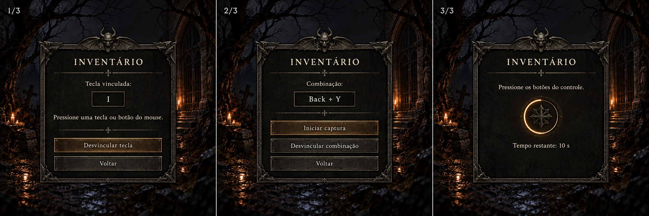
Configurações pré-partida — captura de tecla, mouse e controle
Conceito gerado · R2 · candidato em revisão; não é captura do jogo.
Ver prompt original
Use case: ui-mockup. Project-bound Diablo 3D interface concept, not a screenshot. Use reference image 1 as the approved EXACT visual direction and scene background: dark ruined chapel, restrained candlelight, same charcoal/earth/amber palette; reference image 2 only for worn pewter/iron framing language. Create a polished readable 1920x1080 landscape UI screen, original Diablo 1 gothic restraint, ivory live-text examples, warm muted selected-row accent, no MMO gradients, no electric neon, no new gameplay. Keep central panel bounded in safe screen area, ample line spacing, bottom horizontal Back footer, crisp professional typography, subtle thin ornament. Do not add logo text unless requested. All text Portuguese (Brazil). No misleading before/after or original column. Do not embed technical implementation labels; screen is a candidate for the player. Design review three panels horizontally, landscape3072x1536. Panel1 pre-game keyboard binding title 'INVENTÁRIO', current 'Tecla vinculada: I', instruction 'Pressione uma tecla ou botão do mouse', buttons 'Desvincular tecla' and 'Voltar'. Panel2 controller binding idle title 'INVENTÁRIO', 'Combinação: Back + Y', buttons 'Iniciar captura', 'Desvincular combinação', 'Voltar'. Panel3 controller capture active, title 'INVENTÁRIO', instruction 'Pressione os botões do controle', text 'Tempo restante: 10 s'; navigation actions hidden whilecapture. Equal materials and typography, dark approvedbackground behind all. No real system device names, no save/apply/reset. Label sheet numbers outsidepanels for design review.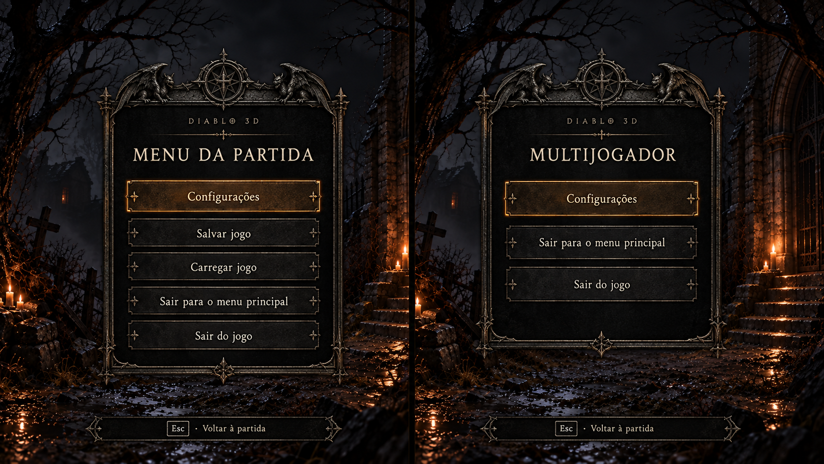
Menu de pausa da partida
Conceito gerado · R2 · candidato em revisão; não é captura do jogo.
Ver prompt original
Use case: ui-mockup. Project-bound Diablo 3D interface concept, not a screenshot. Use reference image 1 as the approved EXACT visual direction and scene background: dark ruined chapel, restrained candlelight, same charcoal/earth/amber palette; reference image 2 only for worn pewter/iron framing language. Create a polished readable 1920x1080 landscape UI screen, original Diablo 1 gothic restraint, ivory live-text examples, warm muted selected-row accent, no MMO gradients, no electric neon, no new gameplay. Keep central panel bounded in safe screen area, ample line spacing, bottom horizontal Back footer, crisp professional typography, subtle thin ornament. Do not add logo text unless requested. All text Portuguese (Brazil). No misleading before/after or original column. Do not embed technical implementation labels; screen is a candidate for the player. Design review TWO side-by-side full menu proposals over subtly dim illustrated Tristram world. Leftsolo title 'DIABLO 3D' small and 'MENU DA PARTIDA', five actions centered 'Configurações', 'Salvar jogo', 'Carregar jogo', 'Sair para o menu principal', 'Sair do jogo'. Right multiplayer same elegantframe with only 'Configurações', 'Sair para o menu principal', 'Sair do jogo'. At bottom unobtrusive 'Esc · Voltar à partida'. No Resume action duplicated inlist, no PhotoMode, social, cosmetics or newcampaign buttons. Menu should use much more monitor effectively, crisp HD easy read, understated dark panel, safe margins.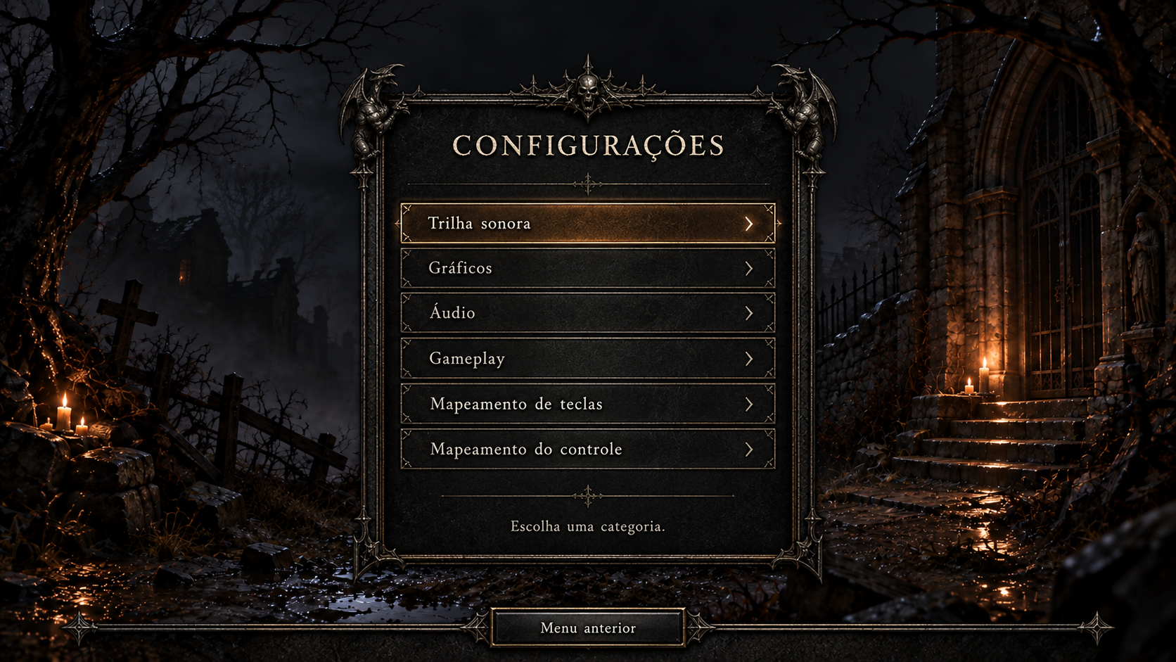
Configurações na partida — categorias
Conceito gerado · R2 · candidato em revisão; não é captura do jogo.
Ver prompt original
Use case: ui-mockup. Project-bound Diablo 3D interface concept, not a screenshot. Use reference image 1 as the approved EXACT visual direction and scene background: dark ruined chapel, restrained candlelight, same charcoal/earth/amber palette; reference image 2 only for worn pewter/iron framing language. Create a polished readable 1920x1080 landscape UI screen, original Diablo 1 gothic restraint, ivory live-text examples, warm muted selected-row accent, no MMO gradients, no electric neon, no new gameplay. Keep central panel bounded in safe screen area, ample line spacing, bottom horizontal Back footer, crisp professional typography, subtle thin ornament. Do not add logo text unless requested. All text Portuguese (Brazil). No misleading before/after or original column. Do not embed technical implementation labels; screen is a candidate for the player. Screen: live in-game settings categories over dim town illustration, title 'CONFIGURAÇÕES'. Same frame as previoussettings. List priority 'Trilha sonora', 'Gráficos', 'Áudio', 'Gameplay', 'Mapeamento de teclas', 'Mapeamento do controle'. Highlight 'Trilha sonora'. NO startup, resolution, mods, game mode or language configuration here unless editable; these are omitted. Horizontal footer 'Menu anterior' then separate '← Página anterior'/'Próxima página →' only if pagination needed (here listfits, omit paging). Description underrows 'Escolha uma categoria.' Never add Apply/Save/reset. Keep safe area and room for up to18native rows FullHD.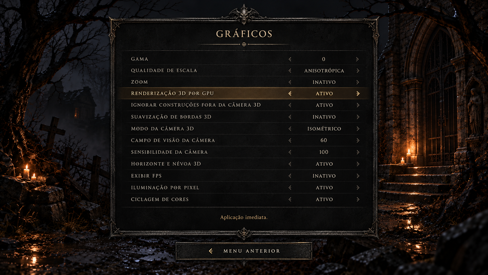
Configurações na partida — gráficos
Conceito gerado · R2 · candidato em revisão; não é captura do jogo.
Ver prompt original
Use case: ui-mockup. Project-bound Diablo 3D interface concept, not a screenshot. Use reference image 1 as the approved EXACT visual direction and scene background: dark ruined chapel, restrained candlelight, same charcoal/earth/amber palette; reference image 2 only for worn pewter/iron framing language. Create a polished readable 1920x1080 landscape UI screen, original Diablo 1 gothic restraint, ivory live-text examples, warm muted selected-row accent, no MMO gradients, no electric neon, no new gameplay. Keep central panel bounded in safe screen area, ample line spacing, bottom horizontal Back footer, crisp professional typography, subtle thin ornament. Do not add logo text unless requested. All text Portuguese (Brazil). No misleading before/after or original column. Do not embed technical implementation labels; screen is a candidate for the player. Screen: graphics settings DURINGgame, title 'GRÁFICOS', over subtly dimtownillustration. Readable wide panel with13rows: 'Gama/0', 'Qualidade de escala/Anisotrópica', 'Zoom/Inativo', 'Renderização 3D por GPU/Ativo', 'Ignorar construções fora da câmera 3D/Ativo', 'Suavização de bordas 3D/Inativo', 'Modo da câmera 3D/Isométrico', 'Campo de visão da câmera/60', 'Sensibilidade da câmera/100', 'Horizonte e névoa 3D/Ativo', 'Exibir FPS/Inativo', 'Iluminação por pixel/Ativo', 'Ciclagem de cores/Ativo'. Select GPUrow, contextualdescription 'Aplicação imediata.' Horizontalbottomfooter 'Menu anterior'. Do NOTinclude Startin3D,resolution,fullscreen,mods,or anyrestartonlysetting. Show labelsivorynotredfortoggles, clear enabled disabled distinction. Preserve allfunctions from functional referenceimage3 but upgradeframe/readability.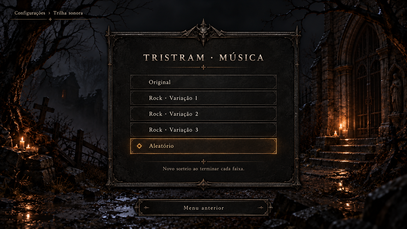
Configurações na partida — música de Tristram
Conceito gerado · R2 · candidato em revisão; não é captura do jogo.
Ver prompt original
Use case: ui-mockup. Project-bound Diablo 3D interface concept, not a screenshot. Use reference image 1 as the approved EXACT visual direction and scene background: dark ruined chapel, restrained candlelight, same charcoal/earth/amber palette; reference image 2 only for worn pewter/iron framing language. Create a polished readable 1920x1080 landscape UI screen, original Diablo 1 gothic restraint, ivory live-text examples, warm muted selected-row accent, no MMO gradients, no electric neon, no new gameplay. Keep central panel bounded in safe screen area, ample line spacing, bottom horizontal Back footer, crisp professional typography, subtle thin ornament. Do not add logo text unless requested. All text Portuguese (Brazil). No misleading before/after or original column. Do not embed technical implementation labels; screen is a candidate for the player. Screen: in-game soundtrack choice for Tristram. Title 'TRISTRAM · MÚSICA'. Four choices 'Original', 'Rock · Variação 1', 'Rock · Variação 2', 'Rock · Variação 3', plus 'Aleatório' selected. Contextualdescription 'Novo sorteio ao terminar cada faixa.' Horizontalfooter 'Menu anterior'. Subtle selection diamond left and focused row warmedge. Native choices, NO play/download button, no albumart or audiolevelsvisualizer. Ivory legiblefont. Otherlocaltracks use identicaltemplate withactualruntimechoices; this isonlyTristramexample. Include small breadcrumb 'Configurações › Trilha sonora'.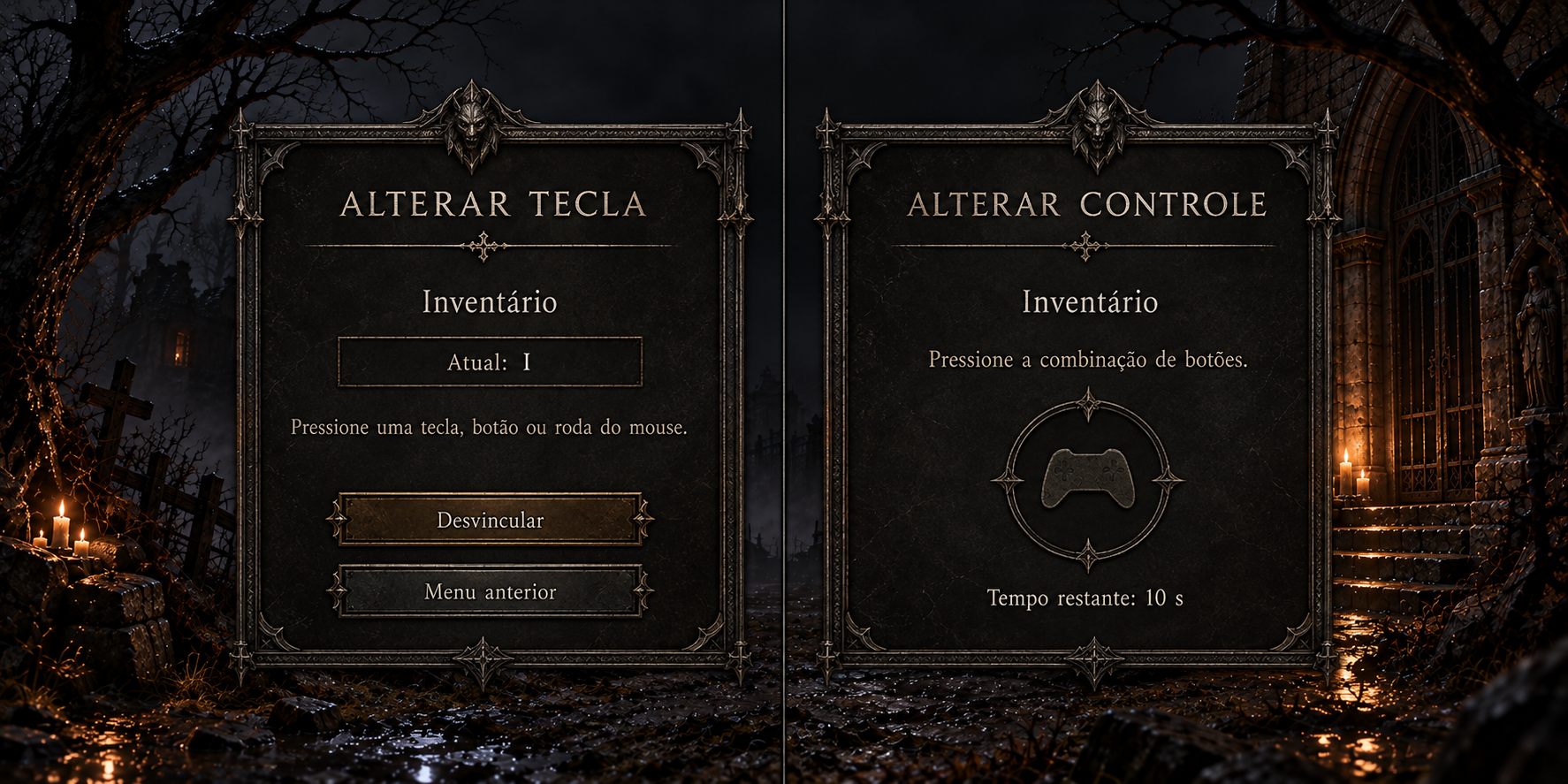
Configurações na partida — captura de tecla, mouse e controle
Conceito gerado · R2 · candidato em revisão; não é captura do jogo.
Ver prompt original
Use case: ui-mockup. Project-bound Diablo 3D interface concept, not a screenshot. Use reference image 1 as the approved EXACT visual direction and scene background: dark ruined chapel, restrained candlelight, same charcoal/earth/amber palette; reference image 2 only for worn pewter/iron framing language. Create a polished readable 1920x1080 landscape UI screen, original Diablo 1 gothic restraint, ivory live-text examples, warm muted selected-row accent, no MMO gradients, no electric neon, no new gameplay. Keep central panel bounded in safe screen area, ample line spacing, bottom horizontal Back footer, crisp professional typography, subtle thin ornament. Do not add logo text unless requested. All text Portuguese (Brazil). No misleading before/after or original column. Do not embed technical implementation labels; screen is a candidate for the player. CONTACT SHEET two fullsettingsscreens sidebyside, requested3072x1536, INGAME dimtownillustrationbackground. Left keyboard/mouse binding title 'ALTERAR TECLA', label 'Inventário', 'Atual: I', 'Pressione uma tecla, botão ou roda do mouse.', buttons 'Desvincular' and 'Menu anterior'. Right active gamepadbindingcapture title 'ALTERAR CONTROLE', label 'Inventário', 'Pressione a combinação de botões.', 'Tempo restante: 10 s'; hide navigationduringactivecapture. Quietgothicframe sameasallsettings, clearfocus. No gameplaykeynames leaked or newbuttons. No actual Saveinthisscreen.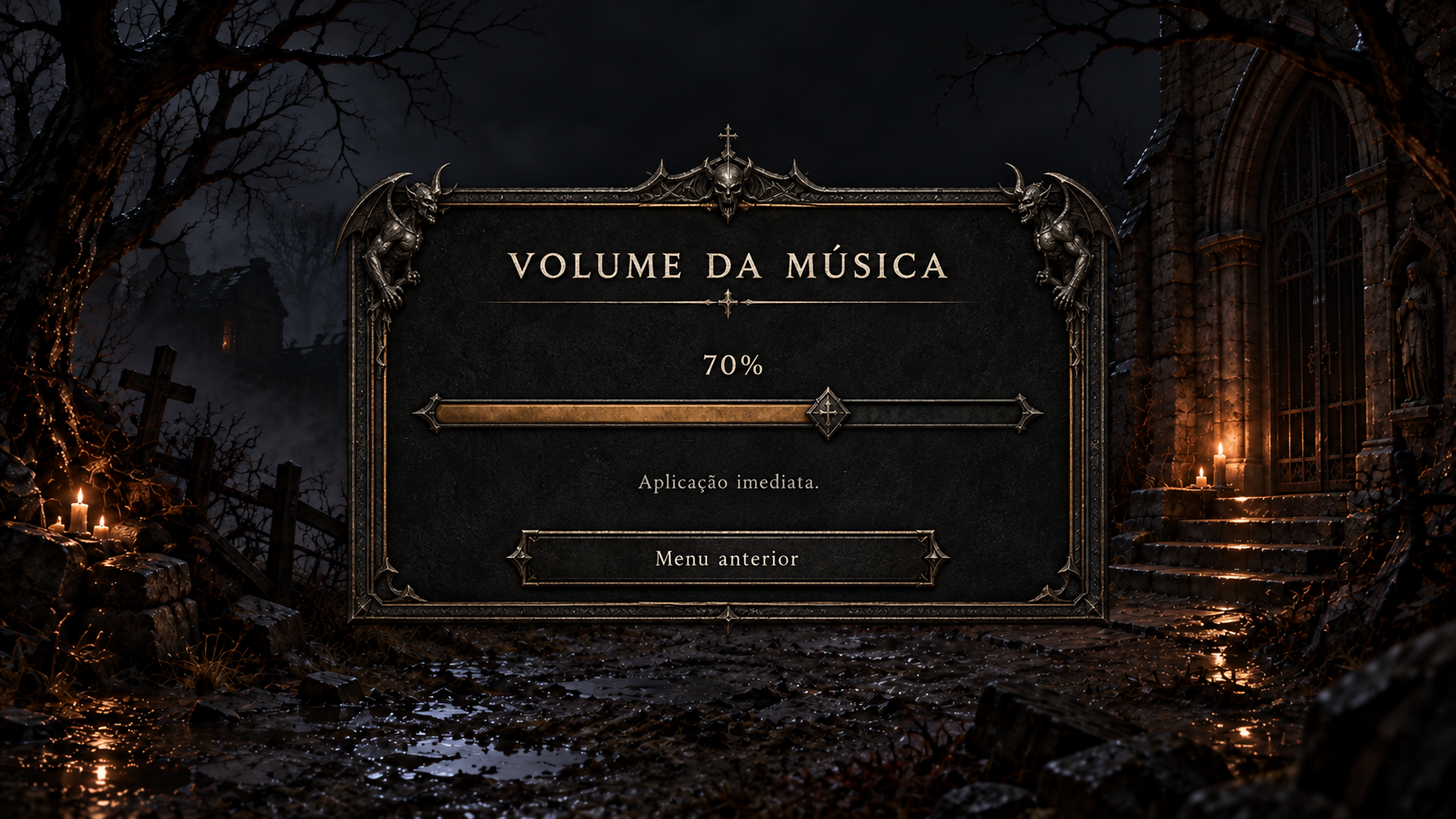
Configurações na partida — volume da música
Conceito gerado · R2 · candidato em revisão; não é captura do jogo.
Ver prompt original
Use case: ui-mockup. Project-bound Diablo 3D interface concept, not a screenshot. Use reference image 1 as the approved EXACT visual direction and scene background: dark ruined chapel, restrained candlelight, same charcoal/earth/amber palette; reference image 2 only for worn pewter/iron framing language. Create a polished readable 1920x1080 landscape UI screen, original Diablo 1 gothic restraint, ivory live-text examples, warm muted selected-row accent, no MMO gradients, no electric neon, no new gameplay. Keep central panel bounded in safe screen area, ample line spacing, bottom horizontal Back footer, crisp professional typography, subtle thin ornament. Do not add logo text unless requested. All text Portuguese (Brazil). No misleading before/after or original column. Do not embed technical implementation labels; screen is a candidate for the player. Screen: volume adjustmentduringgame. Compactcenterwidegothicmodal overdimillustratedtown. Title 'VOLUME DA MÚSICA'. Onehorizontalnativevolume slider currently70%, clear track darkiron andmutedwarmfilledsegment, wornpewterthumb, numeric70%shownabove. Text 'Aplicação imediata.' Footer 'Menu anterior'. NoApplySave, no equalizer, noextra volume channels, no invented mute checkbox ifnotneeded; 0sliderposition meansmute. Samewidgetsreusablefor effects,audiocues,gamma,solospeed. Keep roomylegible highres text and generousdraggabletarget.Painéis e controles
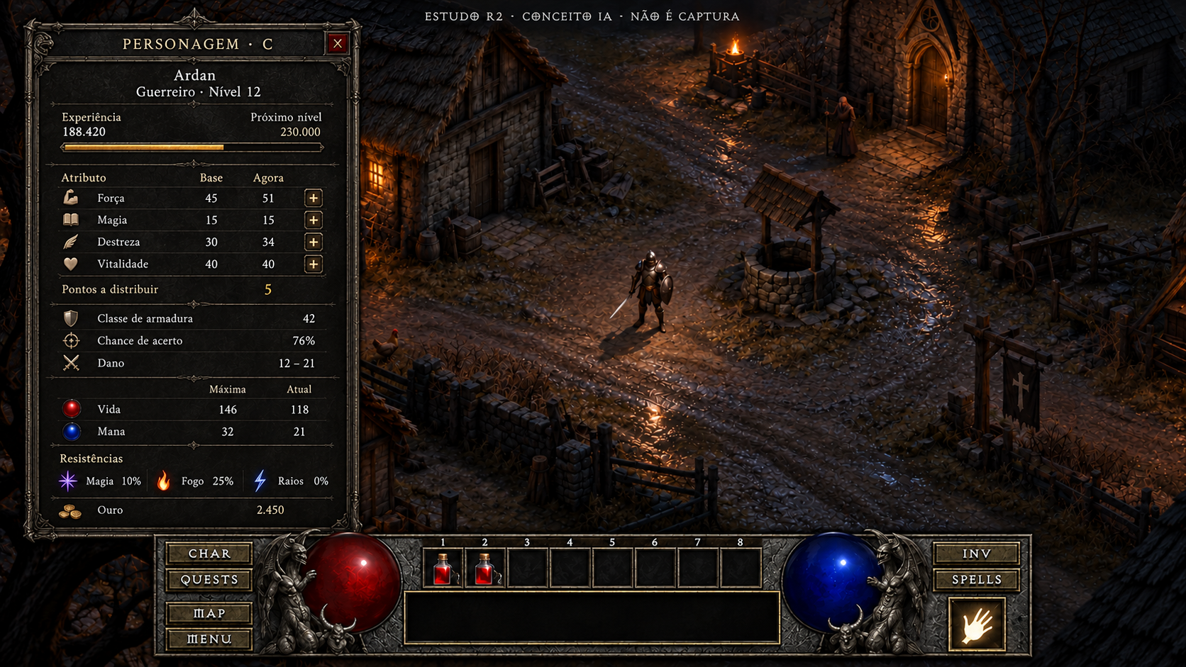
Personagem
Conceito gerado · R2 · candidato em revisão; não é captura do jogo.
Ver prompt original
Use case: ui-mockup. Asset type: candidate high-definition concept painting for Diablo 1 3D UI, not a screenshot and never a fake original comparison. Art direction: match the approved references' dark original Diablo 1 gothic atmosphere: charcoal stone fields, finely worn aged iron frames, pewter engraving, restrained aged brass edging, ivory readable serif text. Tiny amber highlights only for selection and candlelight; red/blue life and mana. Avoid polished MMO UI, fantasy gold filigree overload, neon, flat web UI. Background is an ORIGINAL ILLUSTRATION of nighttime Tristram cobbles, timber cottages and a well; this is illustrative concept scenery, no claim of runtime. Keep the bottom native-style continuous HUD: left CHAR/QUESTS/MAP/MENU buttons, large red life globe held by gothic gargoyles, eight numbered belt cells ABOVE the broad black information box, blue mana globe, right INV/SPELLS buttons with one separate prepared-spell tile under them. No extra permanent quickbar, no minimap except when explicitly requested for a native map mode, no stamina, cooldowns, equipment boots/gloves or invented gameplay. Preserve the free world area. All strings are PT-BR sample copy to be implemented later as live text, never baked final runtime labels. Add a subtle outside-game editorial top caption "ESTUDO R2 · CONCEITO IA · NÃO É CAPTURA". Finish as an art-directed crisp HD bitmap, textured but typography remains clear.
Primary request: FULL SCREEN 1920x1080 landscape UI concept P01, character panel OPEN ON LEFT, taking 35% width and from y=55 to y=835; world visible on right. Only character panel; no inventory or minimap. Panel header "PERSONAGEM · C", close X. All twenty fields must be visible and legible, compact balanced grouping with a clear two-column attribute table. Exact content: "Ardan" "Guerreiro · Nível 12"; "Experiência 188.420" "Próximo nível 230.000"; table headers "Atributo" "Base" "Agora"; rows "Força 45 51 +" "Magia 15 15 +" "Destreza 30 34 +" "Vitalidade 40 40 +"; one plus button aligned beside each attribute (four total). "Pontos a distribuir 5". "Ouro 2.450". "Classe de armadura 42"; "Chance de acerto 76%"; "Dano 12–21"; resource headers "Máxima" "Atual"; "Vida 146 118" "Mana 32 21"; resistances "Magia 10%" "Fogo 25%" "Raios 0%". Preserve both columns rather than reducing attributes to one number. Show low key labeled XP meter after the numeric XP fields. No portrait replacing any statistic. Bottom HUD remains fully visible underneath.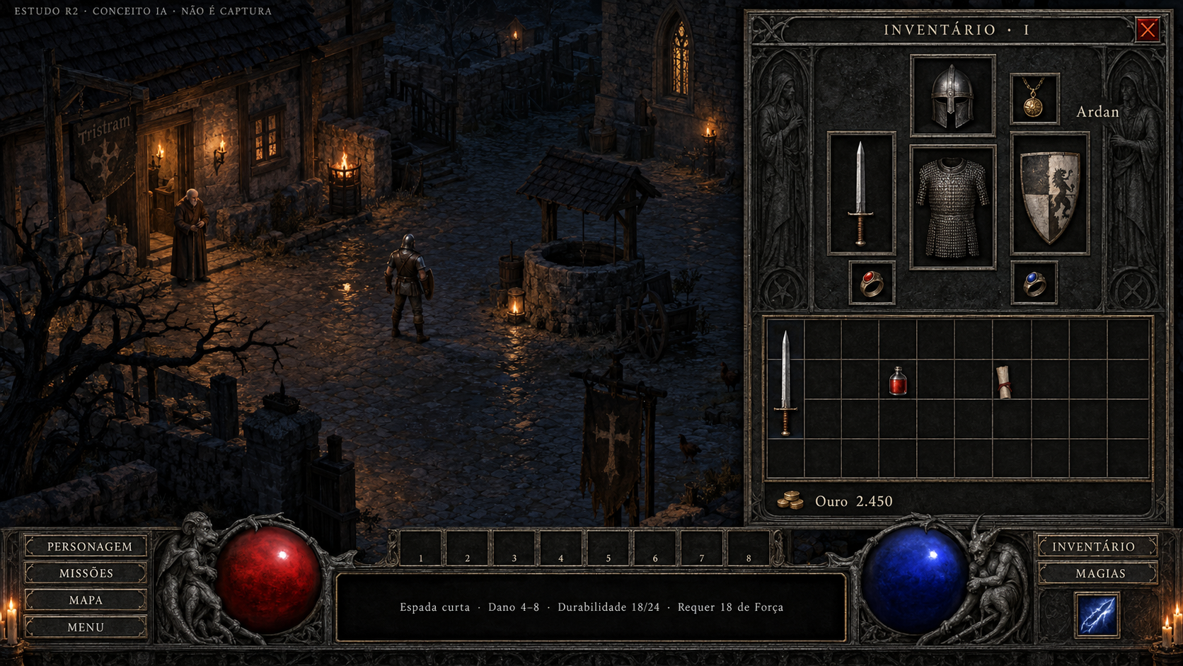
Inventário
Conceito gerado · R2 · candidato em revisão; não é captura do jogo.
Ver prompt original
Use case: ui-mockup. Asset type: candidate high-definition concept painting for Diablo 1 3D UI, not a screenshot and never a fake original comparison. Art direction: match the approved references' dark original Diablo 1 gothic atmosphere: charcoal stone fields, finely worn aged iron frames, pewter engraving, restrained aged brass edging, ivory readable serif text. Tiny amber highlights only for selection and candlelight; red/blue life and mana. Avoid polished MMO UI, fantasy gold filigree overload, neon, flat web UI. Background is an ORIGINAL ILLUSTRATION of nighttime Tristram cobbles, timber cottages and a well; this is illustrative concept scenery, no claim of runtime. Keep the bottom native-style continuous HUD: left CHAR/QUESTS/MAP/MENU buttons, large red life globe held by gothic gargoyles, eight numbered belt cells ABOVE the broad black information box, blue mana globe, right INV/SPELLS buttons with one separate prepared-spell tile under them. No extra permanent quickbar, no minimap except when explicitly requested for a native map mode, no stamina, cooldowns, equipment boots/gloves or invented gameplay. Preserve the free world area. All strings are PT-BR sample copy to be implemented later as live text, never baked final runtime labels. Add a subtle outside-game editorial top caption "ESTUDO R2 · CONCEITO IA · NÃO É CAPTURA". Finish as an art-directed crisp HD bitmap, textured but typography remains clear.
Primary request: Generate a NEW FULL SCREEN bitmap at 1920×1080, aspect ratio16:9, not a redraw at the dimensions of an input image. P02 inventory OPEN ON RIGHT covering 34%width y55 to835. The world stays visible on left. Header "INVENTÁRIO · I", close X, "Ardan". The TOP equipment zone must contain EXACTLY SEVEN separate rectangular equipment receptacles: 1 head centered top, 1 small amulet at top right, 1 torso centered below head, 1 left hand to torso's left, 1 right hand to torso's right, 1 ring bottom left, 1 ring bottom right. Seven total, no boots, gloves, extra socket or decoration mistaken for a slot. Helmet in head, pendant in amulet, chainmail in torso, sword in left hand, shield in right hand, two rings. BELOW a precise backpack grid: TEN columns and FOUR rows, forty equal square cells, eleven vertical grid lines and five horizontal grid lines including borders. Sparse contents: sword spans one column by three rows; a potion one cell; scroll one cell. No eighth equipped slot. Bottom of inventory "Ouro 2.450". Small unobtrusive item information integrated into HUD information box: "Espada curta · Dano 4–8 · Durabilidade 18/24 · Requer 18 de Força". Native-style bottomHUD fully visible with eight belt cells only. Do not label dimensions in player-facing art.Personagem e inventário abertos
Conceito gerado · R2 · candidato em revisão; não é captura do jogo.
Ver prompt original
Use case: precise-object-edit. Edit ONLY the provided concept image P03. Keep the complete composition, both side panels, current statistics, exact seven equipment receptacles, backpack10columns×4rows, illustrated Tristram and bottomHUD. Correct the missing gold field: add a single legible line "Ouro 2.450" within the LEFT character panel, directly beneath "Pontos a distribuir 5", slightly reducing or moving the character portrait if necessary to make room. Do not remove or merge any other statistics; retain Base/Agora for4attributes, Max/Atual Vida/Mana,3resistances,XP,level,armor,tohit,damage. Add no gameplay functions. Do not add gold to the center of world or across HUD. All text is sample concept copy; preserve external CONCEITO disclaimer. This change repairs one omitted native field.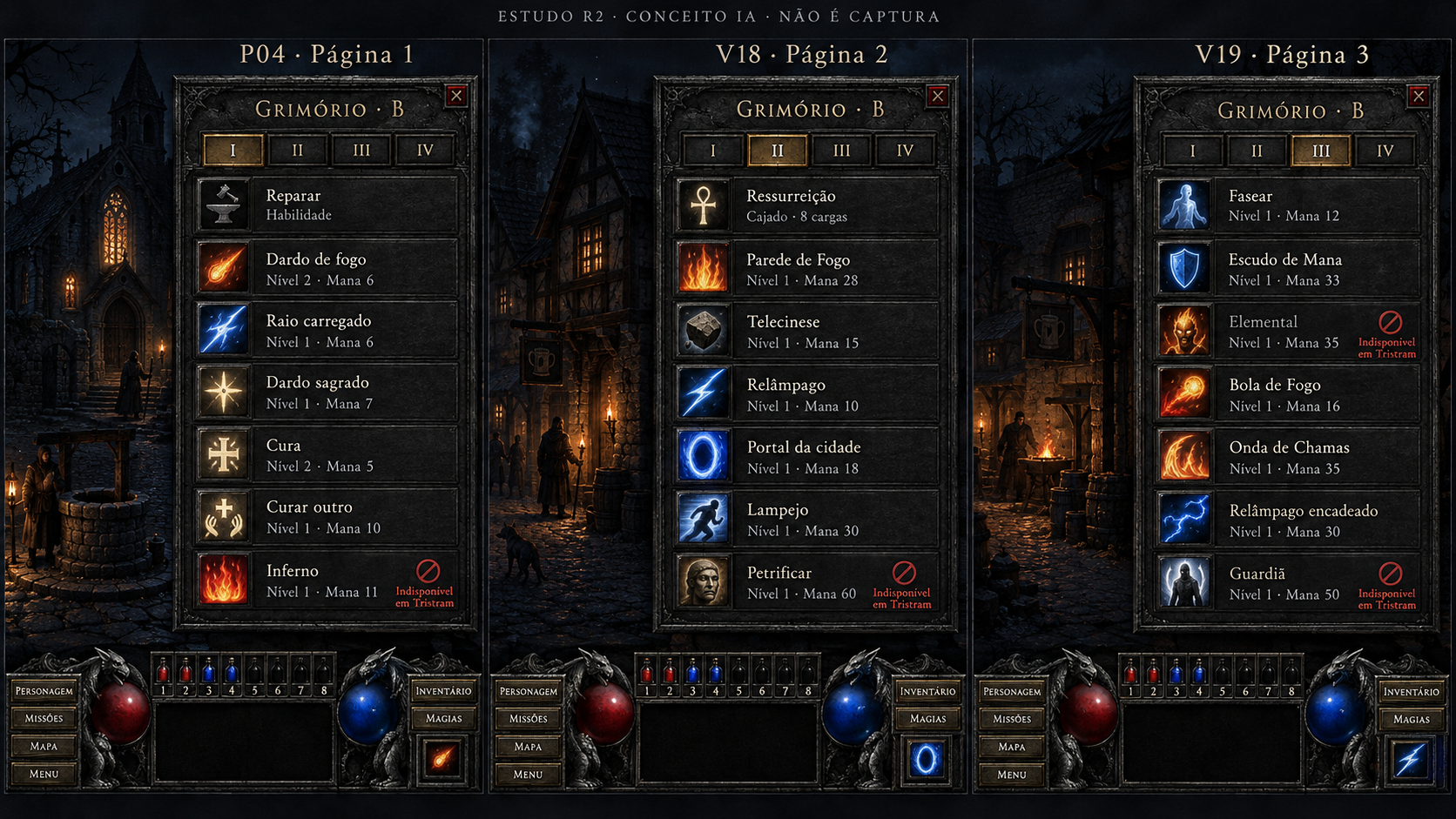
Grimório — páginas 1 a 3
Conceito gerado · R2 · candidato em revisão; não é captura do jogo.
Ver prompt original
Use case: ui-mockup. Asset type: candidate high-definition concept painting for Diablo 1 3D UI, not a screenshot and never a fake original comparison. Art direction: match the approved references' dark original Diablo 1 gothic atmosphere: charcoal stone fields, finely worn aged iron frames, pewter engraving, restrained aged brass edging, ivory readable serif text. Tiny amber highlights only for selection and candlelight; red/blue life and mana. Avoid polished MMO UI, fantasy gold filigree overload, neon, flat web UI. Background is an ORIGINAL ILLUSTRATION of nighttime Tristram cobbles, timber cottages and a well; this is illustrative concept scenery, no claim of runtime. Keep the bottom native-style continuous HUD: left CHAR/QUESTS/MAP/MENU buttons, large red life globe held by gothic gargoyles, eight numbered belt cells ABOVE the broad black information box, blue mana globe, right INV/SPELLS buttons with one separate prepared-spell tile under them. No extra permanent quickbar, no minimap except when explicitly requested for a native map mode, no stamina, cooldowns, equipment boots/gloves or invented gameplay. Preserve the free world area. All strings are PT-BR sample copy to be implemented later as live text, never baked final runtime labels. Add a subtle outside-game editorial top caption "ESTUDO R2 · CONCEITO IA · NÃO É CAPTURA". Finish as an art-directed crisp HD bitmap, textured but typography remains clear.
Primary request: A LARGE HD ART BOARD 2880x1620 with THREE clean equally-sized vertical concept frames side by side, outer editorial label at top. Each frame shows a tall dark stone right-side spellbook panel against a subtle Tristram illustration, a reduced native bottom HUD visible. Make the spellbook lists large and readable, seven FIXED rows each; illustrative spell icons, crisp ivory text, restrained category color. External labels above frames "P04 · Página 1", "V18 · Página 2", "V19 · Página 3". Inside each panel title "GRIMÓRIO · B"; bottom HORIZONTAL four tabs "I II III IV" in fixed order, select correct tab per frame. Page1 exact seven rows: Reparar / Habilidade (no mana); Dardo de fogo / Nível2 · Mana6; Raio carregado / Nível1 · Mana6; Dardo sagrado / Nível1 · Mana7; Cura / Nível2 · Mana5; Curar outro / Nível1 · Mana10; Inferno / Nível1 · Mana11. Page2 seven rows: Ressurreição / Cajado · 8 cargas; Parede de Fogo / Nível1 · Mana28; Telecinese / Nível1 · Mana15; Relâmpago / Nível1 · Mana10; Portal da cidade / Nível1 · Mana18; Lampejo / Nível1 · Mana30; Petrificar / Nível1 · Mana60. Page3 seven rows: Fasear / Nível1 · Mana12; Escudo de Mana / Nível1 · Mana33; Elemental / Nível1 · Mana35; Bola de Fogo / Nível1 · Mana16; Onda de Chamas / Nível1 · Mana35; Relâmpago encadeado / Nível1 · Mana30; Guardiã / Nível1 · Mana50. Small barred/invalid marker on offensive magic with explanatory sample "Indisponível em Tristram", keeping spell text readable. No mana cost on Reparar or staff; no sixth playable tab, no cooldown timers.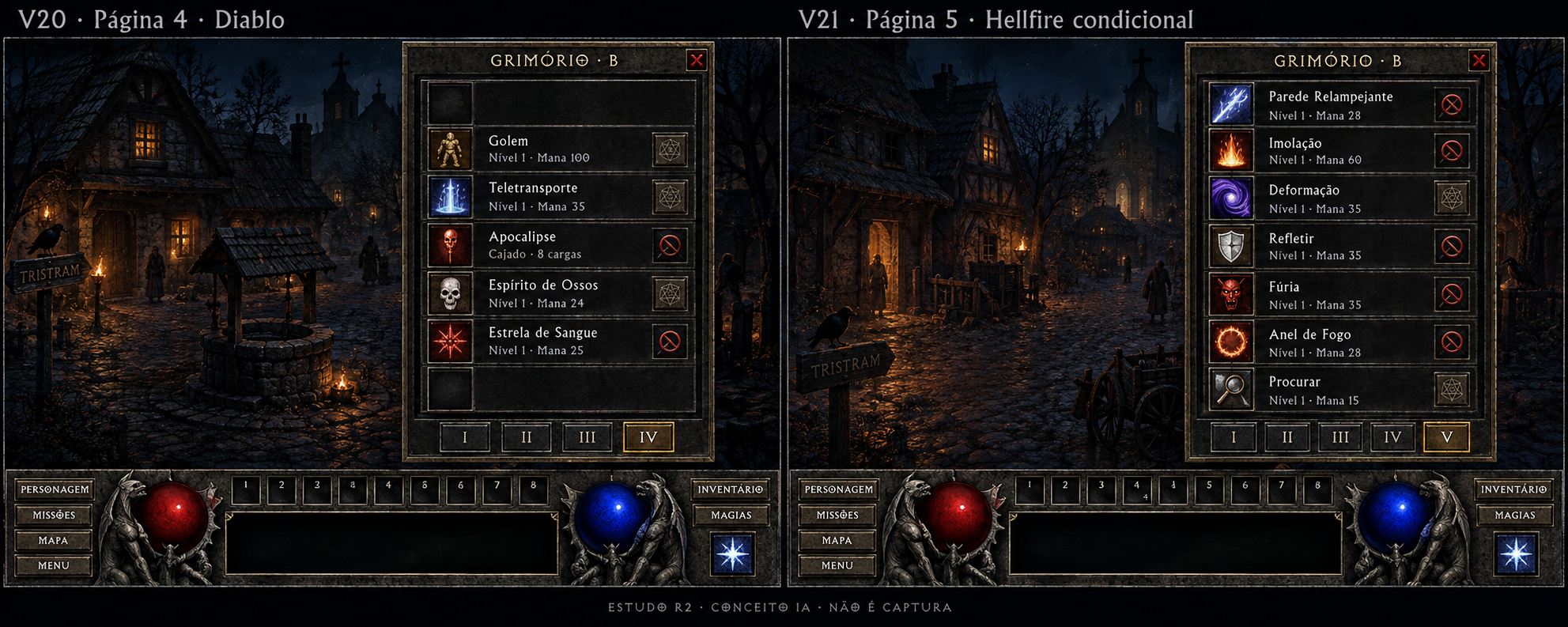
Grimório — páginas 4 e 5 · Hellfire
Conceito gerado · R2 · candidato em revisão; não é captura do jogo.
Ver prompt original
Use case: ui-mockup. Asset type: candidate high-definition concept painting for Diablo 1 3D UI, not a screenshot and never a fake original comparison. Art direction: match the approved references' dark original Diablo 1 gothic atmosphere: charcoal stone fields, finely worn aged iron frames, pewter engraving, restrained aged brass edging, ivory readable serif text. Tiny amber highlights only for selection and candlelight; red/blue life and mana. Avoid polished MMO UI, fantasy gold filigree overload, neon, flat web UI. Background is an ORIGINAL ILLUSTRATION of nighttime Tristram cobbles, timber cottages and a well; this is illustrative concept scenery, no claim of runtime. Keep the bottom native-style continuous HUD: left CHAR/QUESTS/MAP/MENU buttons, large red life globe held by gothic gargoyles, eight numbered belt cells ABOVE the broad black information box, blue mana globe, right INV/SPELLS buttons with one separate prepared-spell tile under them. No extra permanent quickbar, no minimap except when explicitly requested for a native map mode, no stamina, cooldowns, equipment boots/gloves or invented gameplay. Preserve the free world area. All strings are PT-BR sample copy to be implemented later as live text, never baked final runtime labels. Add a subtle outside-game editorial top caption "ESTUDO R2 · CONCEITO IA · NÃO É CAPTURA". Finish as an art-directed crisp HD bitmap, textured but typography remains clear.
Primary request: LARGE HD art board2560x1440 with TWO clearly separated 16:9 screen mockup frames side by side; prioritize legible spellbook panels. External editorial labels above left "V20 · Página 4 · Diablo"; above right "V21 · Página 5 · Hellfire condicional". Tristram original illustration backgrounds, native bottom HUD. LEFT inside header "GRIMÓRIO · B", seven fixed slots with row1 BLANK (not even a label), row2 Golem / Nível1 · Mana100, row3 Teletransporte / Nível1 · Mana35, row4 Apocalipse / Cajado · 8 cargas, row5 Espírito de Ossos / Nível1 · Mana24, row6 Estrela de Sangue / Nível1 · Mana25, row7 BLANK. Retain blank first and seventh row spaces. Four horizontal bottom tabs I II III IV with IV selected. RIGHT header "GRIMÓRIO · B", five bottom tabs I II III IV V with V selected, seven rows in exact order: Parede Relampejante / Nível1 · Mana28; Imolação / Nível1 · Mana60; Deformação / Nível1 · Mana35; Refletir / Nível1 · Mana35; Fúria / Nível1 · Mana35; Anel de Fogo / Nível1 · Mana28; Procurar / Nível1 · Mana15. No sixth playable page. No mana cost added to staff powers. Offensive unavailable spells carry small barred marker, never full unreadable dimming. Four empty positions must not be filled with invented spells.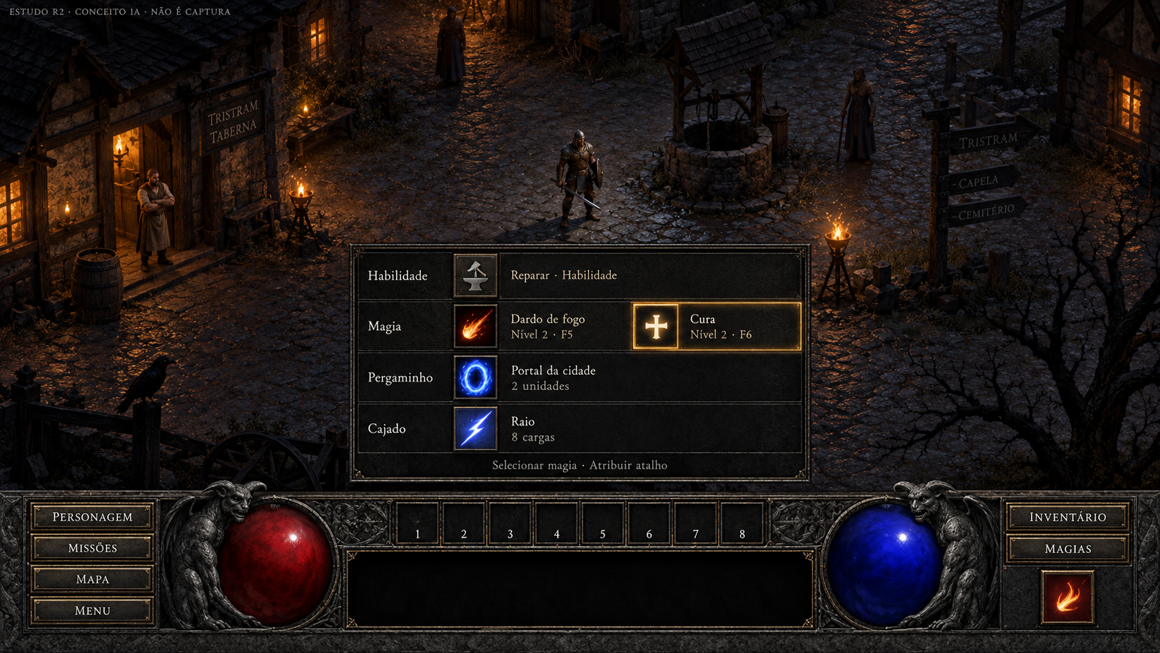
Lista rápida de magias
Conceito gerado · R2 · candidato em revisão; não é captura do jogo.
Ver prompt original
Use case: ui-mockup. Asset type: candidate high-definition concept painting for Diablo 1 3D UI, not a screenshot and never a fake original comparison. Art direction: match the approved references' dark original Diablo 1 gothic atmosphere: charcoal stone fields, finely worn aged iron frames, pewter engraving, restrained aged brass edging, ivory readable serif text. Tiny amber highlights only for selection and candlelight; red/blue life and mana. Avoid polished MMO UI, fantasy gold filigree overload, neon, flat web UI. Background is an ORIGINAL ILLUSTRATION of nighttime Tristram cobbles, timber cottages and a well; this is illustrative concept scenery, no claim of runtime. Keep the bottom native-style continuous HUD: left CHAR/QUESTS/MAP/MENU buttons, large red life globe held by gothic gargoyles, eight numbered belt cells ABOVE the broad black information box, blue mana globe, right INV/SPELLS buttons with one separate prepared-spell tile under them. No extra permanent quickbar, no minimap except when explicitly requested for a native map mode, no stamina, cooldowns, equipment boots/gloves or invented gameplay. Preserve the free world area. All strings are PT-BR sample copy to be implemented later as live text, never baked final runtime labels. Add a subtle outside-game editorial top caption "ESTUDO R2 · CONCEITO IA · NÃO É CAPTURA". Finish as an art-directed crisp HD bitmap, textured but typography remains clear.
Primary request: FULL SCREEN1920x1080 landscape. Native quick spell selection P05 open transiently as a compact four-row floating strip directly ABOVE the bottomHUD, world remains largely visible. Four clearly labeled origins as rows, no MMO hotbar: "Habilidade" with a hammer/anvil tile and "Reparar · Habilidade"; "Magia" with fire tile "Dardo de fogo · Nível2 · F5" and healing tile "Cura · Nível2 · F6"; "Pergaminho" with portal tile "Portal da cidade · 2 unidades"; "Cajado" with lightning tile "Raio · 8 cargas". Make scroll counts and staff charges distinct from learned level. Display a focused amber edge around Cura tile. One small instruction beneath "Selecionar magia · Atribuir atalho". No numerical cooldowns. The hero supports12 remappable shortcuts but do not draw12 permanent buttons or say four is maximum. No minimap.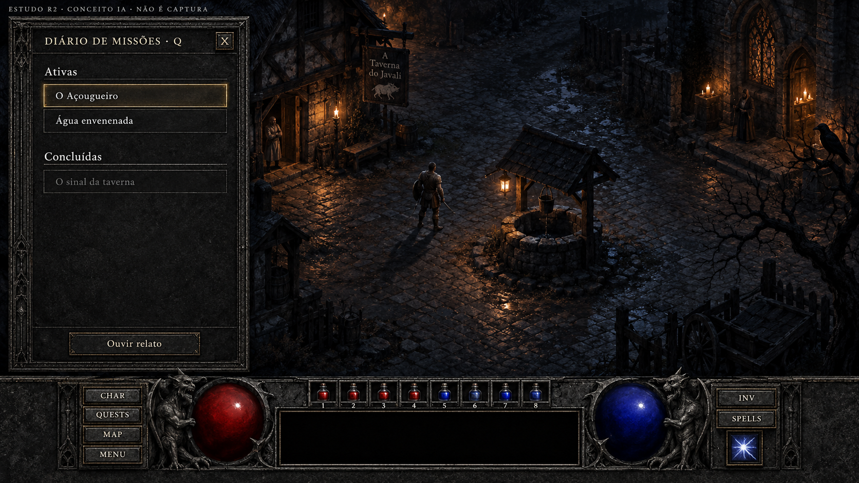
Diário de missões
Conceito gerado · R2 · candidato em revisão; não é captura do jogo.
Ver prompt original
Use case: ui-mockup. Asset type: candidate high-definition concept painting for Diablo 1 3D UI, not a screenshot and never a fake original comparison. Art direction: match the approved references' dark original Diablo 1 gothic atmosphere: charcoal stone fields, finely worn aged iron frames, pewter engraving, restrained aged brass edging, ivory readable serif text. Tiny amber highlights only for selection and candlelight; red/blue life and mana. Avoid polished MMO UI, fantasy gold filigree overload, neon, flat web UI. Background is an ORIGINAL ILLUSTRATION of nighttime Tristram cobbles, timber cottages and a well; this is illustrative concept scenery, no claim of runtime. Keep the bottom native-style continuous HUD: left CHAR/QUESTS/MAP/MENU buttons, large red life globe held by gothic gargoyles, eight numbered belt cells ABOVE the broad black information box, blue mana globe, right INV/SPELLS buttons with one separate prepared-spell tile under them. No extra permanent quickbar, no minimap except when explicitly requested for a native map mode, no stamina, cooldowns, equipment boots/gloves or invented gameplay. Preserve the free world area. All strings are PT-BR sample copy to be implemented later as live text, never baked final runtime labels. Add a subtle outside-game editorial top caption "ESTUDO R2 · CONCEITO IA · NÃO É CAPTURA". Finish as an art-directed crisp HD bitmap, textured but typography remains clear.
Primary request: FULL SCREEN1920x1080. P06 quest log open LEFT in a tall charcoalstone agediron panel, header "DIÁRIO DE MISSÕES · Q" and closeX. Clear ivory headings "Ativas" and "Concluídas". Under Ativas two selectable text entries "O Açougueiro" selected with subtle amber edge, and "Água envenenada". Under Concluídas a muted but readable "O sinal da taverna", without selectable button. Only action at panel bottom "Ouvir relato"; simple closing X at header. No progress percentages, no checklist objectives, no quest tracking arrow, no invented reward icons, no minimap. Leave enough blank breathing room below list and world right, full native bottomHUD.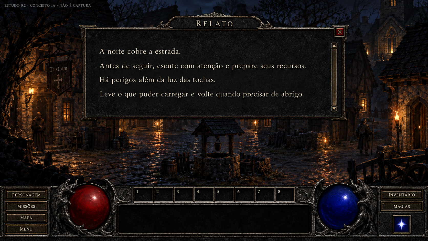
Diálogo e relato narrado
Conceito gerado · R2 · candidato em revisão; não é captura do jogo.
Ver prompt original
Use case: ui-mockup. Asset type: candidate high-definition concept painting for Diablo 1 3D UI, not a screenshot and never a fake original comparison. Art direction: match the approved references' dark original Diablo 1 gothic atmosphere: charcoal stone fields, finely worn aged iron frames, pewter engraving, restrained aged brass edging, ivory readable serif text. Tiny amber highlights only for selection and candlelight; red/blue life and mana. Avoid polished MMO UI, fantasy gold filigree overload, neon, flat web UI. Background is an ORIGINAL ILLUSTRATION of nighttime Tristram cobbles, timber cottages and a well; this is illustrative concept scenery, no claim of runtime. Keep the bottom native-style continuous HUD: left CHAR/QUESTS/MAP/MENU buttons, large red life globe held by gothic gargoyles, eight numbered belt cells ABOVE the broad black information box, blue mana globe, right INV/SPELLS buttons with one separate prepared-spell tile under them. No extra permanent quickbar, no minimap except when explicitly requested for a native map mode, no stamina, cooldowns, equipment boots/gloves or invented gameplay. Preserve the free world area. All strings are PT-BR sample copy to be implemented later as live text, never baked final runtime labels. Add a subtle outside-game editorial top caption "ESTUDO R2 · CONCEITO IA · NÃO É CAPTURA". Finish as an art-directed crisp HD bitmap, textured but typography remains clear.
Primary request: FULL SCREEN1920x1080 P07 narrated quest/NPC text. A large but restrained horizontal darkstone reading window near top-center of illustrated Tristram, width65%, height46%, between y100 andy630. Ivory large serif reading text with comfortable line height, subtle scroll indicator on right, header "RELATO", closeX. Exact author-created sample copy, set in 5 short lines: "A noite cobre a estrada. Antes de seguir, escute com atenção e prepare seus recursos. Há perigos além da luz das tochas. Leve o que puder carregar e volte quando precisar de abrigo." No NPC face portrait, no cinematic dialogue-choice tree, no play/pause media controls; the window represents native scrolling voice-synchronized text, closing retains context. World under it, bottom nativeHUD intact. No extra gameplay features.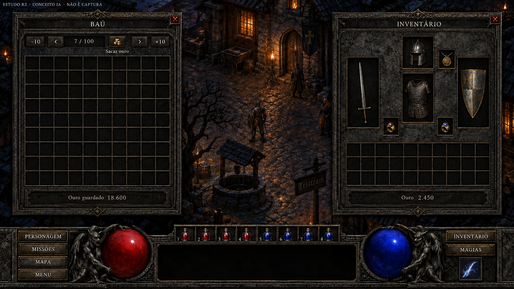
Baú e inventário
Conceito gerado · R2 · candidato em revisão; não é captura do jogo.
A grade desenhada diverge do contrato nativo. Correção pendente antes da integração.
Ver prompt original
Use case: precise-object-edit. Edit ONLY the two cell grids in this supplied concept. Preserve all frames, equipment7slots, gold values, paging/withdraw controls, illustrated world and bottomnativeHUD. LEFT BAÚ cell grid is wrong: replace it with EXACTLY TEN columns by TEN rows (100equal cells). Count ELEVEN vertical full lines and ELEVEN horizontal full lines including borders; make its area square, eachcell equal. Remove current stash item illustrations if needed to reveal correct grid. RIGHT INVENTÁRIO backpack belowequipment is wrong: replace it with EXACTLY TEN columns by FOUR rows (40equalcells), ELEVEN vertical lines and FIVE horizontal lines including border. Equal squarecells, width:height ratio2.5:1. No grid-size labels inside playerUI. If space is tight, reduce empty padding; keep7equipmentframes unchanged. Do not add/removeslots anywhereelse. Primary objective is precise grid count, not new design.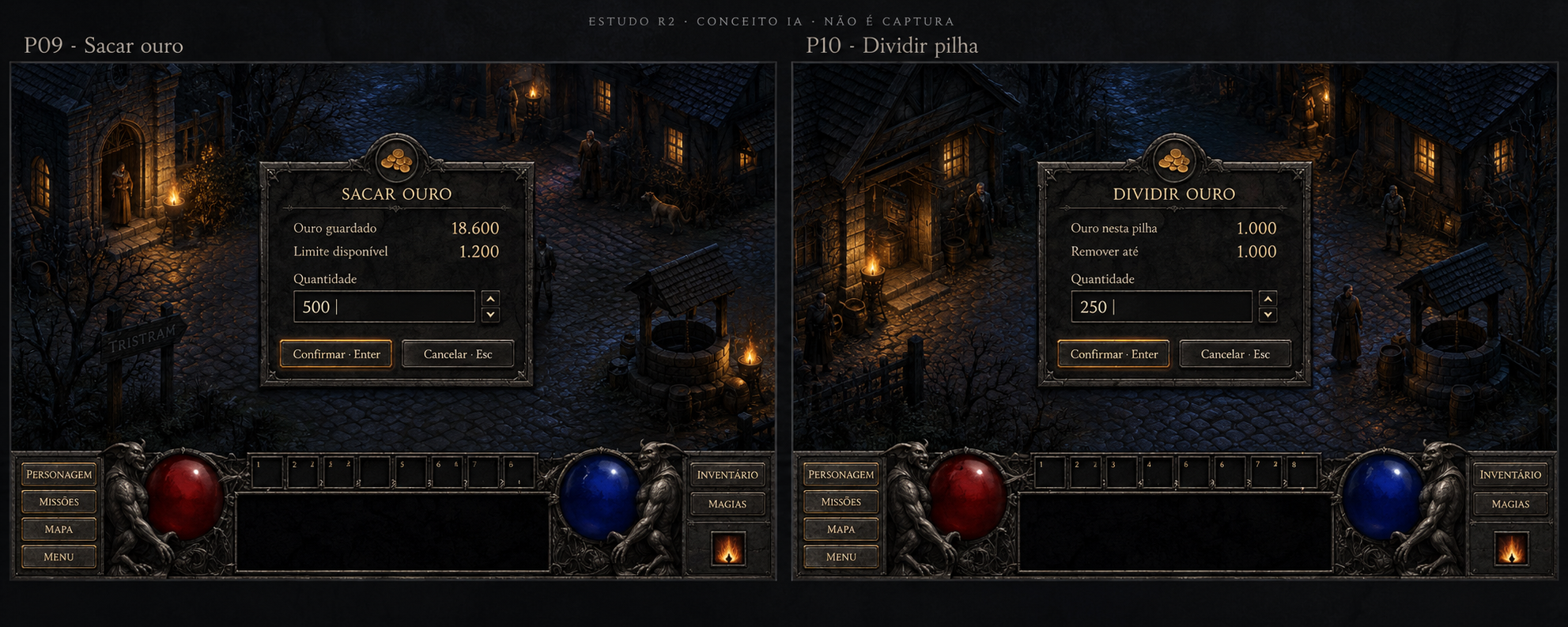
Sacar ouro do baú e dividir pilha
Conceito gerado · R2 · candidato em revisão; não é captura do jogo.
Ver prompt original
Use case: ui-mockup. Asset type: candidate high-definition concept painting for Diablo 1 3D UI, not a screenshot and never a fake original comparison. Art direction: match the approved references' dark original Diablo 1 gothic atmosphere: charcoal stone fields, finely worn aged iron frames, pewter engraving, restrained aged brass edging, ivory readable serif text. Tiny amber highlights only for selection and candlelight; red/blue life and mana. Avoid polished MMO UI, fantasy gold filigree overload, neon, flat web UI. Background is an ORIGINAL ILLUSTRATION of nighttime Tristram cobbles, timber cottages and a well; this is illustrative concept scenery, no claim of runtime. Keep the bottom native-style continuous HUD: left CHAR/QUESTS/MAP/MENU buttons, large red life globe held by gothic gargoyles, eight numbered belt cells ABOVE the broad black information box, blue mana globe, right INV/SPELLS buttons with one separate prepared-spell tile under them. No extra permanent quickbar, no minimap except when explicitly requested for a native map mode, no stamina, cooldowns, equipment boots/gloves or invented gameplay. Preserve the free world area. All strings are PT-BR sample copy to be implemented later as live text, never baked final runtime labels. Add a subtle outside-game editorial top caption "ESTUDO R2 · CONCEITO IA · NÃO É CAPTURA". Finish as an art-directed crisp HD bitmap, textured but typography remains clear.
Primary request: LARGE HD ART BOARD2560x1440 with TWO distinct screen concept frames side by side, editorial labels above them "P09 · Sacar ouro" and "P10 · Dividir pilha". Both show conceptual Tristram with nativeHUD, small centered darkstone numeric input modal, dim backdrop. LEFT modal title "SACAR OURO"; "Ouro guardado 18.600"; "Limite disponível 1.200"; framed number field label "Quantidade" value"500" with visible cursor; two actions "Confirmar · Enter" and "Cancelar · Esc". RIGHT modal title "DIVIDIR OURO"; "Ouro nesta pilha 1.000"; "Remover até 1.000"; "Quantidade" field"250"; identical Enter/Esc actions. Two distinct actions, not currency shop. Do not add bank deposit/taxes or payment icons. Numeric copy is illustrative. Draw a subtle warm coin emblem, restrained amber focus, ivory text. No minimap.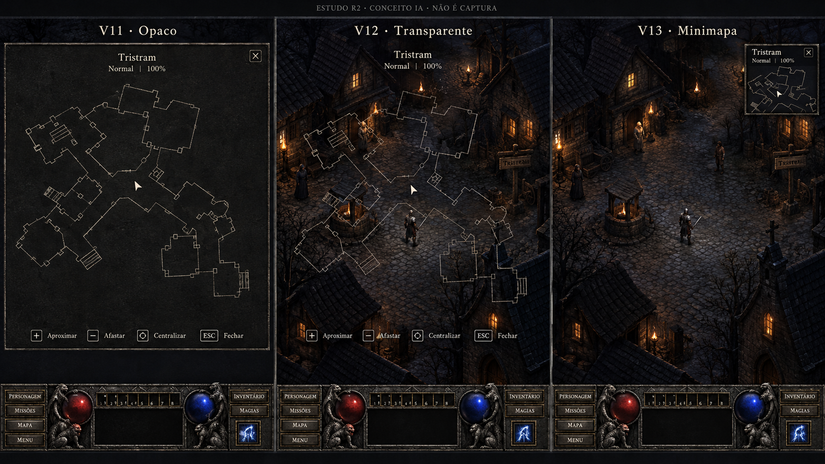
Automapa — modos opaco, transparente e minimapa
Conceito gerado · R2 · candidato em revisão; não é captura do jogo.
Ver prompt original
Use case: ui-mockup. Asset type: candidate high-definition concept painting for Diablo 1 3D UI, not a screenshot and never a fake original comparison. Art direction: match the approved references' dark original Diablo 1 gothic atmosphere: charcoal stone fields, finely worn aged iron frames, pewter engraving, restrained aged brass edging, ivory readable serif text. Tiny amber highlights only for selection and candlelight; red/blue life and mana. Avoid polished MMO UI, fantasy gold filigree overload, neon, flat web UI. Background is an ORIGINAL ILLUSTRATION of nighttime Tristram cobbles, timber cottages and a well; this is illustrative concept scenery, no claim of runtime. Keep the bottom native-style continuous HUD: left CHAR/QUESTS/MAP/MENU buttons, large red life globe held by gothic gargoyles, eight numbered belt cells ABOVE the broad black information box, blue mana globe, right INV/SPELLS buttons with one separate prepared-spell tile under them. No extra permanent quickbar, no minimap except when explicitly requested for a native map mode, no stamina, cooldowns, equipment boots/gloves or invented gameplay. Preserve the free world area. All strings are PT-BR sample copy to be implemented later as live text, never baked final runtime labels. Add a subtle outside-game editorial top caption "ESTUDO R2 · CONCEITO IA · NÃO É CAPTURA". Finish as an art-directed crisp HD bitmap, textured but typography remains clear.
Primary request: LARGE HD ART BOARD2880x1620 with THREE equally sized clearly divided full-screen concept frames, outer labels "V11 · Opaco", "V12 · Transparente", "V13 · Minimapa". SAME original illustrative isometric town/exploration plan across modes, NOT a geographical worldmap. Each has native bottomHUD. LEFT mode: opaque charcoal map field covering most of world above HUD; fine ivory blueprint lines of explored rooms/lanes, doorway gaps, stairs, directional player arrow; no fake undiscovered details. Middle mode: SAME thin ivory explored map lines over the visible dark Tristram world with true transparent visual effect, no opaque panel or parchment. RIGHT mode: world unobstructed with only a small corner map top-right, same plan/arrow in small charcoal field, NOT a permanent minimap outside this explicit mode. Native map metadata "Tristram" "Normal" "100%". Map actions shown subtly "Aproximar" "Afastar" "Centralizar" "Fechar". No GPS routes, destination markers, quest tracking or automatic navigation. Distinction must be obvious from art, not merely labels. Keep readable map motifs and silhouette.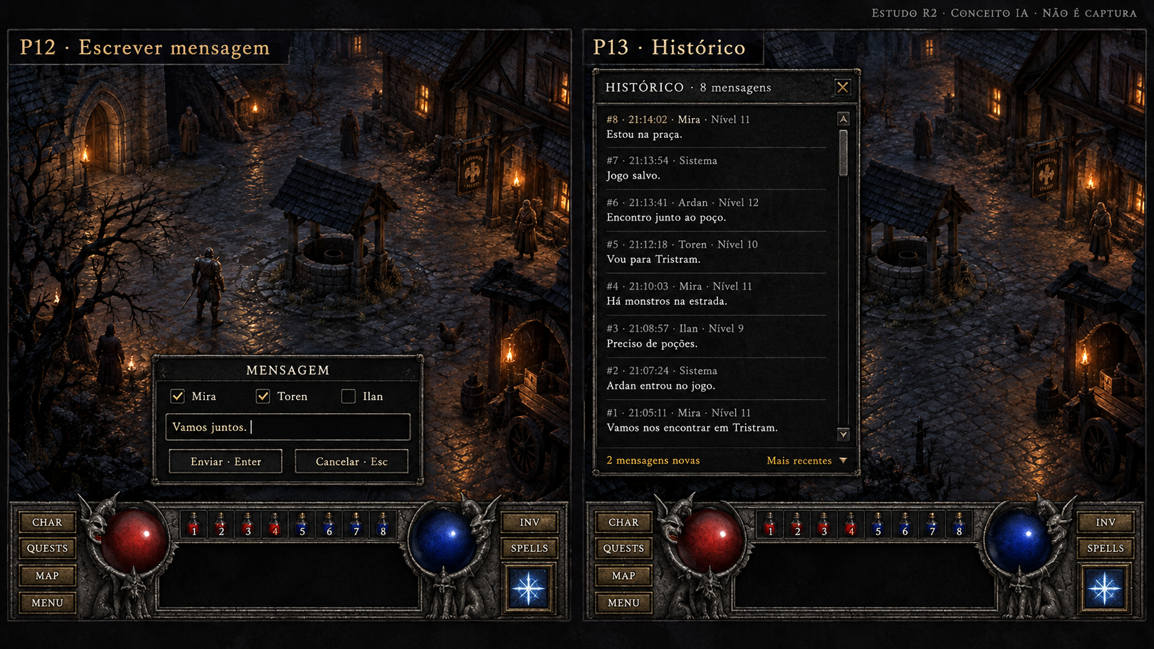
Escrever mensagem e histórico
Conceito gerado · R2 · candidato em revisão; não é captura do jogo.
Ver prompt original
Use case: ui-mockup. Asset type: candidate high-definition concept painting for Diablo 1 3D UI, not a screenshot and never a fake original comparison. Art direction: match the approved references' dark original Diablo 1 gothic atmosphere: charcoal stone fields, finely worn aged iron frames, pewter engraving, restrained aged brass edging, ivory readable serif text. Tiny amber highlights only for selection and candlelight; red/blue life and mana. Avoid polished MMO UI, fantasy gold filigree overload, neon, flat web UI. Background is an ORIGINAL ILLUSTRATION of nighttime Tristram cobbles, timber cottages and a well; this is illustrative concept scenery, no claim of runtime. Keep the bottom native-style continuous HUD: left CHAR/QUESTS/MAP/MENU buttons, large red life globe held by gothic gargoyles, eight numbered belt cells ABOVE the broad black information box, blue mana globe, right INV/SPELLS buttons with one separate prepared-spell tile under them. No extra permanent quickbar, no minimap except when explicitly requested for a native map mode, no stamina, cooldowns, equipment boots/gloves or invented gameplay. Preserve the free world area. All strings are PT-BR sample copy to be implemented later as live text, never baked final runtime labels. Add a subtle outside-game editorial top caption "ESTUDO R2 · CONCEITO IA · NÃO É CAPTURA". Finish as an art-directed crisp HD bitmap, textured but typography remains clear.
Primary request: LARGE HDARTBOARD2560x1440 TWO separate concept screens side by side, external labels "P12 · Escrever mensagem" and "P13 · Histórico". Tristram illustration+nativeHUD each. LEFT a modest lower-world text chat entry box directly aboveHUD. Title "MENSAGEM", three recipient toggle boxes "Mira" "Toren" "Ilan", Mira andToren checked andIlan unchecked. Field "Vamos juntos." with visible caret. Actions "Enviar · Enter" "Cancelar · Esc". These are TEXT recipients; no microphone, voice, audio channels or voice/mute icons. RIGHT a distinct taller darkstone chat history panel on left, header "HISTÓRICO · 8 mensagens"; scroll bar; readable author/level/timestamp entries "#8 · 21:14:02 · Mira · Nível11" then "Estou na praça."; "#7 · 21:13:54 · Sistema" then "Jogo salvo."; "#6 · 21:13:41 · Ardan · Nível12" then "Encontro junto ao poço."; bottom amber subtle "2 mensagens novas" plus "Mais recentes", closeX. Messages names/times fictional. No party invitation action or icons unrelatedtochat. World remains visible. No minimap.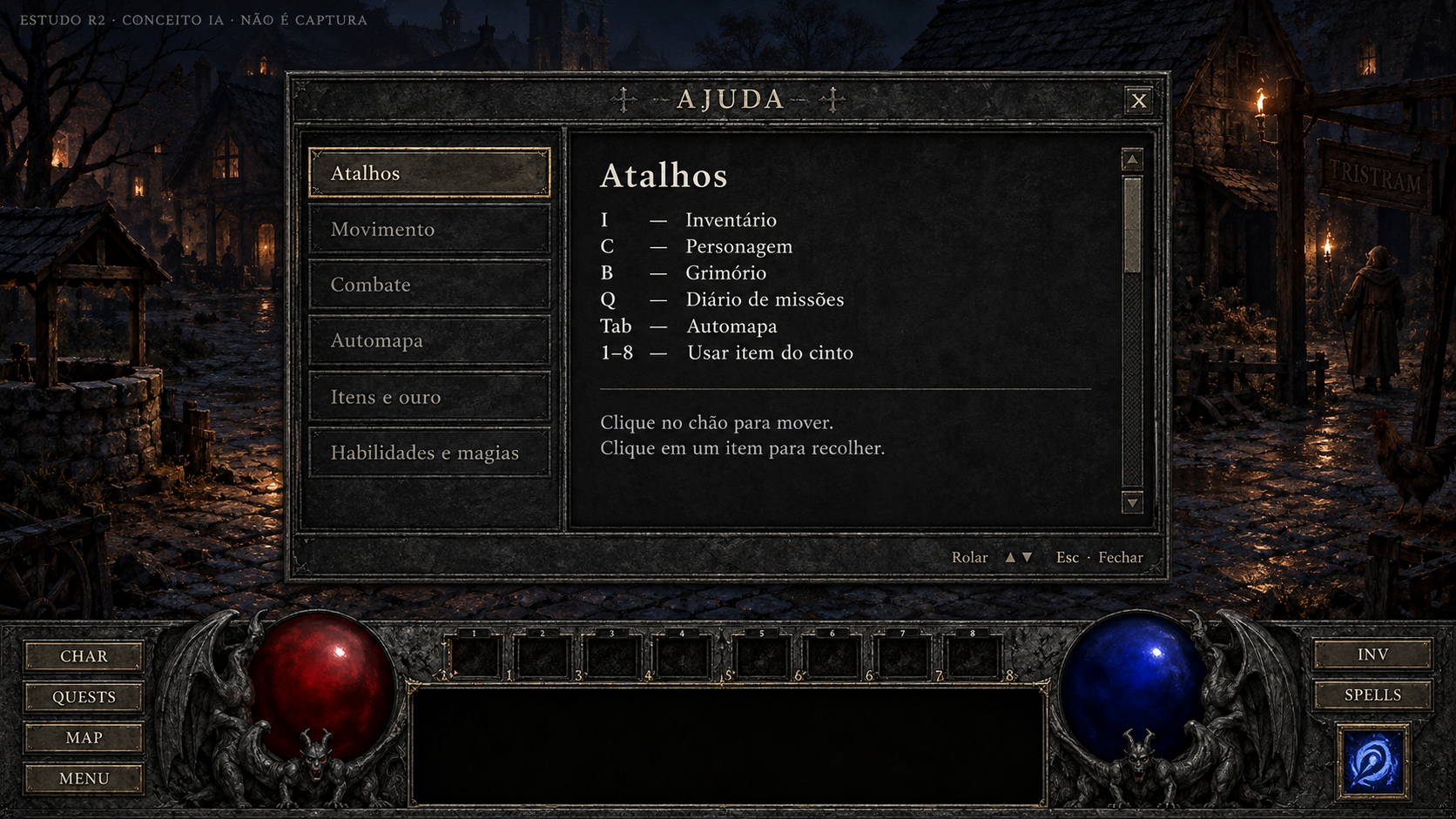
Ajuda
Conceito gerado · R2 · candidato em revisão; não é captura do jogo.
Ver prompt original
Use case: ui-mockup. Asset type: candidate high-definition concept painting for Diablo 1 3D UI, not a screenshot and never a fake original comparison. Art direction: match the approved references' dark original Diablo 1 gothic atmosphere: charcoal stone fields, finely worn aged iron frames, pewter engraving, restrained aged brass edging, ivory readable serif text. Tiny amber highlights only for selection and candlelight; red/blue life and mana. Avoid polished MMO UI, fantasy gold filigree overload, neon, flat web UI. Background is an ORIGINAL ILLUSTRATION of nighttime Tristram cobbles, timber cottages and a well; this is illustrative concept scenery, no claim of runtime. Keep the bottom native-style continuous HUD: left CHAR/QUESTS/MAP/MENU buttons, large red life globe held by gothic gargoyles, eight numbered belt cells ABOVE the broad black information box, blue mana globe, right INV/SPELLS buttons with one separate prepared-spell tile under them. No extra permanent quickbar, no minimap except when explicitly requested for a native map mode, no stamina, cooldowns, equipment boots/gloves or invented gameplay. Preserve the free world area. All strings are PT-BR sample copy to be implemented later as live text, never baked final runtime labels. Add a subtle outside-game editorial top caption "ESTUDO R2 · CONCEITO IA · NÃO É CAPTURA". Finish as an art-directed crisp HD bitmap, textured but typography remains clear.
Primary request: FULLSCREEN1920x1080. P14 help window centered above nativeHUD, width70%height70%, dark charcoalstone/pewter. Header "AJUDA", closeX. Wide readable scrollable text area with large ivory headings "Atalhos", "Movimento", "Combate", "Automapa", "Itens e ouro", "Habilidades e magias"; current section Atalhos lists exactly "I — Inventário", "C — Personagem", "B — Grimório", "Q — Diário de missões", "Tab — Automapa", "1–8 — Usar item do cinto". Below a short sample "Clique no chão para mover. Clique em um item para recolher." Native-style simple narrow scrollbar on right and footer "Rolar" "Esc · Fechar". No online guides, searchbars, external websites or invented key limits. Tristram conceptual world behind, native bottomHUD. Text is sample and shortcuts later driven by real configuration.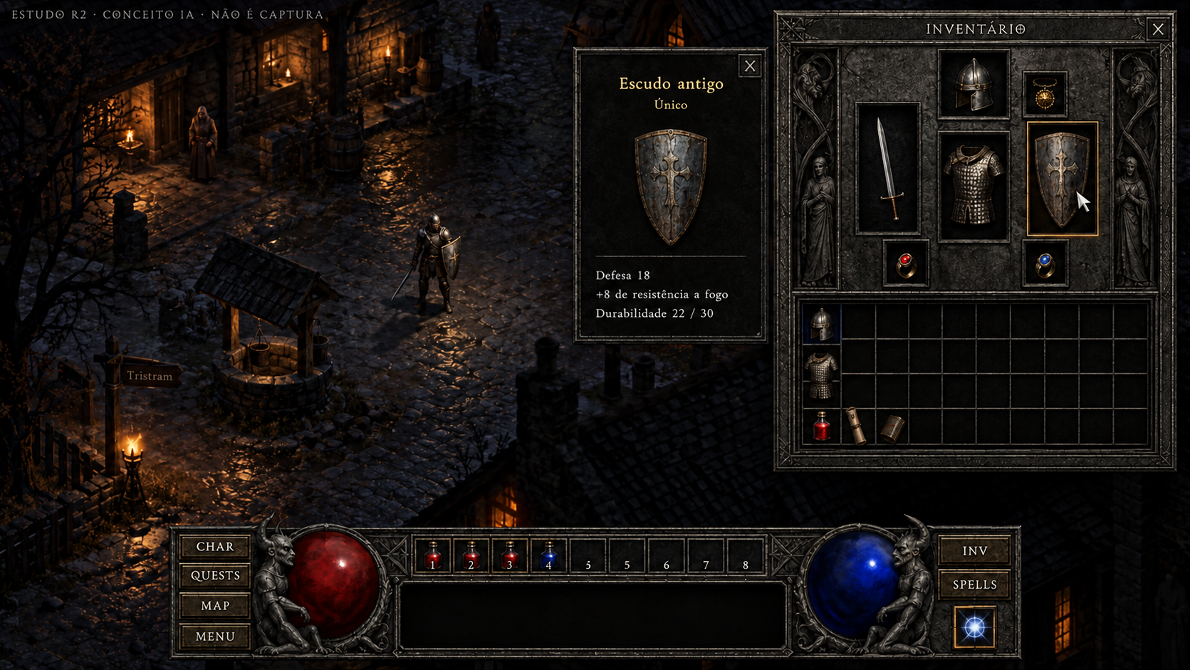
Detalhes de item único
Conceito gerado · R2 · candidato em revisão; não é captura do jogo.
Ver prompt original
Use case: precise-object-edit. The supplied P15 concept inventory backpack incorrectly has FIVE horizontal rows. Make one focused edit: REMOVE THE BOTTOM FIFTH ROW of backpack cells and its item illustrations, bringing the lower backpack frame up exactly one row. Keep the remaining TEN columns and FOUR rows, forty cells, with eleven vertical lines and five horizontal lines including border. Move remaining backpack contents only as needed. Preserve all seven equipment receptacles above, shield detail card, all text, original illustration, native bottom HUD and layout. No other changes. Do not merely empty the fifth row: the fifth row must physically disappear. A compact empty strip below the four-row backpack is fine.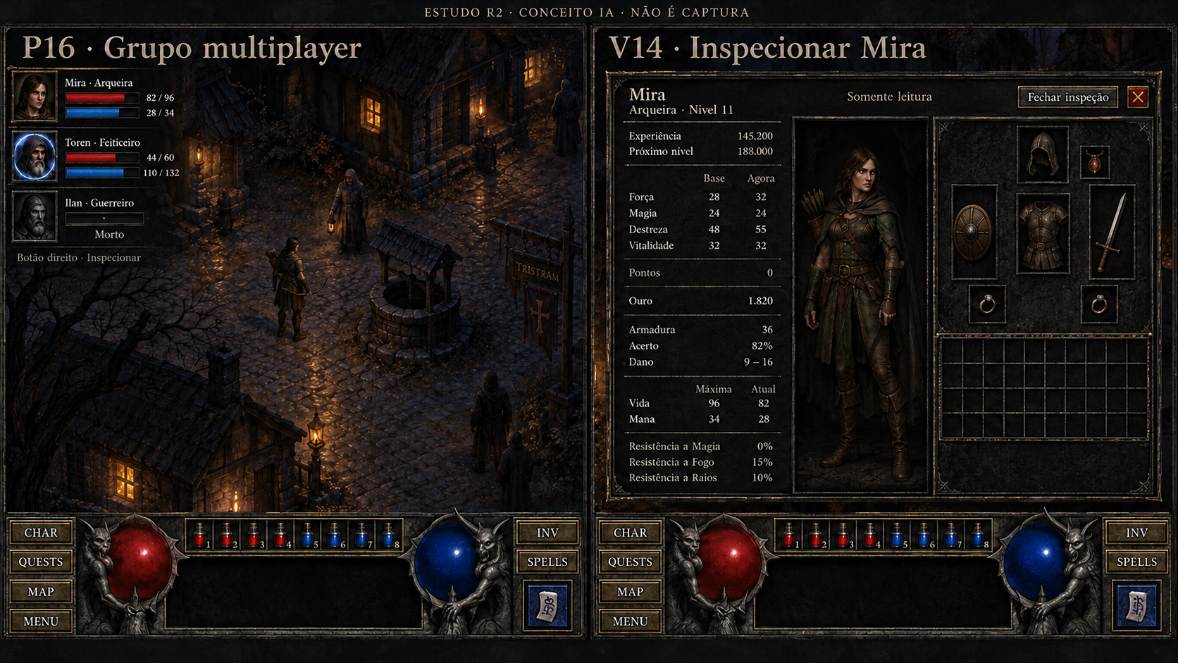
Grupo e inspeção de aliado
Conceito gerado · R2 · candidato em revisão; não é captura do jogo.
Ver prompt original
Use case: precise-object-edit. In the RIGHT inspection frame only, replace the bow in Mira's left hand equipment receptacle with a short one-handed sword, and replace the single arrow in the right hand receptacle with a small wooden round shield. An individual arrow is not a valid native equipped item; this corrects that error. Keep EXACTLY seven equipment receptacles, all other inventory items and backpack grid unchanged. Preserve read-only state, all statistics, portraits, character illustration, party frame on left, dark materials and bottom HUD. No new buttons or items elsewhere.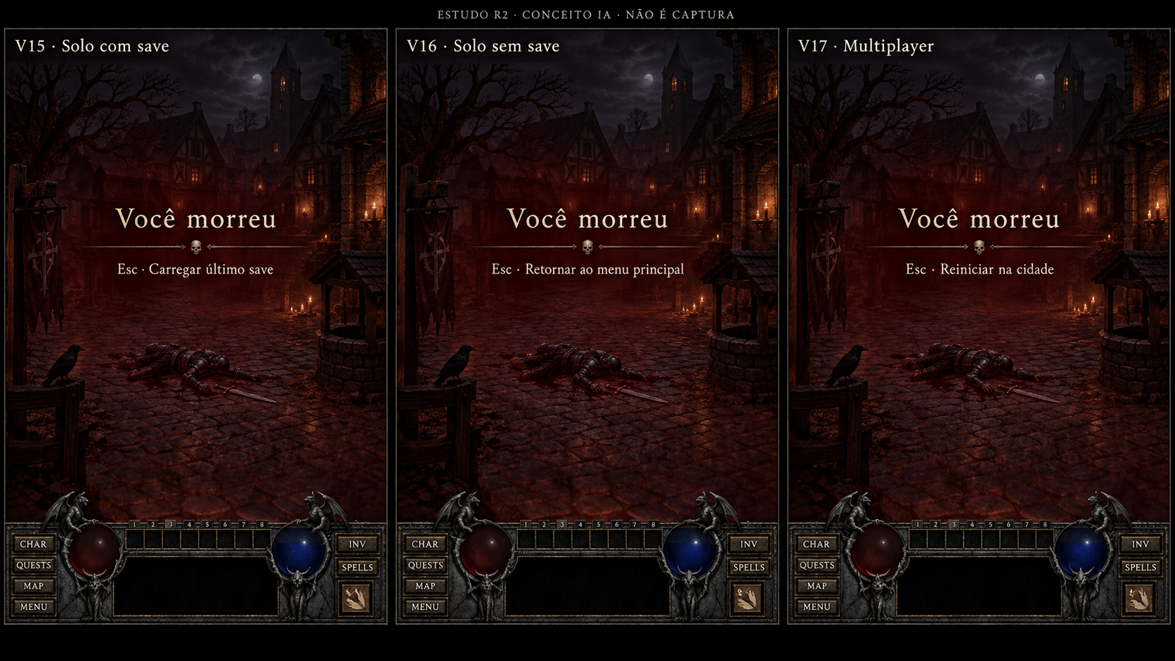
Morte — solo com save, solo sem save e multijogador
Conceito gerado · R2 · candidato em revisão; não é captura do jogo.
Ver prompt original
Use case: ui-mockup. Asset type: candidate high-definition concept painting for Diablo 1 3D UI, not a screenshot and never a fake original comparison. Art direction: match the approved references' dark original Diablo 1 gothic atmosphere: charcoal stone fields, finely worn aged iron frames, pewter engraving, restrained aged brass edging, ivory readable serif text. Tiny amber highlights only for selection and candlelight; red/blue life and mana. Avoid polished MMO UI, fantasy gold filigree overload, neon, flat web UI. Background is an ORIGINAL ILLUSTRATION of nighttime Tristram cobbles, timber cottages and a well; this is illustrative concept scenery, no claim of runtime. Keep the bottom native-style continuous HUD: left CHAR/QUESTS/MAP/MENU buttons, large red life globe held by gothic gargoyles, eight numbered belt cells ABOVE the broad black information box, blue mana globe, right INV/SPELLS buttons with one separate prepared-spell tile under them. No extra permanent quickbar, no minimap except when explicitly requested for a native map mode, no stamina, cooldowns, equipment boots/gloves or invented gameplay. Preserve the free world area. All strings are PT-BR sample copy to be implemented later as live text, never baked final runtime labels. Add a subtle outside-game editorial top caption "ESTUDO R2 · CONCEITO IA · NÃO É CAPTURA". Finish as an art-directed crisp HD bitmap, textured but typography remains clear.
Primary request: LARGEHDARTBOARD2880x1620 THREE distinct concept screens side by side, external editorial labels "V15 · Solo com save", "V16 · Solo sem save", "V17 · Multiplayer". Each frame shows same originalILLUSTRATIONfallenarmoredhero onTristramcobbles, darkcrimson death tint over world, nativebottomHUD with EMPTY redlifeglobe. Centerivorytext "Você morreu" with ONLYONEvalidcontextualaction beneath it: LEFT "Esc · Carregar último save"; MIDDLE "Esc · Retornar ao menu principal"; RIGHT "Esc · Reiniciar na cidade". No otherchoices inanyframe, no genericFechar, no resurrectioncashshop, no countdown, no restartdungeon invention. Do not puttechnicalmodeconditioninsidegame UI; frame labelsoutsidegamearecomparisoneditorial. Restrainedgothictext, novastornamentalmenu. Fallenherodistantnon-graphic.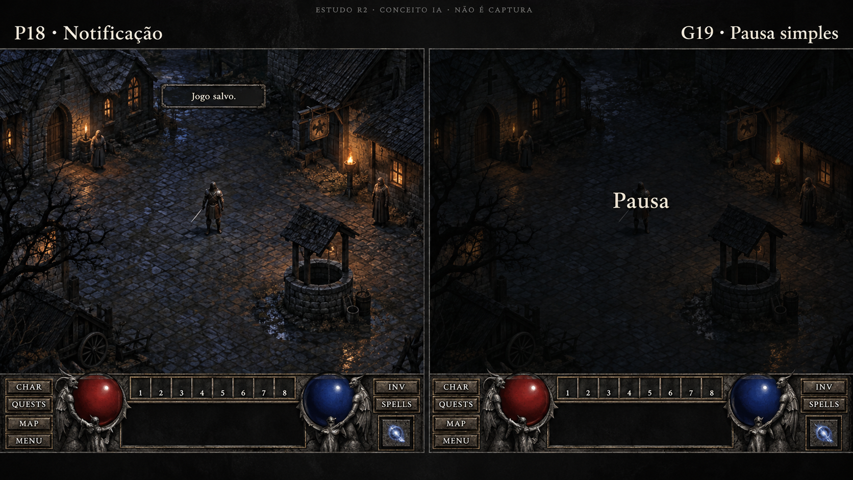
Notificação da partida e pausa simples
Conceito gerado · R2 · candidato em revisão; não é captura do jogo.
Ver prompt original
Use case: ui-mockup. Asset type: candidate high-definition concept painting for Diablo 1 3D UI, not a screenshot and never a fake original comparison. Art direction: match the approved references' dark original Diablo 1 gothic atmosphere: charcoal stone fields, finely worn aged iron frames, pewter engraving, restrained aged brass edging, ivory readable serif text. Tiny amber highlights only for selection and candlelight; red/blue life and mana. Avoid polished MMO UI, fantasy gold filigree overload, neon, flat web UI. Background is an ORIGINAL ILLUSTRATION of nighttime Tristram cobbles, timber cottages and a well; this is illustrative concept scenery, no claim of runtime. Keep the bottom native-style continuous HUD: left CHAR/QUESTS/MAP/MENU buttons, large red life globe held by gothic gargoyles, eight numbered belt cells ABOVE the broad black information box, blue mana globe, right INV/SPELLS buttons with one separate prepared-spell tile under them. No extra permanent quickbar, no minimap except when explicitly requested for a native map mode, no stamina, cooldowns, equipment boots/gloves or invented gameplay. Preserve the free world area. All strings are PT-BR sample copy to be implemented later as live text, never baked final runtime labels. Add a subtle outside-game editorial top caption "ESTUDO R2 · CONCEITO IA · NÃO É CAPTURA". Finish as an art-directed crisp HD bitmap, textured but typography remains clear.
Primary request: LARGEHDARTBOARD2560x1440 TWOclearlyseparatedconceptscreenssidebyside. Externallabels "P18 · Notificação" and "G19 · Pausa simples". SameoriginalTristramillustrationandnativebottomHUD. LEFT: smalltemporarysystemmessage atuppercenter "Jogo salvo." inivoryserif on averyrestrainedcharcoal/pewter horizontalplate; NOconfirmbutton, NOmandatorydialog, noothermessages. RIGHT: simplepausedworldwithONLYcenteredword "Pausa" inivory, absolutely NOmenuoptions, no panel frame, noresume/save/quitlist, no big logo, noinventedcontrols. Pauseisaseparateplainnativeoverlay. Bothworldsmostlyunobstructed, nomap. Avoidaddingtimersorprogressbars.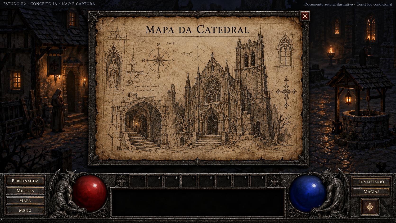
Mapa da Catedral
Conceito gerado · R2 · candidato em revisão; não é captura do jogo.
Ver prompt original
Use case: ui-mockup. Asset type: candidate high-definition concept painting for Diablo 1 3D UI, not a screenshot and never a fake original comparison. Art direction: match the approved references' dark original Diablo 1 gothic atmosphere: charcoal stone fields, finely worn aged iron frames, pewter engraving, restrained aged brass edging, ivory readable serif text. Tiny amber highlights only for selection and candlelight; red/blue life and mana. Avoid polished MMO UI, fantasy gold filigree overload, neon, flat web UI. Background is an ORIGINAL ILLUSTRATION of nighttime Tristram cobbles, timber cottages and a well; this is illustrative concept scenery, no claim of runtime. Keep the bottom native-style continuous HUD: left CHAR/QUESTS/MAP/MENU buttons, large red life globe held by gothic gargoyles, eight numbered belt cells ABOVE the broad black information box, blue mana globe, right INV/SPELLS buttons with one separate prepared-spell tile under them. No extra permanent quickbar, no minimap except when explicitly requested for a native map mode, no stamina, cooldowns, equipment boots/gloves or invented gameplay. Preserve the free world area. All strings are PT-BR sample copy to be implemented later as live text, never baked final runtime labels. Add a subtle outside-game editorial top caption "ESTUDO R2 · CONCEITO IA · NÃO É CAPTURA". Finish as an art-directed crisp HD bitmap, textured but typography remains clear.
Primary request: FULL SCREEN 1920x1080. P19 special Cathedral Map document item. Center a large aged vellum parchment over illustrated Tristram and above native bottom HUD. Charcoalstone/agediron thin outer holder, close X. Parchment title "MAPA DA CATEDRAL". Original hand-drawn ink sketch: cathedral facade with tall tower, a crypt descent motif, small star-like arcane cartographic marks, marginal hatch lines; rough antique document, NOT same explored automap geometry. No GPS, no quest markers, no clickable route, no world atlas, no navigation buttons. Small editorial note OUTSIDE the game frame "Documento autoral ilustrativo · Conteúdo condicional"; not native lore copy. Inside parchment no invented prose or canonicity claim. Native HUD visible. Keep composition different from automap boards, warm worn ivory paper but overall dark Diablo1 mood.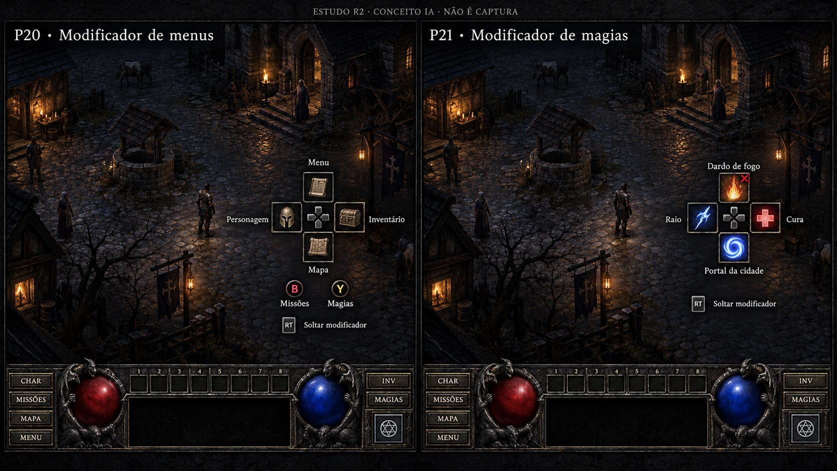
Auxiliares do controle — menus e magias
Conceito gerado · R2 · candidato em revisão; não é captura do jogo.
Ver prompt original
Use case: ui-mockup. Asset type: candidate high-definition concept painting for Diablo 1 3D UI, not a screenshot and never a fake original comparison. Art direction: match the approved references' dark original Diablo 1 gothic atmosphere: charcoal stone fields, finely worn aged iron frames, pewter engraving, restrained aged brass edging, ivory readable serif text. Tiny amber highlights only for selection and candlelight; red/blue life and mana. Avoid polished MMO UI, fantasy gold filigree overload, neon, flat web UI. Background is an ORIGINAL ILLUSTRATION of nighttime Tristram cobbles, timber cottages and a well; this is illustrative concept scenery, no claim of runtime. Keep the bottom native-style continuous HUD: left CHAR/QUESTS/MAP/MENU buttons, large red life globe held by gothic gargoyles, eight numbered belt cells ABOVE the broad black information box, blue mana globe, right INV/SPELLS buttons with one separate prepared-spell tile under them. No extra permanent quickbar, no minimap except when explicitly requested for a native map mode, no stamina, cooldowns, equipment boots/gloves or invented gameplay. Preserve the free world area. All strings are PT-BR sample copy to be implemented later as live text, never baked final runtime labels. Add a subtle outside-game editorial top caption "ESTUDO R2 · CONCEITO IA · NÃO É CAPTURA". Finish as an art-directed crisp HD bitmap, textured but typography remains clear.
Primary request: LARGE HD ART BOARD 2560x1440, TWO separate concept screens side by side with outer labels "P20 · Modificador de menus" and "P21 · Modificador de magias". Same Tristram illustrated world and native bottom HUD; each has a small transient cross-shaped group of FOUR square icon hints over world near lower-right, not a circular radial gameplay menu. LEFT cross: above "Menu", right "Inventário", below "Mapa", left "Personagem"; two small adjacent face-button hints "Missões" and "Magias". Tiny native-controller hint "Soltar modificador". RIGHT cross: above fire icon "Dardo de fogo", right healing icon "Cura", below scroll/portal icon "Portal da cidade", left lightning icon "Raio"; small invalid marker on fire in Tristram, text remains readable. Exactly four spell hints in this transient cross, no permanent magic hotbar or claim four is total shortcut limit. Use neutral simple controller directional/button glyphs that stay coherent. No minimap, cooldowns, extra skills or new wheel actions.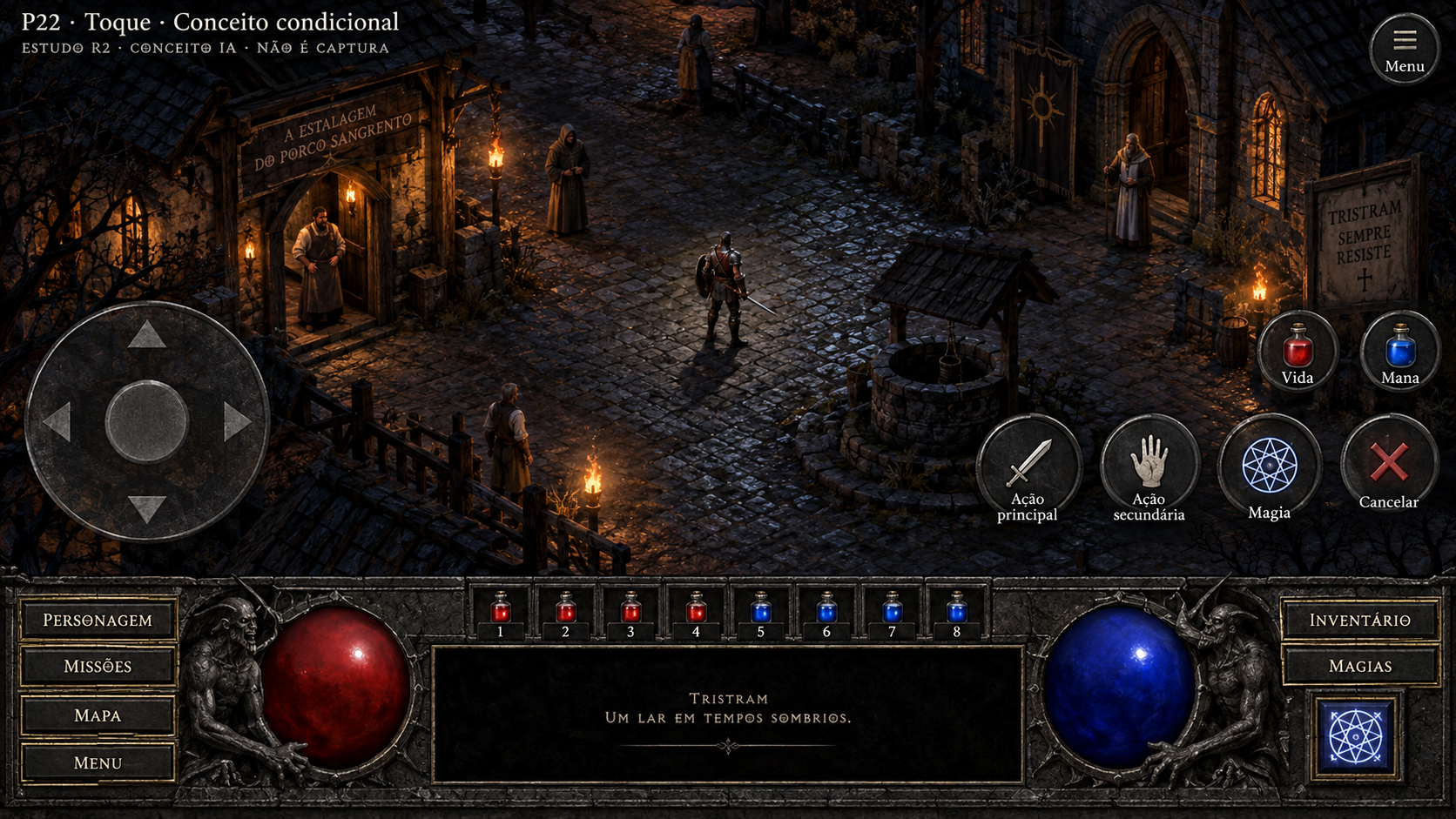
Controles de toque
Conceito gerado · R2 · candidato em revisão; não é captura do jogo.
Ver prompt original
Use case: ui-mockup. Asset type: candidate high-definition concept painting for Diablo 1 3D UI, not a screenshot and never a fake original comparison. Art direction: match the approved references' dark original Diablo 1 gothic atmosphere: charcoal stone fields, finely worn aged iron frames, pewter engraving, restrained aged brass edging, ivory readable serif text. Tiny amber highlights only for selection and candlelight; red/blue life and mana. Avoid polished MMO UI, fantasy gold filigree overload, neon, flat web UI. Background is an ORIGINAL ILLUSTRATION of nighttime Tristram cobbles, timber cottages and a well; this is illustrative concept scenery, no claim of runtime. Keep the bottom native-style continuous HUD: left CHAR/QUESTS/MAP/MENU buttons, large red life globe held by gothic gargoyles, eight numbered belt cells ABOVE the broad black information box, blue mana globe, right INV/SPELLS buttons with one separate prepared-spell tile under them. No extra permanent quickbar, no minimap except when explicitly requested for a native map mode, no stamina, cooldowns, equipment boots/gloves or invented gameplay. Preserve the free world area. All strings are PT-BR sample copy to be implemented later as live text, never baked final runtime labels. Add a subtle outside-game editorial top caption "ESTUDO R2 · CONCEITO IA · NÃO É CAPTURA". Finish as an art-directed crisp HD bitmap, textured but typography remains clear.
Primary request: FULL SCREEN 1920x1080 landscape conceptual touch controls for native Diablo1, original illustrated Tristram behind, native bottom HUD coherent. Overlay a large translucent stone/pewter virtual direction pad at lower-left WORLD area ABOVE HUD, subtly transparent four-way arrows and center thumb ring. Lower-right WORLD area ABOVE HUD has touch-sized distinct circular/rounded buttons: sword for "Ação principal", hand for "Ação secundária", magic glyph for "Magia", X for "Cancelar"; two small red/blue potion touch buttons "Vida" and "Mana"; compact "Menu" button top-right. Existing character/inventory/quests/grimório HUD controls remain accessible with sufficiently large targets. No minimap. NO "Ficar parado" in Tristram (that is dungeon conditional); do not add stamina, dodge, jump or cooldowns. Keep center world unobstructed for selection. Make these clearly translucent native touch affordances, not smartphone app nav bars. External editorial caption "P22 · Toque · Conceito condicional".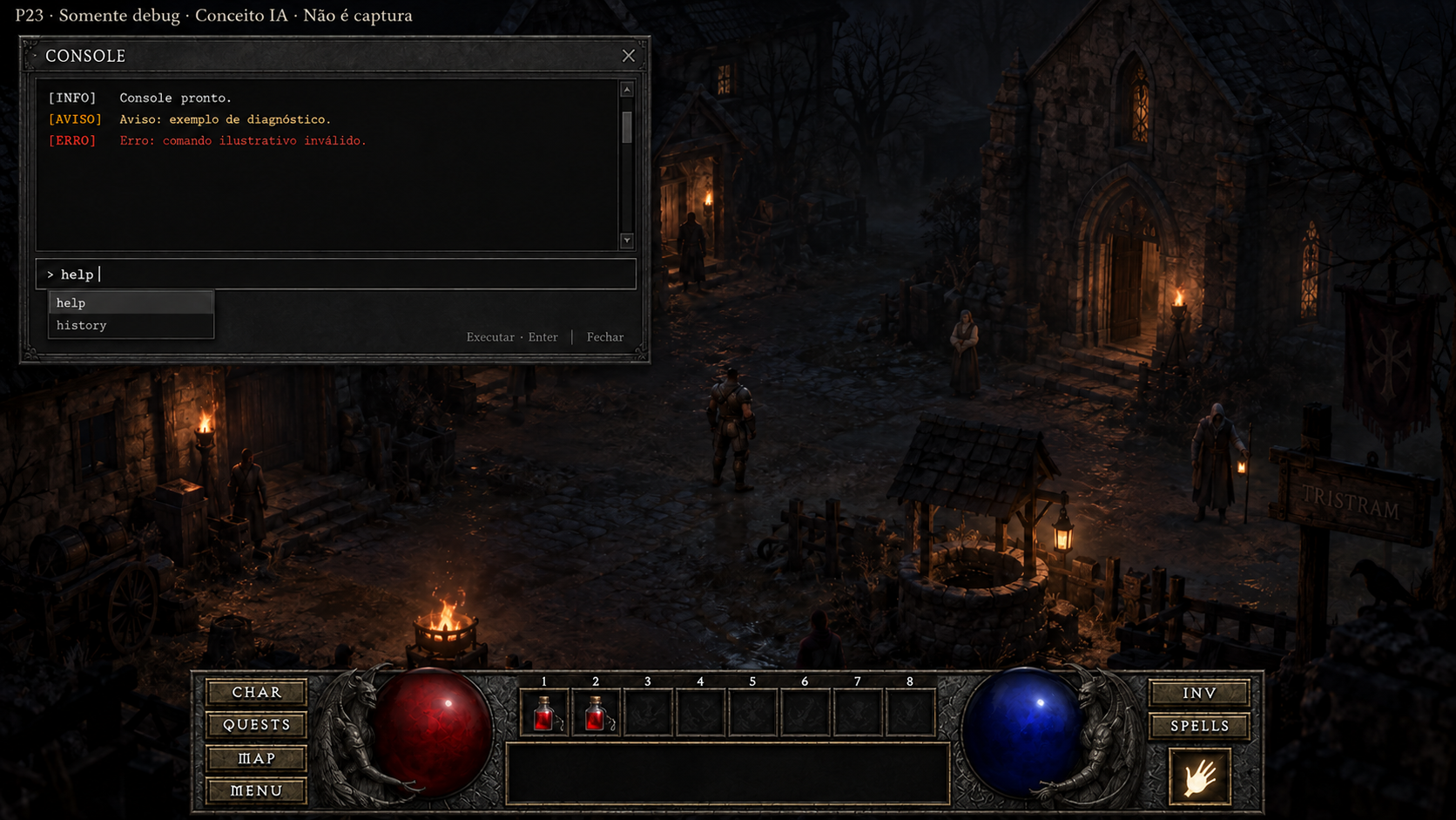
Console de desenvolvimento
Conceito gerado · R2 · candidato em revisão; não é captura do jogo.
Ver prompt original
Use case: precise-object-edit. Image1 is the edit target: the P23 debug console concept. Image2 is a supporting reference ONLY for the native continuous bottom HUD layout. Correct ONLY the lower20% HUD in Image1; the current little permanent magic hotbar is wrong. Replace it with the layout of Image2: LEFT four utility buttons CHAR/QUESTS/MAP/MENU; red life globe; exactly EIGHT numbered belt cells in one row ABOVE a wide black information field; blue mana globe; RIGHT INV/SPELLS buttons and ONE separate prepared-spell tile below them. No extra permanent magic slots. Preserve the console frame, its output/warning/error, autocomplete and entry, upper editorial disclaimer, illustrated Tristram world above HUD. Keep style charcoalstone, agediron, pewter and ivory text. Do not copy the reference's whole world or change console composition. Main purpose is to restore all native HUD controls.Diálogo e comércio
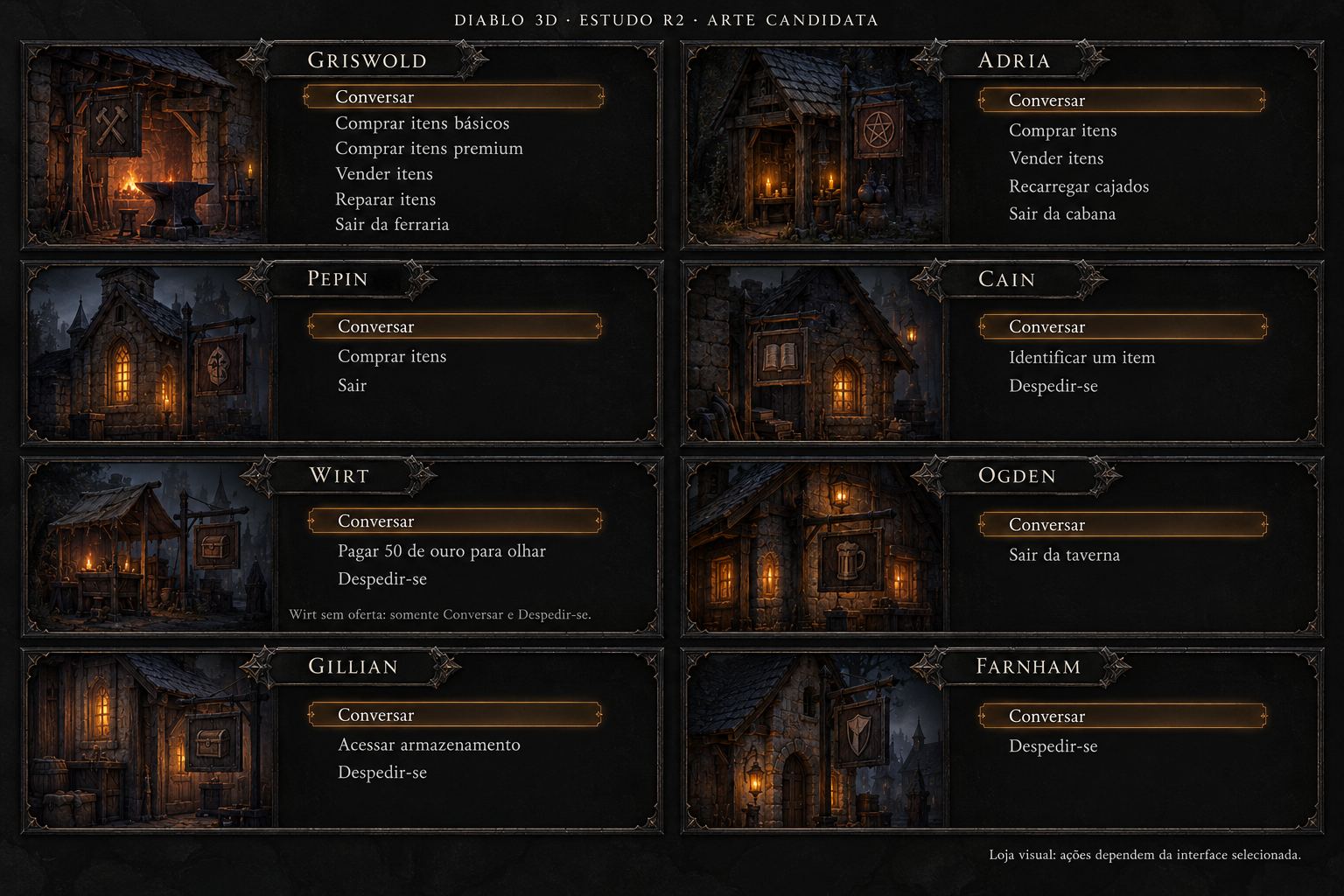
NPCs — oito menus iniciais
Conceito gerado · R2 · candidato em revisão; não é captura do jogo.
Ver prompt original
Use case: ui-mockup. Create a brand-new original raster concept for Diablo 3D HUD r2, a finished comparison-ready UI art board. This is candidate art, never an original game screenshot. High resolution landscape 3072×2048 if possible; crisp legible Portuguese typography. Same design language as the inspected HUD study: charcoal stone and black leather surfaces, forged dark iron, fine pewter edge filigree, restrained aged-brass details, ivory serif text, amber focus. Solid opaque near-black content areas, quiet thin ornament, generous line spacing, no noisy stone behind text. Material depth only at edges. The world, if shown, is a tiny subdued Tristram setting, not the focus. No invented NPC portraits, no character artwork or models, no logos, no promotional copy. Small board header exactly: 'DIABLO 3D · ESTUDO R2 · ARTE CANDIDATA'. Keep every UI text inside its own bounds. Functional controls must be exactly those specified. No extra tabs, buttons, shortcuts, features, currencies or stat types. No side labeled original and no split before/after. Native data remains authoritative; numeric examples are illustrative. Modern placement/proportion allowed, existing actions/capacities remain unchanged.

One coherent 2-column by 4-row board showing all eight native town NPC menu variants, no portraits, each panel with name header and text actions. Keep enough whitespace for the longest six-row panel. Each panel is a complete menu, no footer controls beyond its existing exit action. Text verbatim by panel: GRISWOLD / Conversar / Comprar itens básicos / Comprar itens premium / Vender itens / Reparar itens / Sair da ferraria. ADRIA / Conversar / Comprar itens / Vender itens / Recarregar cajados / Sair da cabana. PEPIN / Conversar / Comprar itens / Sair. CAIN / Conversar / Identificar um item / Despedir-se. WIRT / Conversar / Pagar 50 de ouro para olhar / Despedir-se. OGDEN / Conversar / Sair da taverna. GILLIAN / Conversar / Acessar armazenamento / Despedir-se. FARNHAM / Conversar / Despedir-se. Do not add sell to Pepin or Wirt. Wirt's payment is before seeing the offer, never the purchase price. Do not invent a healing button: Pepin heals automatically. Add small neutral board notes outside player menus only: 'Loja visual: ações dependem da interface selecionada' and 'Wirt sem oferta: somente Conversar e Despedir-se'. These are evidence labels, not clickable actions. This board must make all eight menus visibly different only in their legitimate actions.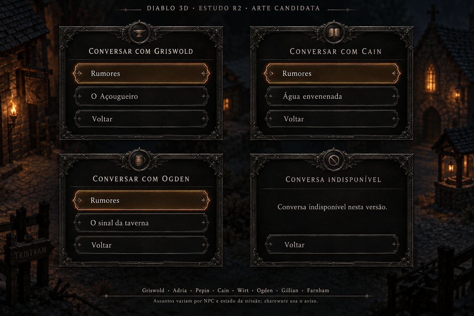
NPCs — assuntos e shareware
Conceito gerado · R2 · candidato em revisão; não é captura do jogo.
Ver prompt original
Use case: ui-mockup. Create a brand-new original raster concept for Diablo 3D HUD r2, a finished comparison-ready UI art board. This is candidate art, never an original game screenshot. High resolution landscape 3072×2048 if possible; crisp legible Portuguese typography. Same design language as the inspected HUD study: charcoal stone and black leather surfaces, forged dark iron, fine pewter edge filigree, restrained aged-brass details, ivory serif text, amber focus. Solid opaque near-black content areas, quiet thin ornament, generous line spacing, no noisy stone behind text. Material depth only at edges. The world, if shown, is a tiny subdued Tristram setting, not the focus. No invented NPC portraits, no character artwork or models, no logos, no promotional copy. Small board header exactly: 'DIABLO 3D · ESTUDO R2 · ARTE CANDIDATA'. Keep every UI text inside its own bounds. Functional controls must be exactly those specified. No extra tabs, buttons, shortcuts, features, currencies or stat types. No side labeled original and no split before/after. Native data remains authoritative; numeric examples are illustrative. Modern placement/proportion allowed, existing actions/capacities remain unchanged.

A polished 2×2 board of reusable NPC conversation-subject layouts, not new portraits. Panel 1 full example: header 'CONVERSAR COM GRISWOLD', rows 'Rumores', 'O Açougueiro', 'Voltar'. Panel 2 full example: 'CONVERSAR COM CAIN', rows 'Rumores', 'Água envenenada', 'Voltar'. Panel 3: 'CONVERSAR COM OGDEN', rows 'Rumores', 'O sinal da taverna', 'Voltar'. Panel 4: 'CONVERSA INDISPONÍVEL', text 'Conversa indisponível nesta versão.', single action 'Voltar'. A subtle amber focus on one actual topic. No simulated dialogue prose, no chat bubbles, no accept quest button. Outside panels add a small noninteractive native-coverage footer: 'Griswold · Adria · Pepin · Cain · Wirt · Ogden · Gillian · Farnham' and 'Assuntos variam por NPC e estado da missão; shareware usa o aviso.' The example topics do not claim every NPC always has that quest. Long narrated report is a different UI, not part of this board.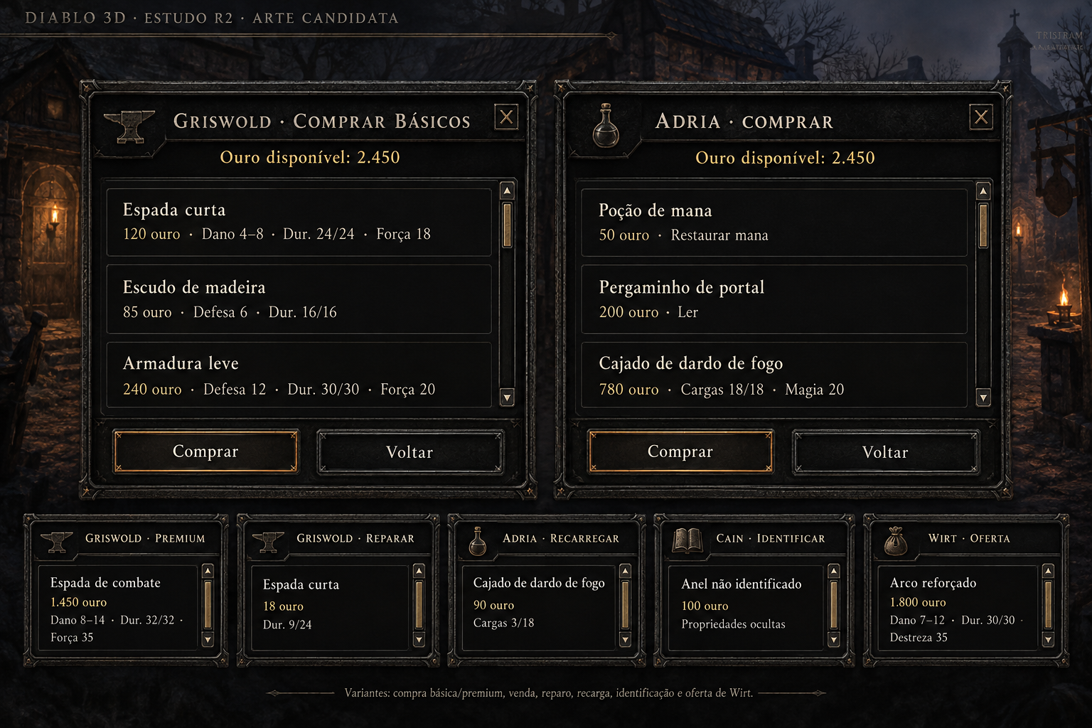
Comércio — lista textual e dados
Conceito gerado · R2 · candidato em revisão; não é captura do jogo.
Ver prompt original
Use case: ui-mockup. Create a brand-new original raster concept for Diablo 3D HUD r2, a finished comparison-ready UI art board. This is candidate art, never an original game screenshot. High resolution landscape 3072×2048 if possible; crisp legible Portuguese typography. Same design language as the inspected HUD study: charcoal stone and black leather surfaces, forged dark iron, fine pewter edge filigree, restrained aged-brass details, ivory serif text, amber focus. Solid opaque near-black content areas, quiet thin ornament, generous line spacing, no noisy stone behind text. Material depth only at edges. The world, if shown, is a tiny subdued Tristram setting, not the focus. No invented NPC portraits, no character artwork or models, no logos, no promotional copy. Small board header exactly: 'DIABLO 3D · ESTUDO R2 · ARTE CANDIDATA'. Keep every UI text inside its own bounds. Functional controls must be exactly those specified. No extra tabs, buttons, shortcuts, features, currencies or stat types. No side labeled original and no split before/after. Native data remains authoritative; numeric examples are illustrative. Modern placement/proportion allowed, existing actions/capacities remain unchanged.

Create a detailed commerce list design sheet with two large panels side by side and a narrow bottom row of compact service examples. No item thumbnails in this archetype: it is text-list mode. Left large panel 'GRISWOLD · COMPRAR BÁSICOS'; 'Ouro disponível: 2.450'; three separated rows verbatim: 'Espada curta' / '120 ouro · Dano 4–8 · Dur. 24/24 · Força 18'; 'Escudo de madeira' / '85 ouro · Defesa 6 · Dur. 16/16'; 'Armadura leve' / '240 ouro · Defesa 12 · Dur. 30/30 · Força 20'; controls 'Comprar' and 'Voltar'. Right large panel 'ADRIA · COMPRAR'; 'Ouro disponível: 2.450'; rows 'Poção de mana' / '50 ouro · Restaurar mana'; 'Pergaminho de portal' / '200 ouro · Ler'; 'Cajado de dardo de fogo' / '780 ouro · Cargas 18/18 · Magia 20'; controls 'Comprar' and 'Voltar'. Bottom five compact state cards retain data and operation labels: 'GRISWOLD · PREMIUM' / 'Espada de combate' / '1.450 ouro · Dano 8–14 · Dur. 32/32 · Força 35'; 'GRISWOLD · REPARAR' / 'Espada curta' / '18 ouro · Dur. 9/24'; 'ADRIA · RECARREGAR' / 'Cajado de dardo de fogo' / '90 ouro · Cargas 3/18'; 'CAIN · IDENTIFICAR' / 'Anel não identificado' / '100 ouro · Propriedades ocultas'; 'WIRT · OFERTA' / 'Arco reforçado' / '1.800 ouro · Dano 7–12 · Dur. 30/30 · Destreza 35'. Compact cards are variants of the list template and no new controls. Outside player UI, small footer notes 'Variantes: compra básica/premium, venda, reparo, recarga, identificação e oferta de Wirt.' Retain scrollbars and room for quality, requirements, revealed powers, charges, damage/defense and durability whenever applicable. Do not flatten or omit these fields.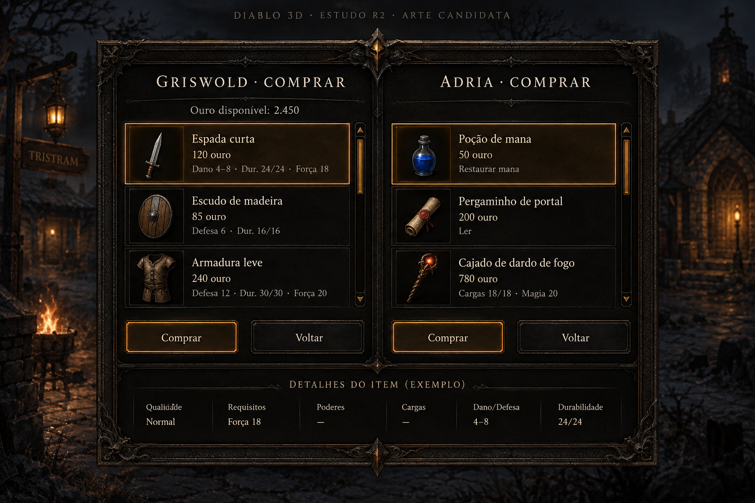
Comércio — lista com miniaturas
Conceito gerado · R2 · candidato em revisão; não é captura do jogo.
Ver prompt original
Use case: ui-mockup. Create a brand-new original raster concept for Diablo 3D HUD r2, a finished comparison-ready UI art board. This is candidate art, never an original game screenshot. High resolution landscape 3072×2048 if possible; crisp legible Portuguese typography. Same design language as the inspected HUD study: charcoal stone and black leather surfaces, forged dark iron, fine pewter edge filigree, restrained aged-brass details, ivory serif text, amber focus. Solid opaque near-black content areas, quiet thin ornament, generous line spacing, no noisy stone behind text. Material depth only at edges. The world, if shown, is a tiny subdued Tristram setting, not the focus. No invented NPC portraits, no character artwork or models, no logos, no promotional copy. Small board header exactly: 'DIABLO 3D · ESTUDO R2 · ARTE CANDIDATA'. Keep every UI text inside its own bounds. Functional controls must be exactly those specified. No extra tabs, buttons, shortcuts, features, currencies or stat types. No side labeled original and no split before/after. Native data remains authoritative; numeric examples are illustrative. Modern placement/proportion allowed, existing actions/capacities remain unchanged.

A complete wide commerce screen for the existing list-with-thumbnails presentation. Single centered framed panel with two side-by-side variant columns 'GRISWOLD · COMPRAR' and 'ADRIA · COMPRAR'; each is a genuine item list, not inventory grid. Add small illustrative item miniatures in a fixed column without changing the item's native dimensions or claiming final approved item icons. Left: 'Ouro disponível: 2.450'; 'Espada curta' / '120 ouro' / 'Dano 4–8 · Dur. 24/24 · Força 18'; 'Escudo de madeira' / '85 ouro' / 'Defesa 6 · Dur. 16/16'; 'Armadura leve' / '240 ouro' / 'Defesa 12 · Dur. 30/30 · Força 20'. Right: 'Poção de mana' / '50 ouro · Restaurar mana'; 'Pergaminho de portal' / '200 ouro · Ler'; 'Cajado de dardo de fogo' / '780 ouro · Cargas 18/18 · Magia 20'. Each column has 'Comprar' and 'Voltar' only, an amber selected row and scroll affordance. Under the lists, a restrained noninteractive specimen details strip labels 'Qualidade · Requisitos · Poderes · Cargas · Dano/Defesa · Durabilidade'. Native operations supported by template are buy basic/premium, sell, repair, recharge, identify, Wirt offer. Do not draw ten duplicated screens; show consistent template with sufficient detail space. Do not add filtering, search, rarity sort, currencies, comparison stats or equipment slots.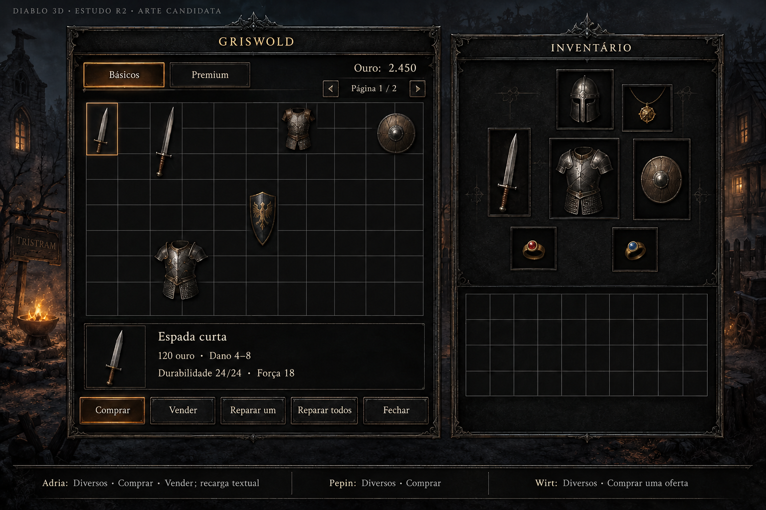
Comércio — estudo de grade e inventário
Conceito gerado · R2 · candidato em revisão; não é captura do jogo.
A grade desenhada diverge do contrato nativo. Correção pendente antes da integração.
Ver prompt original
Edit the inspected candidate UI art image. This is a surgical correction of the LEFT SHOP GRID ONLY. Preserve the entire composition, all text, headings, shop tabs, price/details, five shop buttons, background, frame style, and the RIGHT INVENTORY exactly as they are. In particular the right inventory retains exactly SEVEN equipped slots and TEN columns by FOUR rows of backpack cells. Rebuild only the rectangular shop grid beneath Griswold's tabs and above the item-detail panel. It MUST contain EXACTLY TEN columns and NINE rows: 90 equal rectangular cells. This means ELEVEN full vertical boundary lines including both borders, and TEN full horizontal boundary lines including both borders. Count 10 spaces across and 9 spaces down before finishing. Uniform cell spacing, no extra narrow column or partial cell. Keep the same outer grid rectangle, adjusting line spacing inside it. Keep the existing item illustrations roughly in their same grid locations, without obscuring enough grid lines to hide the count. All other image pixels should remain visually unchanged. No additional text, symbols, buttons, arrows, slots or artworks. The existing shop layout currently has the wrong grid count; correct it to 10×9.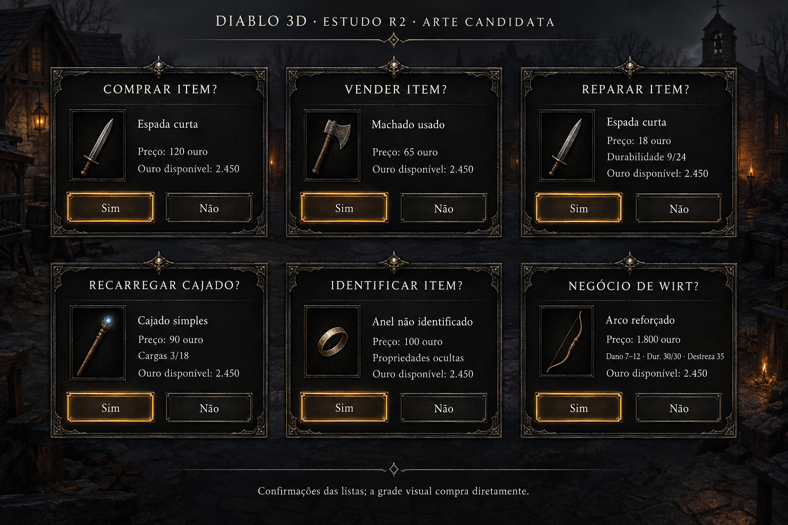
Comércio — seis confirmações
Conceito gerado · R2 · candidato em revisão; não é captura do jogo.
Ver prompt original
Use case: ui-mockup. Create a brand-new original raster concept for Diablo 3D HUD r2, a finished comparison-ready UI art board. This is candidate art, never an original game screenshot. High resolution landscape 3072×2048 if possible; crisp legible Portuguese typography. Same design language as the inspected HUD study: charcoal stone and black leather surfaces, forged dark iron, fine pewter edge filigree, restrained aged-brass details, ivory serif text, amber focus. Solid opaque near-black content areas, quiet thin ornament, generous line spacing, no noisy stone behind text. Material depth only at edges. The world, if shown, is a tiny subdued Tristram setting, not the focus. No invented NPC portraits, no character artwork or models, no logos, no promotional copy. Small board header exactly: 'DIABLO 3D · ESTUDO R2 · ARTE CANDIDATA'. Keep every UI text inside its own bounds. Functional controls must be exactly those specified. No extra tabs, buttons, shortcuts, features, currencies or stat types. No side labeled original and no split before/after. Native data remains authoritative; numeric examples are illustrative. Modern placement/proportion allowed, existing actions/capacities remain unchanged.

A 3-column by 2-row art board with six complete confirmation dialog variants, all the same dignified charcoal/iron/ivory frame. Every dialog has exactly two actions 'Sim' and 'Não', clear keyboard/controller focus amber on one, no duplicate footer actions. First 'COMPRAR ITEM?' / 'Espada curta' / 'Preço: 120 ouro' / 'Ouro disponível: 2.450'. Second 'VENDER ITEM?' / 'Machado usado' / 'Preço: 65 ouro' / 'Ouro disponível: 2.450'. Third 'REPARAR ITEM?' / 'Espada curta' / 'Preço: 18 ouro' / 'Durabilidade 9/24' / 'Ouro disponível: 2.450'. Fourth 'RECARREGAR CAJADO?' / 'Cajado simples' / 'Preço: 90 ouro' / 'Cargas 3/18' / 'Ouro disponível: 2.450'. Fifth 'IDENTIFICAR ITEM?' / 'Anel não identificado' / 'Preço: 100 ouro' / 'Propriedades ocultas' / 'Ouro disponível: 2.450'. Sixth 'NEGÓCIO DE WIRT?' / 'Arco reforçado' / 'Preço: 1.800 ouro' / 'Dano 7–12 · Dur. 30/30 · Destreza 35' / 'Ouro disponível: 2.450'. Do not confuse Wirt's 50-gold look fee with this item price. A small noninteractive board footnote says 'Confirmações das listas; a grade visual compra diretamente.' No original-game reference panel.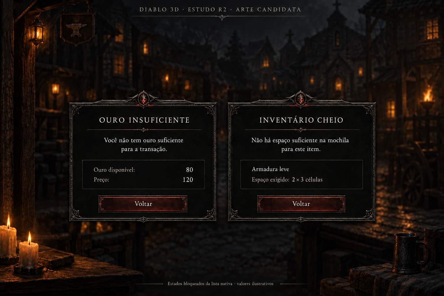
Comércio — dinheiro e espaço insuficientes
Conceito gerado · R2 · candidato em revisão; não é captura do jogo.
Ver prompt original
Edit this inspected candidate image by removing ONLY the two large background UI panels titled COMERCIANTE and INVENTÁRIO, including ALL their item names, icons, columns, item prices, weight column, fake gear rows, and their frames. Replace those background panels with the same softly blurred dark Tristram street scenery already present between them. Keep the TWO FOREGROUND WARNING DIALOGS exactly unchanged: OURO INSUFICIENTE with its complete Portuguese message, Ouro disponível 80, Preço120 and Voltar; INVENTÁRIO CHEIO with its complete Portuguese message, Armadura leve, Espaço exigido 2×3 células and Voltar. Preserve the foreground dialog borders, size, placement, material, text, values and buttons exactly. Preserve top candidate header, bottom evidence note, candles and mug. There must be absolutely NO other UI behind the warning dialogs after this edit: no inventory list, no merchant list, no stats, no weight, no gloves/boots/belt, no hidden fake features. This is a surgical background correction; do not redesign either foreground warning popup and do not add anything new.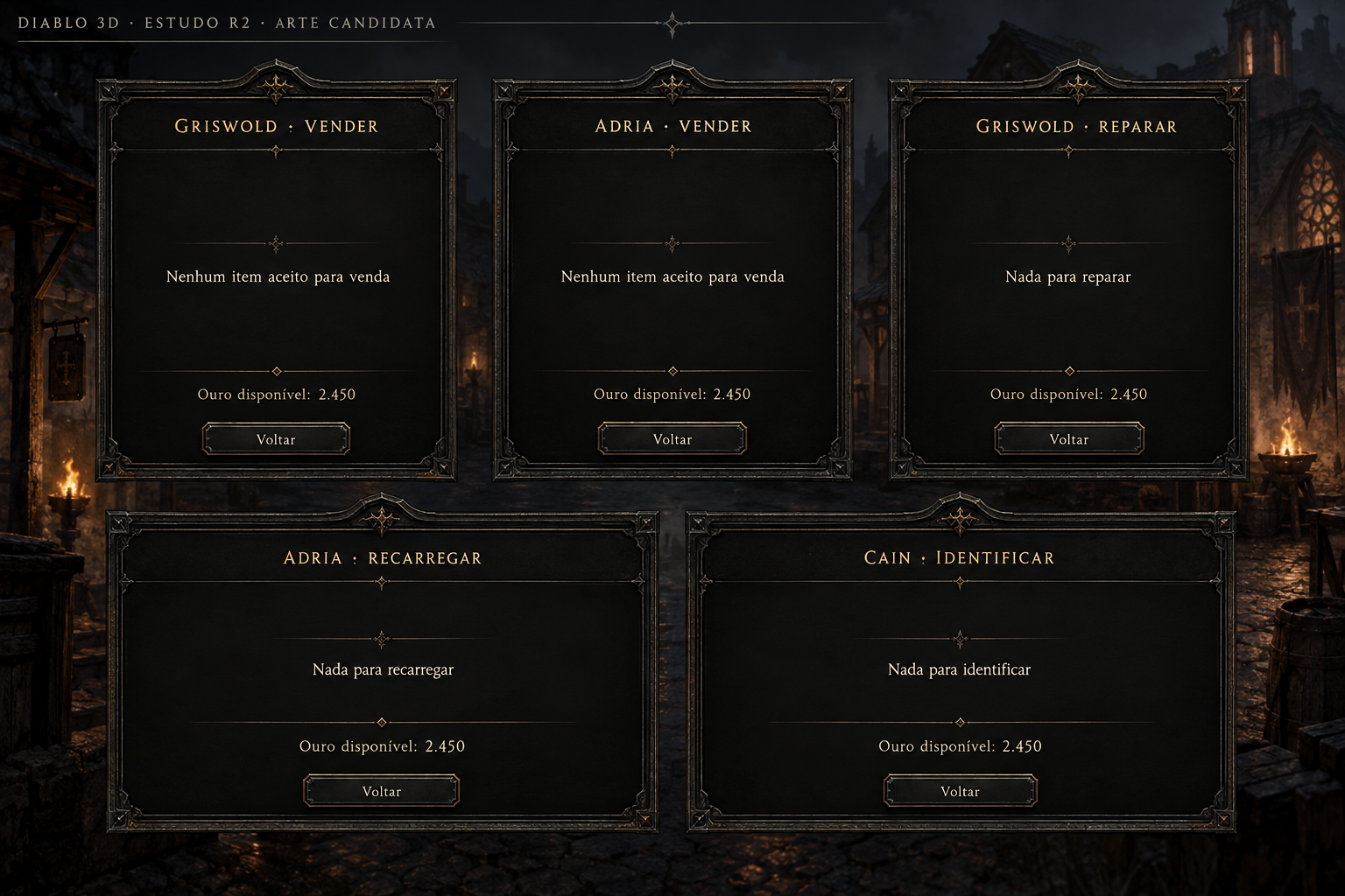
Comércio — cinco estados sem itens
Conceito gerado · R2 · candidato em revisão; não é captura do jogo.
Ver prompt original
Use case: ui-mockup. Create a brand-new original raster concept for Diablo 3D HUD r2, a finished comparison-ready UI art board. This is candidate art, never an original game screenshot. High resolution landscape 3072×2048 if possible; crisp legible Portuguese typography. Same design language as the inspected HUD study: charcoal stone and black leather surfaces, forged dark iron, fine pewter edge filigree, restrained aged-brass details, ivory serif text, amber focus. Solid opaque near-black content areas, quiet thin ornament, generous line spacing, no noisy stone behind text. Material depth only at edges. The world, if shown, is a tiny subdued Tristram setting, not the focus. No invented NPC portraits, no character artwork or models, no logos, no promotional copy. Small board header exactly: 'DIABLO 3D · ESTUDO R2 · ARTE CANDIDATA'. Keep every UI text inside its own bounds. Functional controls must be exactly those specified. No extra tabs, buttons, shortcuts, features, currencies or stat types. No side labeled original and no split before/after. Native data remains authoritative; numeric examples are illustrative. Modern placement/proportion allowed, existing actions/capacities remain unchanged.

A professional art board with five empty-store-state cards in a clear layout: top three cards, bottom two wider cards. Same iron/charcoal frame as all commerce concepts; no fake product rows or disabled purchase controls. Card 1 header 'GRISWOLD · VENDER', message 'Nenhum item aceito para venda', 'Ouro disponível: 2.450', only 'Voltar'. Card 2 'ADRIA · VENDER', message 'Nenhum item aceito para venda', 'Ouro disponível: 2.450', only 'Voltar'. Card 3 'GRISWOLD · REPARAR', message 'Nada para reparar', 'Ouro disponível: 2.450', only 'Voltar'. Card 4 'ADRIA · RECARREGAR', message 'Nada para recarregar', 'Ouro disponível: 2.450', only 'Voltar'. Card 5 'CAIN · IDENTIFICAR', message 'Nada para identificar', 'Ouro disponível: 2.450', only 'Voltar'. Use empty negative space attractively and keep content vertically centered; no portraits, icons can be tiny neutral ornamental line marks only. Do not use Griswold's acceptance criteria for Adria; messages are generic and correctly named. No loot suggestions, no new navigation.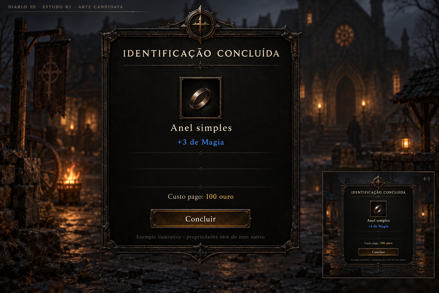
Comércio — identificação revelada
Conceito gerado · R2 · candidato em revisão; não é captura do jogo.
Ver prompt original
Use case: ui-mockup. Create a brand-new original raster concept for Diablo 3D HUD r2, a finished comparison-ready UI art board. This is candidate art, never an original game screenshot. High resolution landscape 3072×2048 if possible; crisp legible Portuguese typography. Same design language as the inspected HUD study: charcoal stone and black leather surfaces, forged dark iron, fine pewter edge filigree, restrained aged-brass details, ivory serif text, amber focus. Solid opaque near-black content areas, quiet thin ornament, generous line spacing, no noisy stone behind text. Material depth only at edges. The world, if shown, is a tiny subdued Tristram setting, not the focus. No invented NPC portraits, no character artwork or models, no logos, no promotional copy. Small board header exactly: 'DIABLO 3D · ESTUDO R2 · ARTE CANDIDATA'. Keep every UI text inside its own bounds. Functional controls must be exactly those specified. No extra tabs, buttons, shortcuts, features, currencies or stat types. No side labeled original and no split before/after. Native data remains authoritative; numeric examples are illustrative. Modern placement/proportion allowed, existing actions/capacities remain unchanged.

A finished focused result screen after Cain identifies an item, the original shop interaction elegantly reframed, not a new reward or character-level-up screen. One centered large framed panel over subdued blurred Tristram neutral scene. Header 'IDENTIFICAÇÃO CONCLUÍDA'. Small illustrative ring icon as specimen, no final approved item asset claim. Exact main content 'Anel simples' in ivory; property '+3 de Magia' in restrained magical blue; line 'Custo pago: 100 ouro'. Native result and a sole return/completion action labeled 'Concluir'. Keep clear space reserved for additional revealed properties when a different item is identified, but do not invent or display other stats. Small noninteractive bottom label 'Exemplo ilustrativo · propriedades vêm do item nativo'. No equip, compare, sell, craft, salvage, reroll, rarity badge or popup original side. Match all charcoal stone/iron/pewter/ivory/amber materials with thin highlights and spacious readable type. Also show a small compact 4:3 variation inset at bottom-right of the board, same one result and one Concluir action; it is a responsive specimen of the same screen, not a second game window.
Peças sem texto
Kit sem texto — moldura de painel
Peça candidata sem texto, com alfa exterior; ainda exige revisão e montagem.
Ver prompt original
Use case: background-extraction. Extract a production-usable EMPTY gothic HUD panel skin from the supplied reference1, preserving its exact worn dark iron, pewter thin border, black charcoalstone interior and restrained corner filigree. The result must be a SINGLE front-on rectangular panel, approximately4:3, centered, occupying90% ofcanvas, fully framed edge-to-edge with clear right angles. REMOVE ALL TEXT, ALL numbers, rows, checkboxes, buttons, icons, slider, decorative wings/skulls projecting outside the rectangular border, backdrop scene and lightingoutsidepanel. Interior is opaque smooth very dark texturedstone lowcontrast (not transparent). Outside rectangle truly transparent alpha, NOT checkerboard image. No bakedshadows outside boundary, no glow. Designed for 9-slice with fixed64px corners, longstraightmiddle edges allowingresize. Highquality2K+ifpossible. This is a clean raster component extracted from the concept to assemble real editable menus withlive text. Do not produce afullmockupscreen. Preserve styleexactly.
Kit sem texto — moldura de modal
Peça candidata sem texto, com alfa exterior; ainda exige revisão e montagem.
Ver prompt original
Use case: background-extraction. Extract a SINGLE empty horizontal gothic modal window frame from reference1, the same worn pewter/darkiron/black charcoalstone visual design. Canvaslandscape, rectangle about2:1aspect, centeredoccupying90%. Opaqueverydark lowcontrast interior; borderfineagedmetal/cornerfiligree. REMOVE ALLTEXTnumberssliderbuttonsicons AND worldbackdrop, no projectingwingedgargoyles outside rectangle. Truly transparent alpha outsideframe, no checkerboardpattern. Rectilinear fixedcorners, longstraightedgecentres support9slice64px. No additional panels/components, no watermark. A clean standalone project-bound raster asset extracted from suppliedscreen; live textand controlswillbeoverlaidbyGodot. Highquality2K+target.
Kit sem texto — moldura de controle
Peça candidata sem texto, com alfa exterior; ainda exige revisão e montagem.
Ver prompt original
Use case: background-extraction. Extract a SINGLE empty rectangular menu BUTTON skin from the 'Menu anterior' button in suppliedreference1. Keep exactlydarkstone/forgediron, thinfinepewterborder, subtleworncornerornament. REMOVE text, allletters,numbers, icons, arrows, backdrop, shadowoutsidebutton, otherpaneldecoration. Onlyonebutton, horizontal5:1proportion, fronton, symmetricfixedcorners, longstraightedgecentre,support9slice. Canvaswidebuttonnearlyfills90%width, generousfullytransparentalphaoutside. Interioropaque nearblacklowcontrast. Trulytransparentbackground; nevercheckerboardorwhitepaint. No labelword, no tinyduplicatebuttons. Project-bound reusablebuttonframe for liveUItext inGodot. Highquality2Kwidthtarget.14 referências nativas completas
Uma captura histórica de janela e 13 composições offscreen. As outras 51 telas ainda não têm imagem nativa; uma referência não cobre automaticamente todas as variantes.
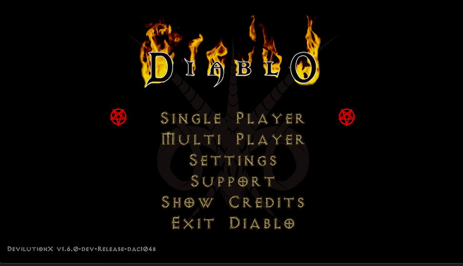
Menu principal — Diablo
Referência histórica de janela. Captura histórica fornecida da apresentação nativa Diablo/DevilutionX, com seis ações e logo original; não representa a revisão D3D instalada hoje.
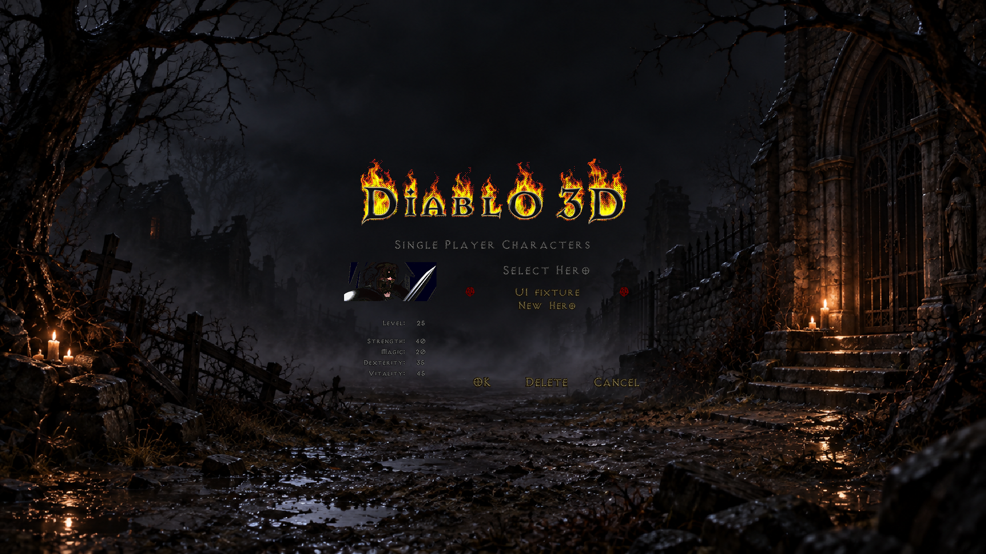
Personagens de um jogador
Referência nativa offscreen. Fixture de funções/arte nativas e compositor SDL real sem janela. Herói sintético; fundo RGB D3D aprovado, não screenshot vanilla intacto.
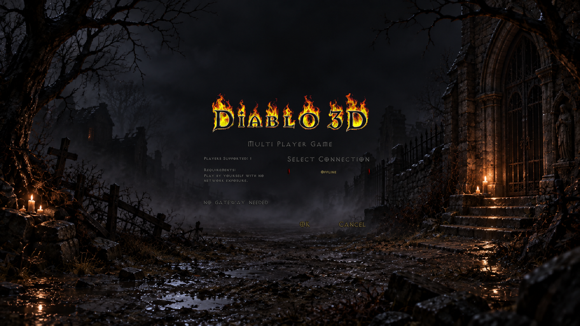
Multijogador — conexão Offline
Referência nativa offscreen. Fixture nativa real sem janela; provider Offline do build NONET, com fundo D3D aprovado. TCP/ZeroTier não foram capturados.
Créditos
Referência nativa offscreen. Fixture sem janela do renderer, fundo e texto nativos de créditos; imagem da taverna e rolagem preservadas.
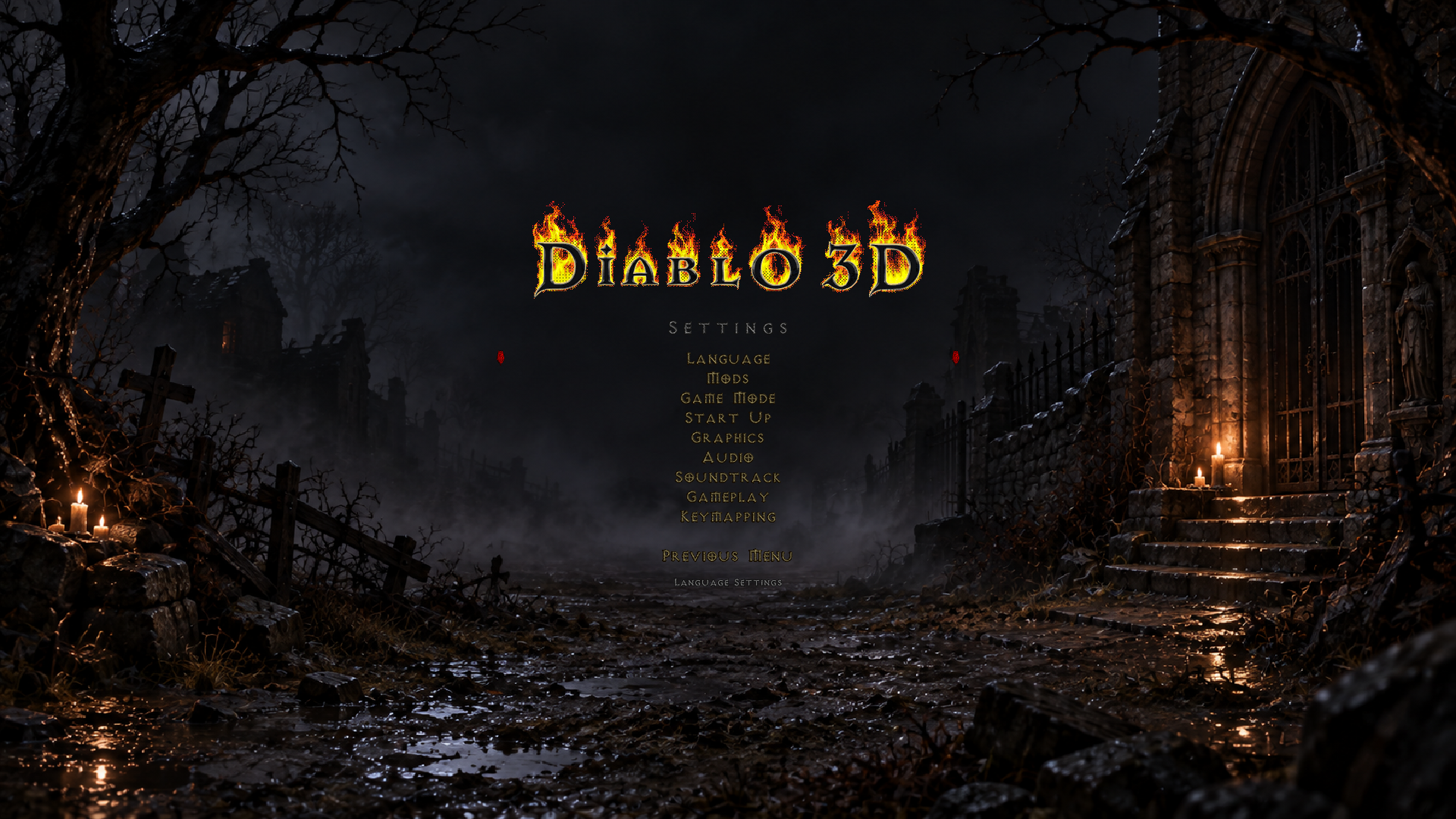
Configurações pré-partida — categorias
Referência nativa offscreen. Fixture nativa pré-partida sem janela, fundo D3D aprovado; categorias reais do build no momento do diagnóstico.
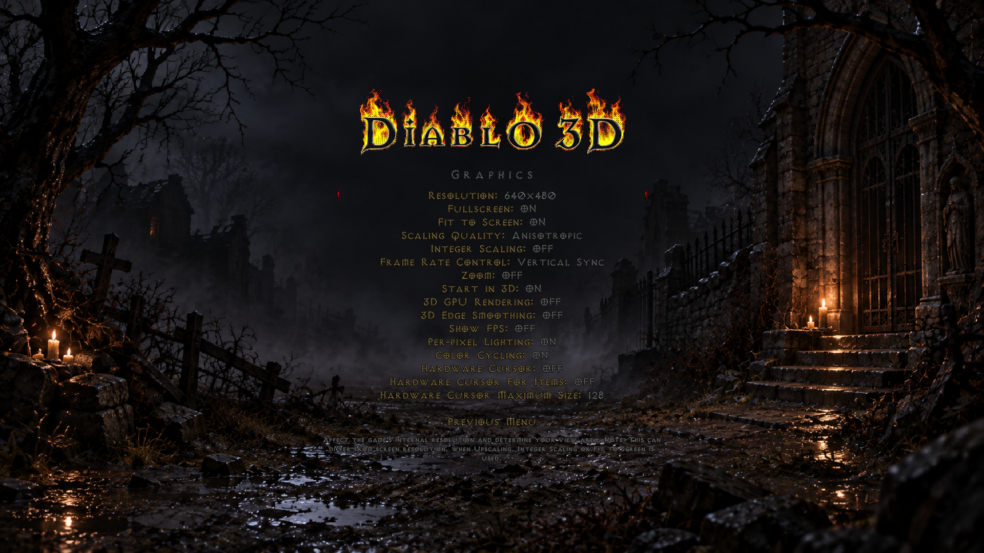
Configurações pré-partida — opções da categoria
Referência nativa offscreen. Referência direta da variante Gráficos pelo renderer nativo; demais categorias não têm imagem localizada. Fundo D3D aprovado e UI nativa.
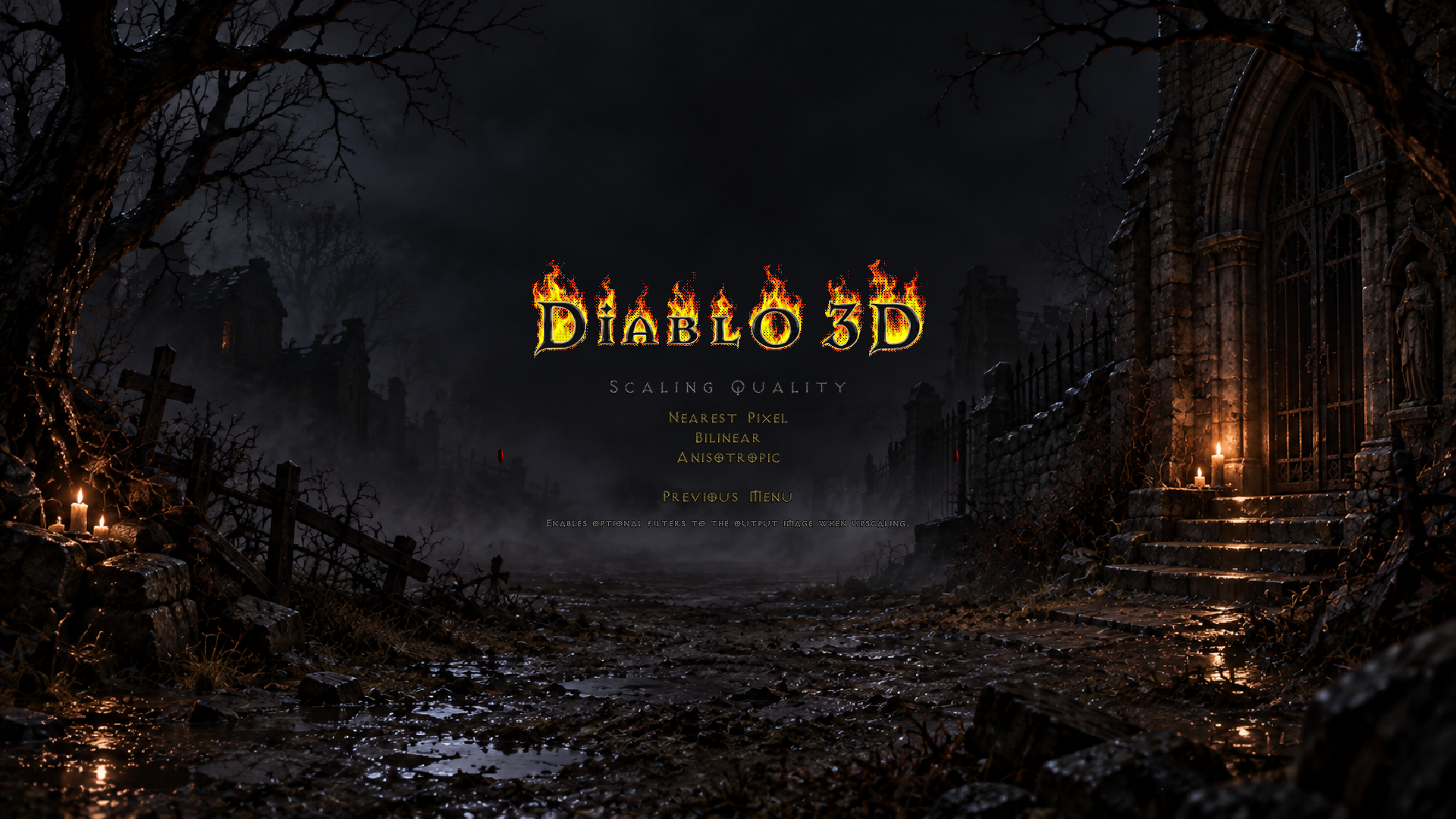
Configurações pré-partida — escolher valor
Referência nativa offscreen. Fixture nativa real da opção Scaling Quality; outras enumerações são variantes de conteúdo sem captura própria.
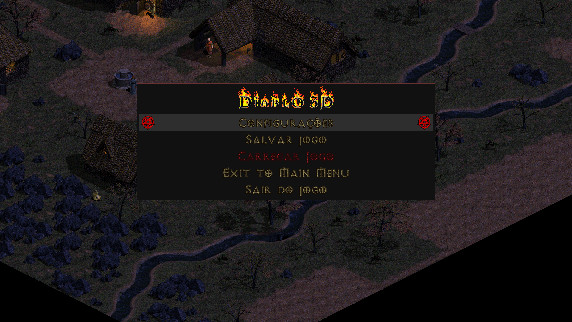
Menu Esc da partida
Referência nativa offscreen. Fixture nativa atual sem janela sobre Tristram; ilustra o Esc atual e não o antigo submenu de opções.
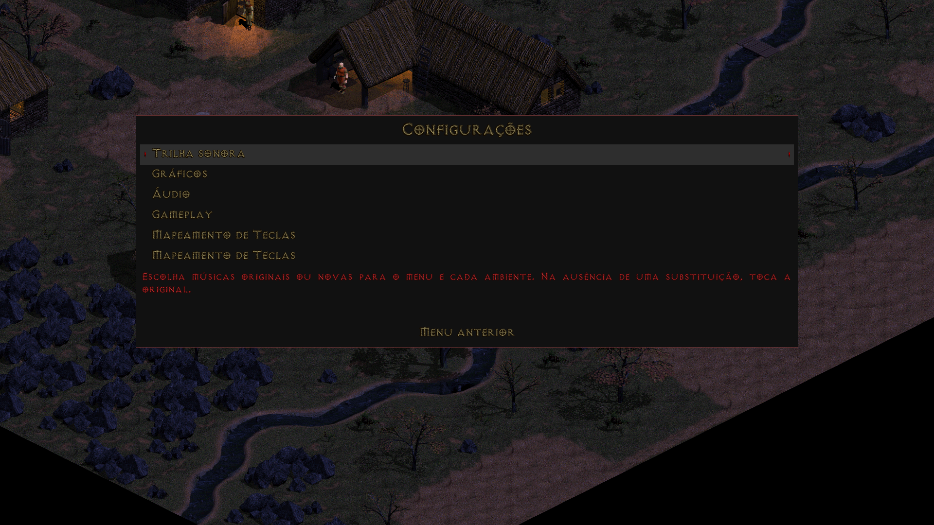
Configurações na partida — categorias
Referência nativa offscreen. Fixture de desenho nativo atual sobre Tristram, sem HUD inferior; prova de composição offscreen, não screenshot de janela.
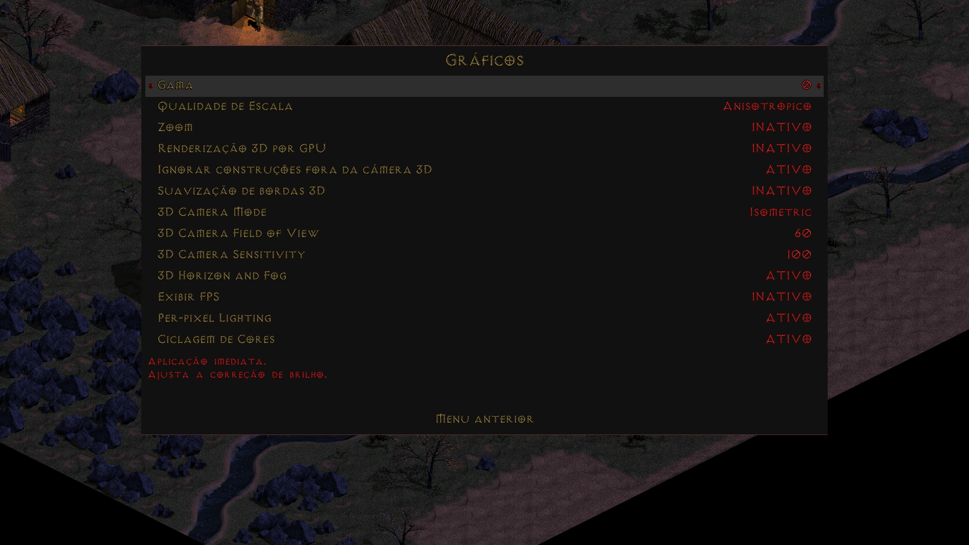
Configurações na partida — opções da categoria
Referência nativa offscreen. Fixture nativa atual da variante Gráficos. Música também existe em 1920x1080-music-page-1-focus-first.png no mesmo diretório; demais categorias sem captura própria.
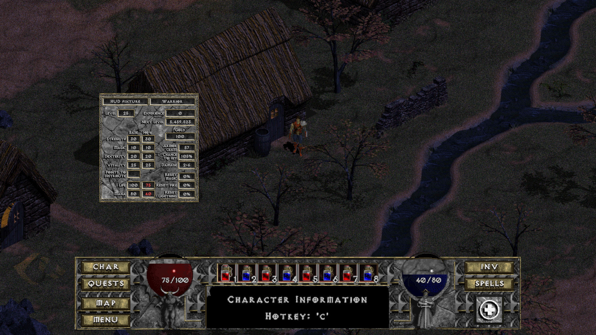
Personagem
Referência nativa offscreen. Fixture integrado do painel e sprites nativos sobre Tristram nativa, composto no SDL real sem janela. Personagem/valores de teste; HUD D3D da revisão histórica. Não é screenshot da janela.
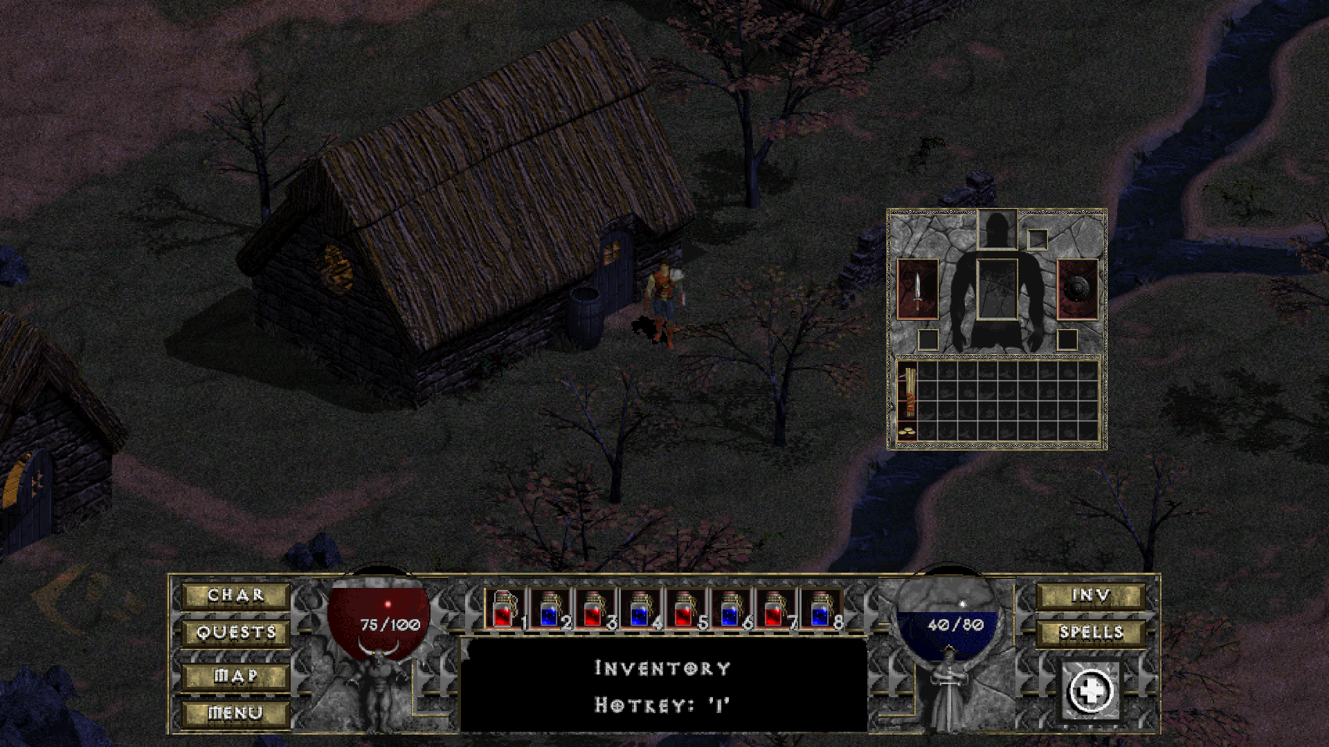
Inventário
Referência nativa offscreen. Fixture integrado do painel e sprites nativos sobre Tristram nativa, composto no SDL real sem janela. Personagem/valores de teste; HUD D3D da revisão histórica. Não é screenshot da janela.
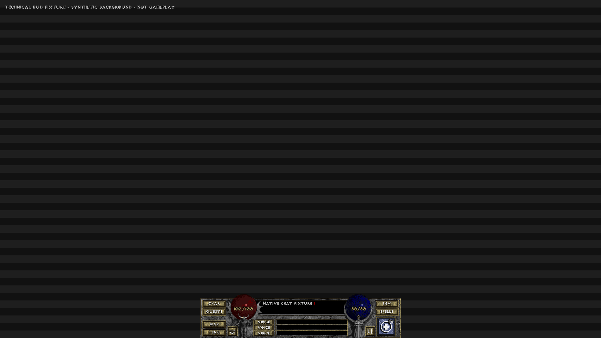
Escrever mensagem
Referência nativa offscreen. Fixture de desenho do painel de chat nativo sobre fundo sintético explicitamente identificado. Texto de teste e controles legados reais; não gameplay nem captura de janela.
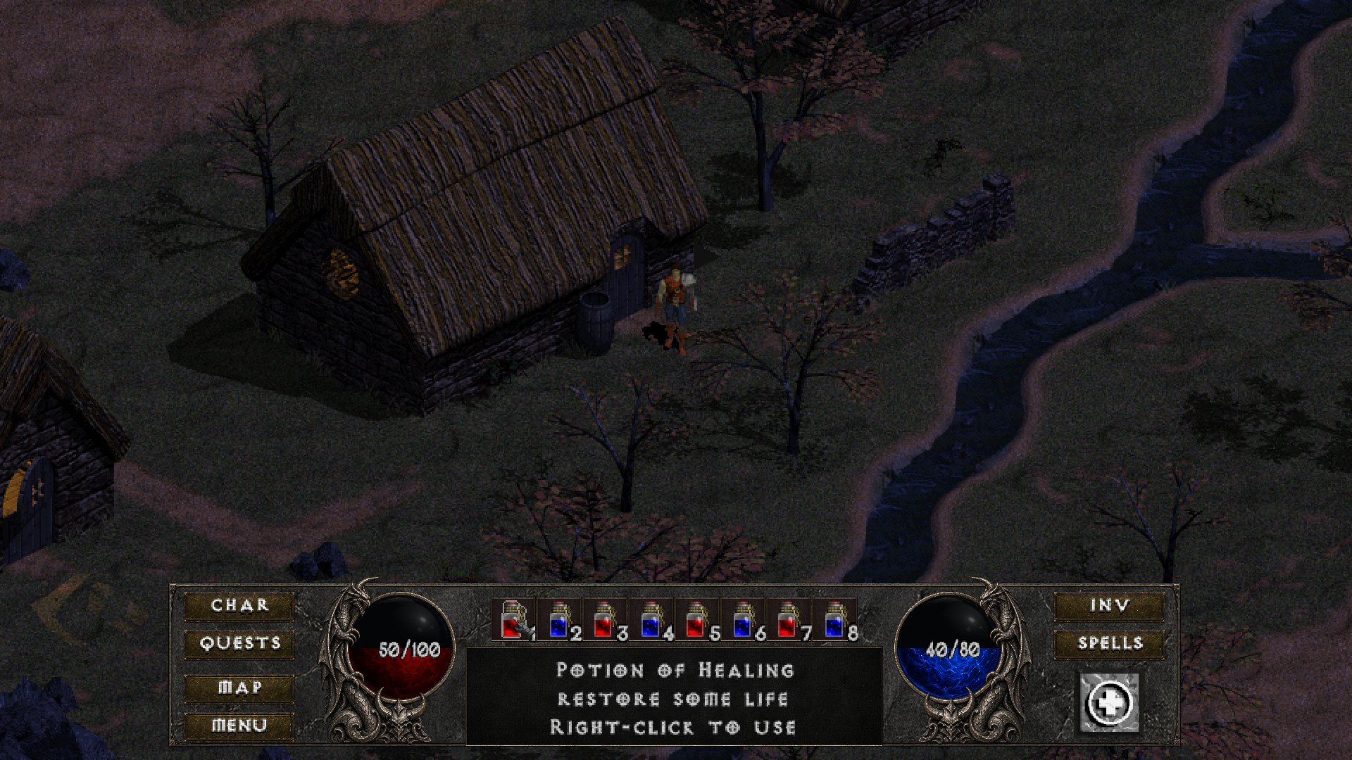
HUD principal já instalado — referência preservada
Referência nativa offscreen. Composição produtiva offscreen da baseline HD atual; ref de integração D3D, não original vanilla. Inventário inclui apenas para continuidade.